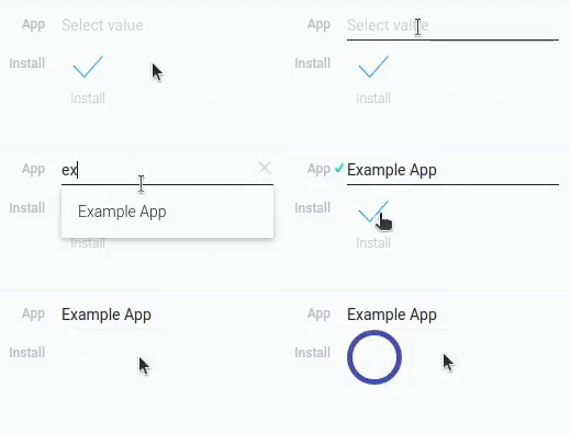
Install
Install is a gh-element that allows to install the copy of an application with the certain number of items. By working with the App element, the user can choose which application they want to install.

With this element, the user can only install an existing application.
That is, this element creates a copy of the selected application. This includes all views, fields, and a certain number of items.
It is also important that the user can only install the application to which they have access. This can be any permission from Reader to Administrator.
The created application will have the same name as the original, but with the word New at the end.
For example, if a user installs a application named My Application, the installed application will be named My Application New.
Functional Characteristics
The purpose of the current element allows users to copy any application with all its fields and items. It is very useful when developing applications, because it allows you to copy a ready-made application, which saves time. The user can even develop a template application for further copying.
Element Options
The install element has only one group of parameters that can configure it.
Field Settings
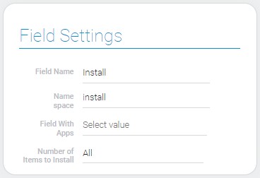
The only element settings are located in this group. Two of them are the standard field settings.

| Name | Description |
|---|---|
| Field With Apps | allows you to select the field in which the application to be installed will be selected; details... |
| Number of Items to Install | allows to select the number of items that will be installed with an app; details... |
| Browser Install | allows element to install application in a browser; details... |
Field With Apps
To install any application, the user must first select which application they want. To do this, you need to connect the App element to the Install. Thus, the user will be able to select any application in the App field and the selected application will be downloaded to the user's account.
As you may have already guessed, this is the setting where you should select App. This is the most important setting for the current element.
Number Of Items To Install
Together with the application itself, Install allows you to install its items. Therefore, the current setting allows you to choose how many of the existing items will be installed. There 6 existing options:
- All
- 10000
- 1000
- 500
- 100
- 10
This allows you to control how many items a user can install for themselves.
By default, the user can install 1000 items.
Browser Install
This is a setting that configures the installation of the application. Specifically, it defines the area where the application will be installed. If it is enabled, the application will be installed in the browser. This means that the installation may be interrupted by page reloads. If this option is disabled, the installation will be performed on the server.
It is disabled by default.
Element Style
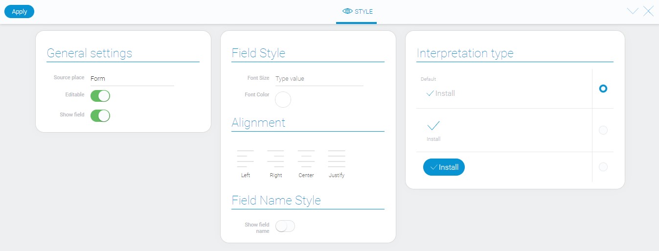
The current item has a set of default style settings and several interpretation types.

Filtration
This is the element that cannot be filtered out.
Interpretation
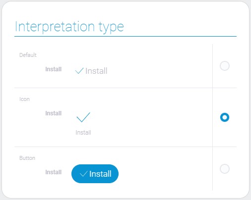
The Install element has three types of interpretation. They are all quite similar to the other buttons:

Default
This interpretation type allows the element to be displayed as an icon with a button name next to it.
Icon
The second type displays an icon with the name of the button under it.
Button
The last interpretation type allows the element to be displayed as a blue button with an icon and button name.
Value Format
This element has no field value.
Data Model
The data model of the element is quite small and contains only element settings and interpretation array.
{
    "data_model": {
        "apps_to_install" : "584778",
        "number_of_items_to_install": 1000,
        "interpretation" : []
    }
}
| Name | Type | Description |
|---|---|---|
| apps_to_install | string |
|
| interpretation | array |
contains all element interpretation types |
| number_of_items_to_install | string |
contains number of fields which will be installed |

 Edit document