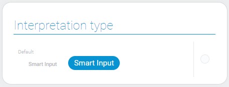
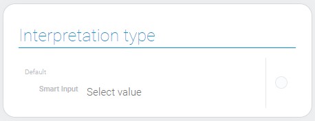
Smart Input
Smart Input is a gh-element that allows you to configure various types of smart tools. The work of smart input is based on the automation nodes. There a special node called SmartInput that is available only in this element. Together with a variety of element settings, you can create a useful automation tool according to your needs.
Depending on the output socket used, different types of current element are used.
Functional Characteristics
The Smart Input is very useful element with lots of application options. Since, due to big number of settings and automation nodes, it can be configured as you wish, its functional characteristics will be described superficially by type:
- Button - allows to create buttons to add data or update existing data in items remotely.
- Input - allows to create the input field to add and update data in any field remotely.
- Form - allows you to create a special button that will add new elements to the application, for example, with certain fields filled in.
- List - allows you to create a list of items. When the user selects one of them, a certain action will happen.
Also due to automation, this element can do a few actions at the same time. For example, the Button for changing the task status can simultaneously send a message about this change to the project manager.
Value Format
With any setting, the current gh-element has no value.
Element Options
The current item has many different settings. Many of them appear only in certain cases.
Field Settings
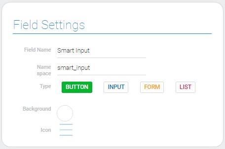
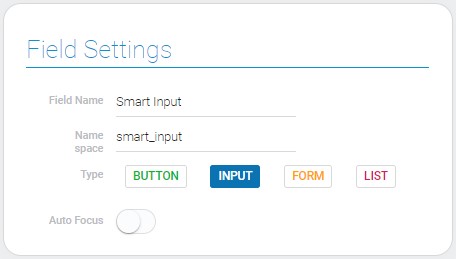
Field settings are the most important for the element. The consists of standard gh-element settings, type option, and settings of types.
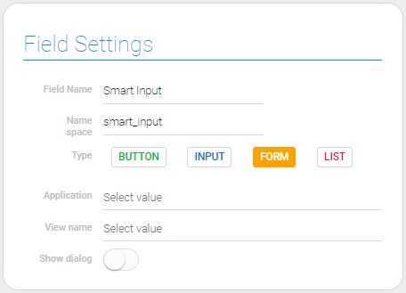
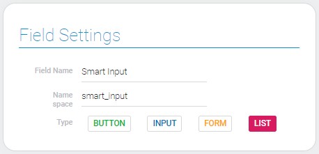
When you change the type of smart input, additional settings change as well.
-
Button
-
Input
-
Form
-
List
| Name | Description |
|---|---|
| Type | allows to change the functions of the element; details... |
| Background | allows to select color of the button; details... |
| Icon | allows to add and select the icon of the button; details... |
| Auto Focus | allows to enable automatic focusing on the current element when the user opens an element; details... |
| Application | allows to select the source application; details... |
| View name | allows to select the view of the empty item; details... |
| Show dialog | allows to configure whether the item will be opened on the full screen or as a pop-up window; details... |
Type
Types of the smart input element determine which type function the it will be able to perform and which socket of its node will use. In addition, the use of the following settings depends on the selected type.
- Button
- Input
- Form
- List
Background
This is the function that allows to open the color picker and select the color of the button. It is available only for the Button type.
Icon
This is the icon that will be displayed on the button when the Button type is selected.
Auto Focus
When this feature is enabled and the user opens an item, he/she can enter any value in Smart Input without clicking on it. In addition, the page will automatically scroll to this element. This feature works only for Input type.
Application
This is the source application whose item will be opened after the smart input button is clicked. It can only be selected for the Form type.
View Name
This is the view of the application items, that will be opened after the smart input button is clicked. As well as the application, this option is available only for the Form type.
Show Dialog
If this function is on, the empty item will be opened as a pop-up window. It is available only for the Form type.
Use Selected Items And List Input Settings
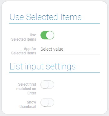
The second settings block contains two groups. The first one allows configure the selection of the items. The second group contains additional settings for the List type. Also, they are not displayed unless the List type is selected.
| Name | Description |
|---|---|
| Use Selected Items | allows you to use another application to update items rather than the current one; details... |
| App for Selected Items | allows to select the application whose items will be updated; details... |
| Select first matched on Enter | allows you to enable or disable the items selection function by pressing the Enter key; details... |
| Show thumbnail | allows to enable or disable displaying the thumbnails in the drop-down list; details... |
Use Selected Items
The Smart Input node by default processes item data from the application where the Smart Input item is located. But the Use Selected Items allows you to select a different application if this option is enabled.
App For Selected Items
This function appears only if the previous one is enabled. The items of the selected application will be used for the following actions and transmitting to the next nodes instead of the current app.
Select First Matched On Enter
The name of this setting clearly describes its function. If it is enabled, when the user enters an item name into the field, he/she can simply select the first matching item by pressing Enter.
Show Thumbnail
The source field for thumbnails is selected in additional settings of the List input. The current setting, in turn, allows you to determine whether those thumbnails will be displayed in the item drop-down list.
List Input Settings
The last block of settings is always on the screen, but it used only for the List type of the smart input. These settings allows to generate the drop-down list of items.

| Name | Description |
|---|---|
| Application | allows to select the source application whose items will be used in the list; details... |
| View | allows to select the view of the items; details... |
| Title | allows to select the field from whose values will be used as an items titles in the drop-down list; details... |
| Settings | allows to configure additional settings for the drop-down list options from a specific application; details... |
| Edit | allows to edit or delete the list option; details... |
Application For List
This is the application whose existing items will be used to form the drop-down list and to which the item provides access.
View
This is the view from the source application. It is the view of its items.
Title
The titles of items in the list are taken from the selected field with data. Thus, you must select the field that will give the corresponding names to the elements.
Edit
As usual, the last column contains two buttons for each of the created options. One of the buttons allows you to edit it, the other allows you to delete it.
Settings
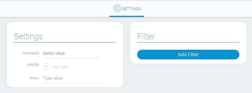
This group of settings is for adding some features to a group of list items from one application.
| Name | Description |
|---|---|
| Thumbnail | allows to select the source field from which images will be used as thumbnails in the drop-down list; details... |
| Subtitle | allows to select the field whose values will be displayed in the drop-down list; details... |
| Notes | allows to leave some notes in settings; details... |
| Filter | allows you to configure which items can use these settings; details... |
Thumbnail
Use this function to select the source element of the images. These images will be displayed in the drop-down list as thumbnails of the defined elements.
Subtitle
This function allows you to select the fields whose data will be displayed in the drop-down list below every header. Data for subtitles can be provided from several fields at the same time.
Notes
This setting is for marking a setting assignment or leaving any notes there.
Filter
The last function allows you to add many different filters which will sift items to which the additional settings should not apply.
Element Style
The style of the current element is customized using standard settings and has only one interpretation type.
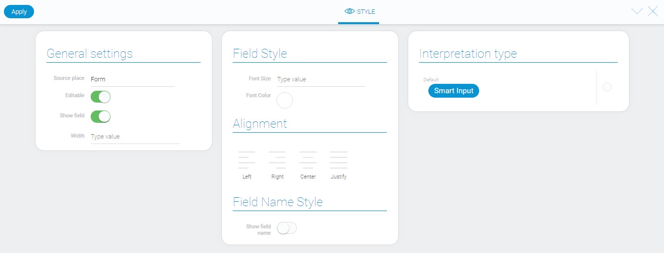
General Settings
The only additional setting is located in general group of style settings.
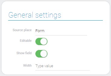
| Name | Description |
|---|---|
| Width | allows to set the width of the element field/button |
Width
The current settings accept any values in any CSS length units.
Data Model
{
    "data_model": {
        "app_id": "28752",
        "auto_focus": 1,
        "color": "#00cccc",
        "icon": "rar",
        "interpretation": [],
        "select_first_matched_option": 1,
        "selected_apps": [{
            "app_id": "28855",
            "settings": {
                "notes": "adsdsa",
                "filters_list": [],
                "subtitle_field_ids": "680499",
                "thumbnail_field_id": "680498"
            },
            "title_field_ids": "680365",
            "view_id": "1531669"
        }],
        "selected_items_app_id": "28752",
        "settings": {
            "include_nodes": []
        },
        "show_dialog": 1,
        "show_thumbnail": 0,
        "trigger": {},
        "type": "list",
        "use_selected_items": 0,
        "view_id": "1527725"
    }
}
| Name | Type | Description |
|---|---|---|
| app_id | string |
contains ID of the application from which the items for the list of items will be taken |
| auto_focus | boolean |
shows whether the auto focus is used or not |
| color | string |
contains hex code of the selected button color |
| icon | string |
contains name of the selected button icon |
| interpretation | array |
contains all element interpretation types |
| select_first_matched_option | boolean |
shows whether or not the function of selecting a matching item by pressing Enter |
| selected_apps | array |
contains all application and other settings of option for drop-down list |
| app_id | string |
contains ID of the source application for drop-down list |
| settings | object |
contains all additional settings of options of the items in the drop-down list |
| notes | string |
contains notes that have been entered in the settings |
| filters_list | array |
contains all filters used in additional settings of the List type |
| subtitle_field_ids | string |
contains ID of the field from which the subtitles for the dropdown list will be taken |
| thumbnail_field_id | string |
contains ID of the field from which the images for the thumbnails will be taken |
| title_field_idobjects | string |
contains the field ID from which the value for the element headers will be taken |
| view_id | string |
contains ID of the items view |
| selected_items_app_id | string |
contains the ID of the application whose items will be used instead of the current application |
| settings | object |
contains settings of element automation |
| include_nodes | array |
contains all used nodes and their settings |
| show_dialog | boolean |
shows whether the item will be opened as the pop-up window |
| show_thumbnail | boolean |
shows whether the thumbnails will be displayed or not |
| trigger | object |
contains all setting of the element nodes |
| type | string |
contains selected type of the element |
| use_selected_items | boolean |
shows whether selected items will be used or not |
| view_id | string |
contains ID of the view of items |
Filtration
This element cannot be filtered out.
Interpretation
Smart input input has only one type of interpretation, which differs depending on the type setting:

 Edit document
