App Constructor
App Constructor is a gh-element that allows users to create a new applications. After clicking this button, the creation window opens. In general, the creation of an application is divided into 6 steps:
-
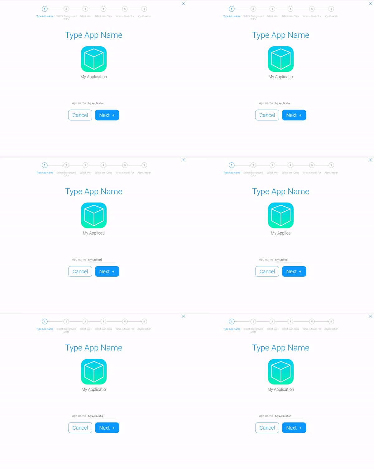
Type App Name - at the first stage user can enter the name of the future application.
-
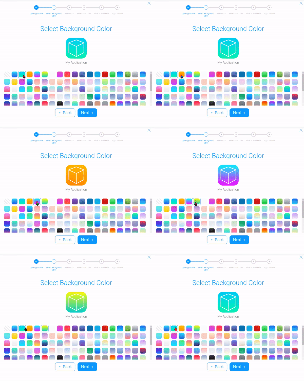
Select Background Color - allows user to select the background color style of the app icon.
-
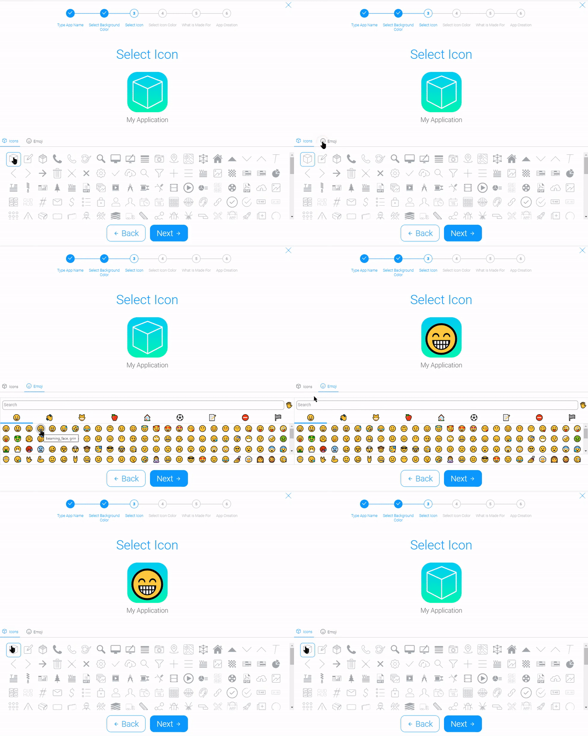
Select Icon allows the user to choose an image for the app icon. It can be one of the GudHub icons or any emoji.
-
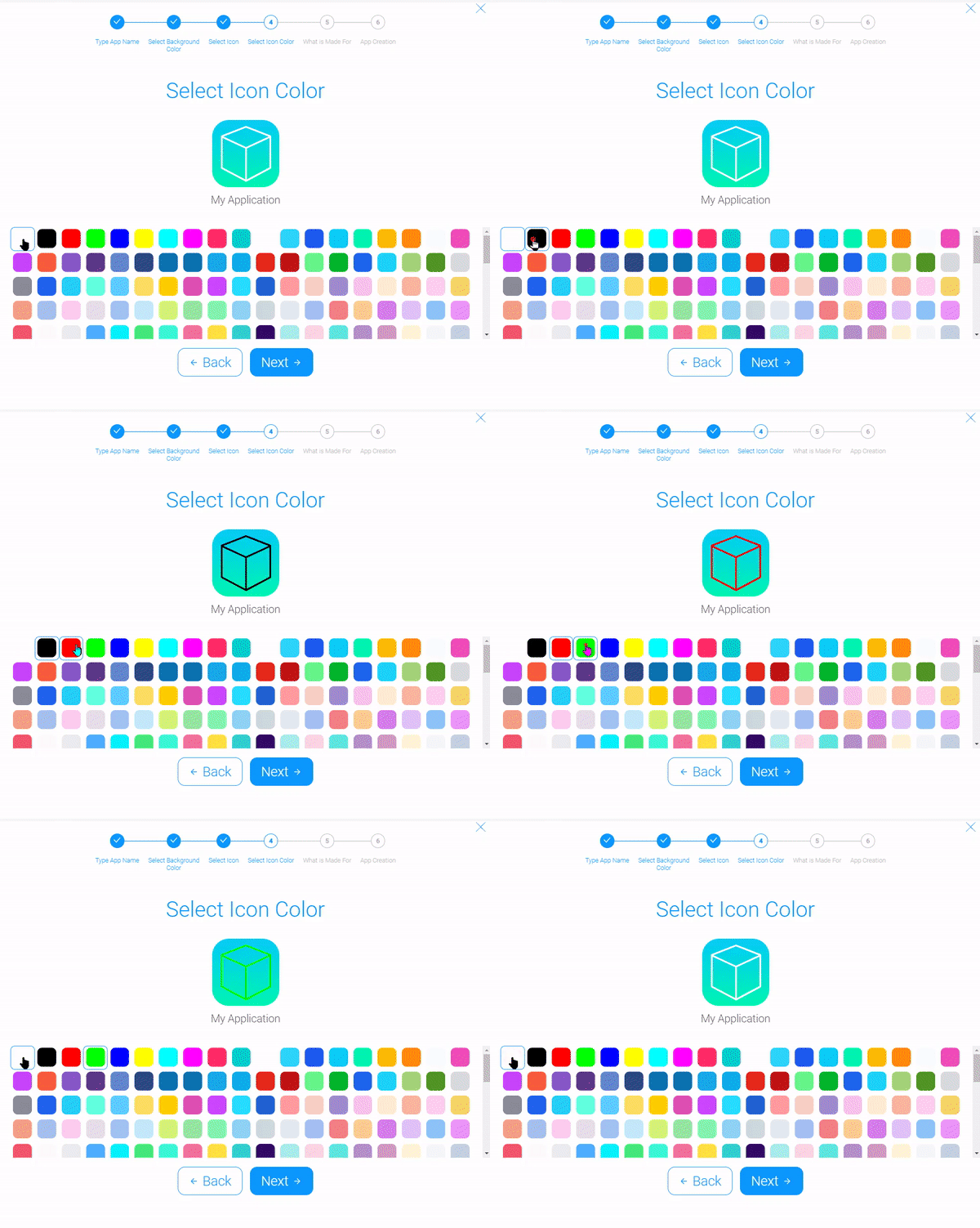
Select Icon Color allows the user to choose the color of the previously selected icon. the color can be changed only for GudHub icons.
-
What is Made for - for the created app user can select one of the seven templates. Each of them is the ready-made application with template items.
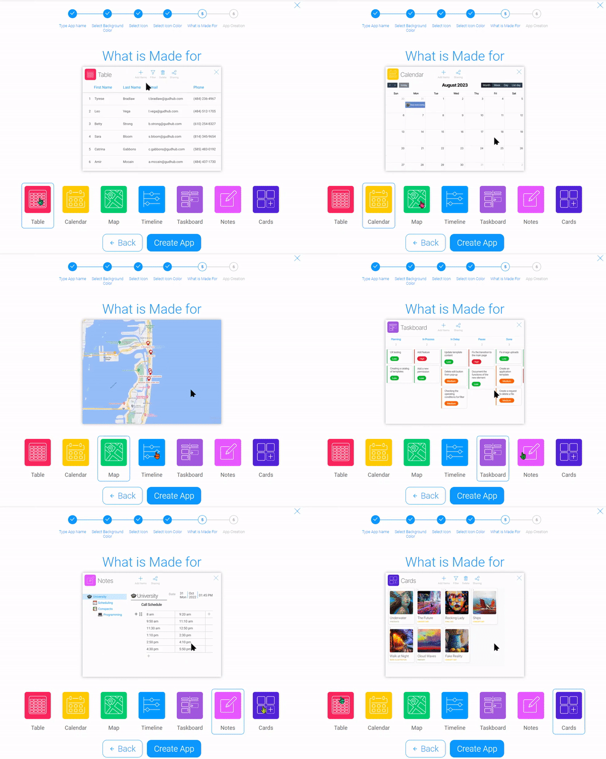
-
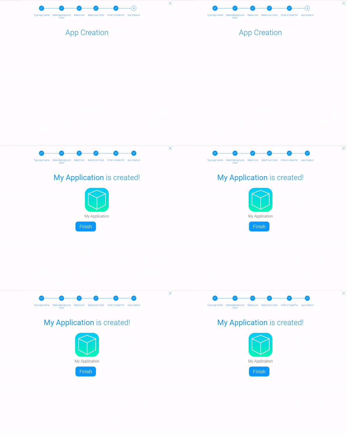
App Creation - the last step is waiting for the application to be created. This is the final stage.
Functional Characteristics
The only usage of the current element is to create applications. When you add it to an app, it eliminates the need to go to the main menu to create a new app. Although, App Constructor is used by default in the user's application list.
Element Options
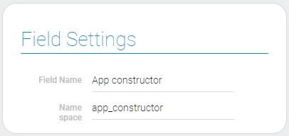
The only element options are the standard field settings.
Element Style
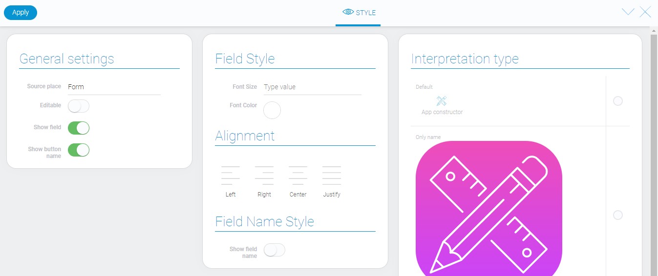
Despite the interpretation types, the element has only standard style options. Even an additional one, called Show button name, you might have already seen in other articles. And as usual, the types of interpretation are described at the end of this article.
General Settings
As always, additional element style settings can be found in the General Settings group.
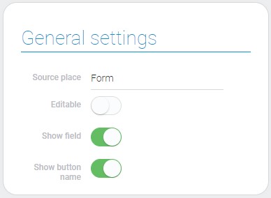
| Name | Description |
|---|---|
| Show button name | allows to hide name of the button |
Show Button Name
Depends of its value, this function allows to show or hide the button name.
Filtration
This element is unfiltered.
Interpretation
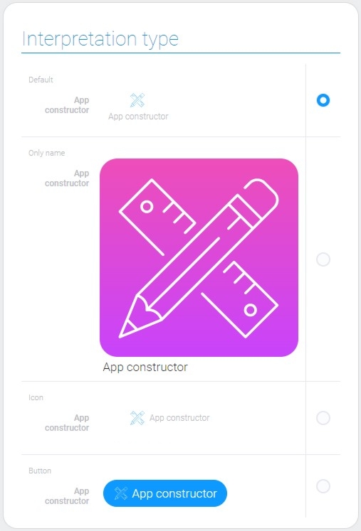
With these types of interpretation you can choose the appearance of the current button.
Default
The first type displays the element as an icon with the name of the button below it.
Only Name
Displays a huge colored icon with the name of the button below it.
Icon
The current interpretation allows you to display the element as an icon with the name of the button next to it.
Button
The last type of element interpretation displays the element as a blue button with an icon and a button name.
Value Format
App Constructor has no field value.
Data Model
The current element has no properties other than interpretation in its data model.
{
    "data_model": {
        "interpretation": []
    }
}
| Name | Type | Description |
|---|---|---|
| interpretation | array |
contains all element interpretation types |

 Edit document