Text
Text field allows you to enter short text, save it and display in different ways. For example, it is used for titles, statuses, short notes and many more things.
The element with the default configuration consists only of the input field.

In order to save this text, the user just needs to click the mouse outside the field or does any other action in application.

Despite of its simplicity, text has different properties and settings. In this chapter we will look at this type and all its features in detail.
Functional Characteristics
This element is used for short text and can be used in different ways. It is suitable for titles, notes, different personal information. Due to its various settings it also can be used as a list of items, status field. It also used to group, sort, and filter items. We also do not forget about that it usually used for item references and table of content.
Instead, for large amounts of text there is an element called Text Editor, for full-fledged documents, there is Text Editor MSE, and for advanced notes or documents, there is Editor JS.
Element Options
This gh-element has a few unique options in Field Settings and Default Value Settings
Field Settings
This group of settings consists of standard Field Name and Name Space, and three available modes.
Only one mode can work at a time. If all of them are enabled, only Autocomplete will work.
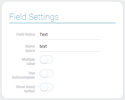
| Name | Description |
|---|---|
| Multiple value | allows the text field to accept multiple values; details... |
| Use Autocomplete | creates a list of already existed values and allows to select one of them for other items; details... |
| Show emoji button | allows to add the button after clicking on which the emoji picker will open; details... |
Multiple value
The main purpose of this mode is to allow users to enter more than one value in a text field. The text element has a slightly different look when Multiple value is enabled.

As you can see in the picture above, the value is displayed as a block with text and the Add Text button has appeared. That means the very way of entering and deleting text text changes.
Now user need to click on the Add Text button, after which a field for entering text will appear.

The user can close the input field without saving the value by clicking the cancel button at the end of the field.
To save the text value, the user must press the Enter button.

To delete any value, the user just needs to click on the delete button on the block of a certain value. The button appears when you hover the cursor over the value.

So, this setting also allows to visually separate the multiple values. It is useful for saving different properties in one element.
Use Autocomplete
The current mode allows user to use a text element as a dynamic Text Options. When the Use autocomplete option is enabled, and the user tries to enter any text, a drop-down list of item values from the current field appears.
The list will include all existing values, newly entered values and all deleted values.
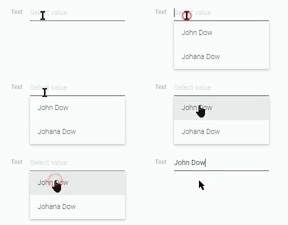
That means it groups all values in a list of unique values.
Duplicate values will be grouped into one value.
All these features guarantee fast and convenient data entry by searching for a similar value.
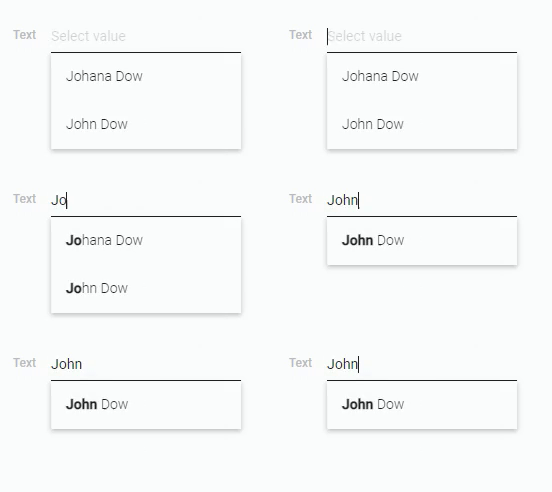
To delete a value, the user needs to move the cursor over the field and click the delete button that appears at the end of the field.

Show Emoji Button
As you might have guessed from the name, the current setting allows you to add an emoji button to the text field. This button is displayed in the end of the field. When user clicks on it, a drop-down list opens.
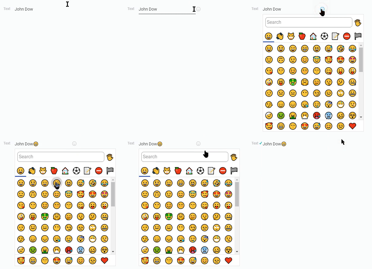
There users can choose any emoji that will be displayed in their text.
The main purpose of this mode is to provide users with a tool to diversify their titles, names or other text usage.
Default Value Settings
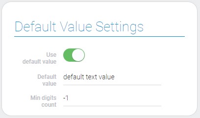
The current group of settings allows you to configure the value of the field, in particular its default value.
Default value - the value that will be used to fill the field when creating a new item, but provided that the field is empty.
| Name | Description |
|---|---|
| Use default value | allows to use default value; details... |
| Default value | allows to enter default value; appears when Use default value is on; details... |
| Min digits count | allows to configure the minimum number of signs; details... |
Use Default Value
The main purpose of this setting is the activation of the Default Value. When this feature is enabled, you can enter a default value for the current field and use it accordingly.
Otherwise, even if a default value exists, it will not be used.
Default Value
This setting allows you to assign a value to the text field when creating an item. In other words, it allows you to assign a default value. This is useful in cases when the field is not filled in by the user or cannot be edited.
This option is hidden until Use Default Value is activated.
Min Digits Count
This setting allows you to set the minimum length of text that can be entered in the field. This restriction does not allow the user to enter fewer characters in the field than specified in this setting.
Element Style
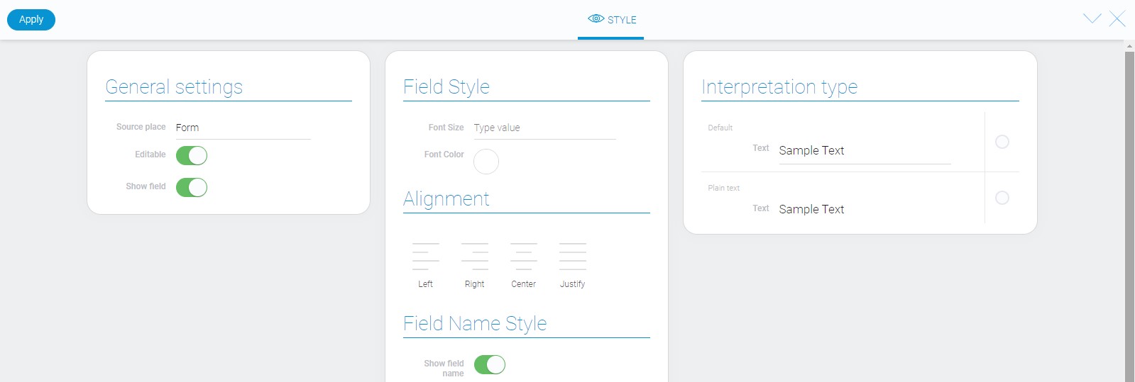
In case with style, text element has only standard settings. They are described in Setting Overview and about Interpretation type you can read below.
Filtration
Like most other types of data, text can be filtrated. The filters that accept it:
- Contains(or)
- Contains(and)
- Not contains(or)
- Not contains(and)
- Equals(or)
- Equals(and)
- Not equals(or)
- Not equals(and)
- Value
- Search
Interpretation
The text element has the same interpretation types in different source places.
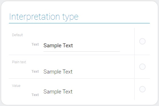
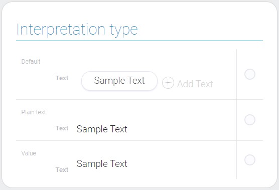
Even for multiple values interpretations will be the same, just the default multiple value has a bit different displaying.
Default
The default value of the text interpretation type is editable text.
Plain Text
This type of text interpretation makes the text uneditable.
Value
The last type allows to display the value of the element.
Value Format
A text value is a set of different characters in string format.
{
    "field_value": "abcDEF 123 -#@%_=+😁"
}
Data Model
The text data model looks like this:
{
    "data_model": {
        "default_field_value": "default text value",
        "interpretation": [],
        "min_digits_count": -1,
        "multiple_value": 1,
        "use_default_value": 1,
    }
}
| Name | Type | Description |
|---|---|---|
| default_field_value | string |
contains entered default value |
| interpretation | array |
contains all interpretations of the text element |
| min_digits_count | number |
shows the minimum number of characters that should be entered in the field |
| multiple_value | boolean |
shows whether the text element accepts multiple values |
| use_default_value | boolean |
shows whether the default value is used or not |

 Edit document