Item Remote Add
Item Remote Add is a gh-element that allows you to add items with references to other items. It is used to create an item in one application from an item in another application.
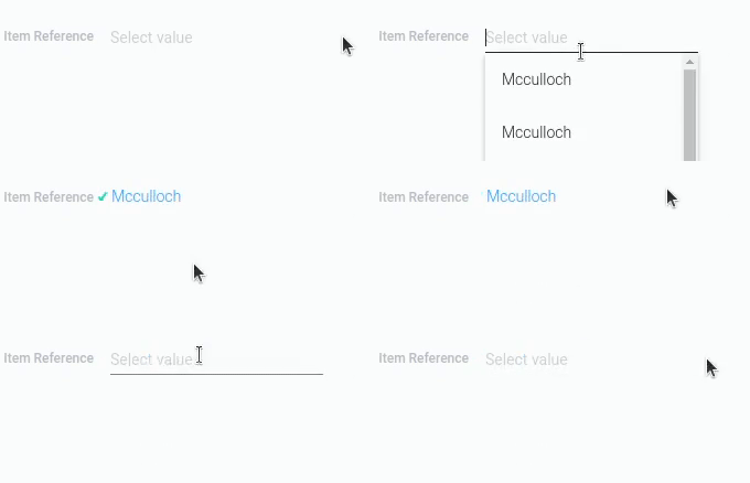
To use this element user have to select one of existing items from the drop-down list. It will be used to create a reference that will be used to fill in the field for the selected item. This way, the newly created item will be immediately linked to the one the user selected in the list. In addition, the created item will be linked to the item from which it is created. That is, a certain field will be filled with a reference to the current position.
Because items are linked by references, the current element should only work in conjunction with different Item Reference elements.
Functional Characteristic
The main purpose of the current item is to add items remotely. That is, it provides the ability to create items in a particular application without being in that application.
In practice, it is useful in cases like the following example. Image that you have three applications:
- Projects - contains various projects. Each project has tasks associated with it.
- Tasks - contains all existed tasks. Each task has a corresponding project and a responsible manager.
- Managers - contains all managers and their information. Each manager is associated with specific tasks.
In the Project app we also have Item Remote Add. It is located in the items. Its drop-down list consists of Manager items, and new items will be created in the Tasks application.
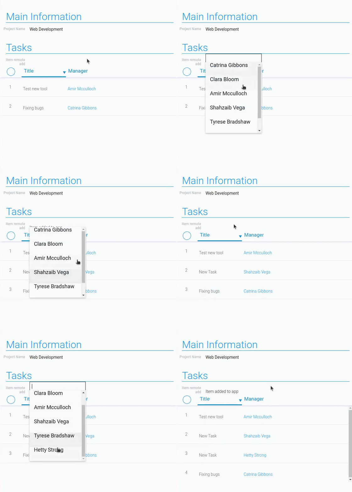
So, when a user opens a project that displays all the tasks associated with it, they can add a new task for that project. To do this, the user simply clicks on the Item Remote Add field, after which the list of managers will open. The user selects a manager, and then a task is created with the manager and project filled in.
Element Options
The Item Remote Add has two blocks of settings with different groups of settings.
Field And Destination Reference Settings
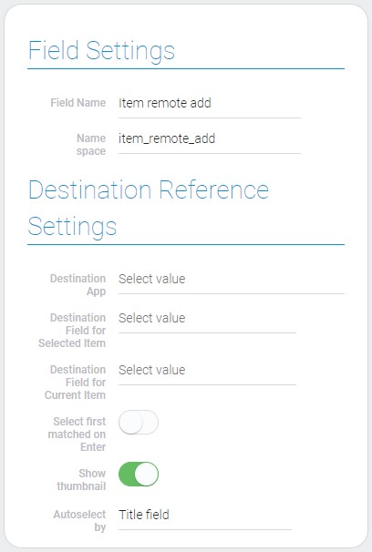
The first block consists of Field Settings, which are standard settings, and Destination Reference Settings, which configure the destination and operation of the element.
| Name | Description |
|---|---|
| Destination App | allows you to select the application to which the item will be added; details... |
| Destination Field for Selected Item | allows to select field where the item reference of the selected item will be saved; details... |
| Destination Field for Current Item | allows to select field where the item reference of the current item will be saved; details... |
| Select first matched on Enter | allows you to select the desired item by pressing a single button; details... |
| Show Thumbnail | allows to display thumbnails of images in the drop-down list; details... |
| Autoselect by | allows to select the field by which auto selection will be performed; details... |
Destination App
Just like Add Items, the current gh-item has to add items somewhere. So the current setting allows you to choose the application to which the items will be added.
So, even though you don't need to choose a view, the item will be created in the application you selected here, but without opening it. But for two references, you need to select fields from this application. That is, the fields for the next two settings are pulled from this application.
Destination Field For Selected Item
The current setting allows you to select the field from the previous selected app. This field will store a reference to the item selected in the drop-down list. This will be the default value for the field.
The current setting provides a connection between the item from the drop-down list and the current item in which this Item Remote Add is located. But there is a nuance, in order to implement this, you need to select the Item Reference element in the current setting.
Destination Field For Current Item
Just like for the item selected in the list, here you need to select the field in which the reference will be stored. More specifically, you need to select a field that will be filled with a reference to the current position when creating a new item in the application.
Select First Matched On Enter
As the name implies, this setting allows the user to select the appropriate item by pressing Enter. Namely, the user can do this if this setting is enabled.
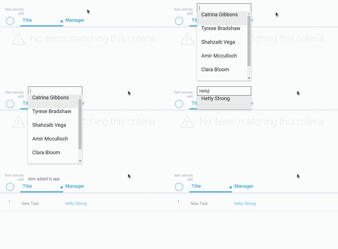
This option is most useful when searching for an exact item in a drop-down list. If this setting is disabled, the Item Remote Add does not respond to the Enter key.
Show Thumbnail
This setting is directly related to the Dropdown Settings block. It will affect whether thumbnails are displayed in the list.
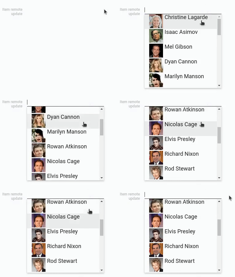
By default, the image field for thumbnails is always selected and always pulls picture for it. But, as was already told, they will be displayed, only if this setting is enabled.
Autoselect By
Item Remote Add has one default feature that allows you to select an item by entering its full title. In turn, the current setting allows you to select the field for which auto-selection will be performed:
The convenience of this setting is that the user knows the full name of the desired item and can select it without using the mouse.
Dropdown Settings
The second block contains settings for configuring the drop-down list of items. Due to this, the user can select the item that will be associated with the one created by the item reference.

| Name | Description |
|---|---|
| Application | allows to select the source application; details... |
| Thumbnail | allows to select field from which images will be taken; details... |
| Title | allows to select the field from which text for titles will be taken; details... |
| Subtitle | allows to select field with text that will be taken for subtitles; details... |
| Filter | allows to add filters that determine which items will be in the dropdown list; details... |
| Edit | allows you to edit and delete a drop-down list item; details... |
Application
This is the key setting for the drop-down list of items. Here you have to select the source application. Items from this application can be selected and connected to the created item. Also, the following settings will receive data from this application.
You can select here only the application to which you have access.
Thumbnail
This setting is responsible for item thumbnails. Namely, here you have to select the field from which the image for thumbnails will be retrieved. These images will be displayed in the drop-down list before the item titles.
Here you need to select any Image element.
Thumbnail is related to the Show Thumbnail setting. The current setting is where you choose the exact image for the thumbnails, and that setting determines whether they are displayed.
Title
Like the previous setting, this one allows you to select a source field for the list. The value from it will be used as the title for the item in the drop-down list. In other words, with this setting, you assign a title to the items. This allows users to distinguish between items in the list.
Subtitle
This setting is responsible for the subtitle of the item, which is displayed below the Title. Here you can select a source field for it. The value from this field will be used as the subtitle of the item. This will help you provide users with additional information about the items in the list.
Filter
The current setting provides tools for customizing the display of items. That is, you can determine which items will be available in the drop-down list by setting conditions. More precisely, you select and configure filters, as in the Filter element. Only those items that have passed the filter will be displayed in the list and, accordingly, only they can be selected in the field.
Edit
As with all such blocks, the current settings block provides tools for working with each of the options separately. That is, each option has separate tools for working with it. They include two buttons:
- To edit an option
- To delete an option
Element Style
The current gh-element does not require special style settings. But, despite this, in addition to the standard settings, it has one unique setting. And, of course, it has its own types of interpretations.
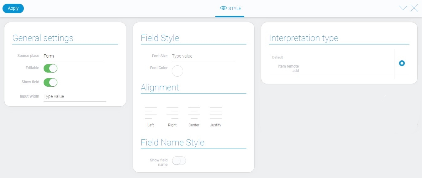
General Settings
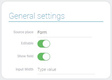
The basic style settings of the current gh element contain a single unique setting.
| Name | Description |
|---|---|
| Input Width | allows to set the width of the enter field |
Input Width
This is the setting field that determines the field width. You can enter your own value of the width. The value is measured in pixels.
The minimum field width is 190 pixels. It is also the default value for this gh-element.
Filtration
This element cannot be filtered out.
Interpretation
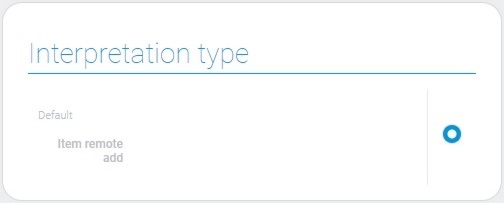
The current element has only one type of interpretation, which is the default interpretation. This is the field where you can enter a specific name and select the required item.
Value Format
There is no value in the current element.
Data Model
The Item Remote Add has a large data model that contains all element settings.
{
    "data_model": {
        "autoselect_by": "title",
        "current_item_destination_field": "697445",
        "destination_app": "29862",
        "interpretation": [],
        "select_first_matched_option": 1,
        "selected_apps": [{
            "app_id": "29674",
            "filters_list": [],
            "subtitle_field_ids": "695197",
            "thumbnail_field_id": "695197",
            "title_field_ids": "695198"
        }],
        "selected_item_destination_field": "697446",
        "show_tubnail": 0
    }
}
| Name | Type | Description |
|---|---|---|
| autoselect_by | string |
contains the selected field by which the autosuggestion is performed |
| current_item_destination_field | string |
contains ID of the field in which the item reference to the destination fields will be saved |
| destination_app | string |
contains ID of the application to which the item will be added |
| interpretation | array |
contains all element interpretation types |
| select_first_matched_option | boolean |
shows whether the user can select the option by pressing Enter |
| selected_apps | array |
contains all the settings of the drop-down list |
| app_id | string |
contains ID of the destination application |
| filters_list | array |
contains all filters of the option |
| subtitle_field_ids | string |
contains ID of the source field of subtitle |
| thumbnail_field_id | string |
contains ID of the source field from which the images will be taken |
| title_field_ids | string |
contains ID of the source field of the title |
| selected_item_destination_field | string |
contains ID of the selected field |
| show_tubnail | boolean |
contains ID of the field from which images for thumbnail will be taken |

 Edit document