Button
Button is quite useful gh-element that can be used for connection between other elements.
Functional Characteristics
In fact, this Button does nothing by itself. It is designed to work in conjunction with automation nodes. Thus, the functionality of the button is determined by the setting of its automation.
Element Options
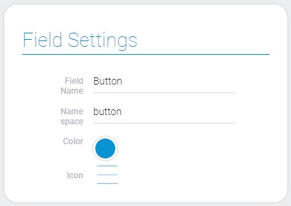
Button settings consists of only one group of options.
Field Settings
Besides standard Field Name and Name Space, the element has special functions to configure the button look.

| Name | Description |
|---|---|
| Color | allows to select the color of button; details... |
| Icon | allows to select the icon image; details... |
Color
After clicking on this circle you can open Color Picker and select the color of the button.
Icon
This special function allows to select and add the icon near the button name.
Once an icon is selected, it cannot be deleted, but only changed to another one.
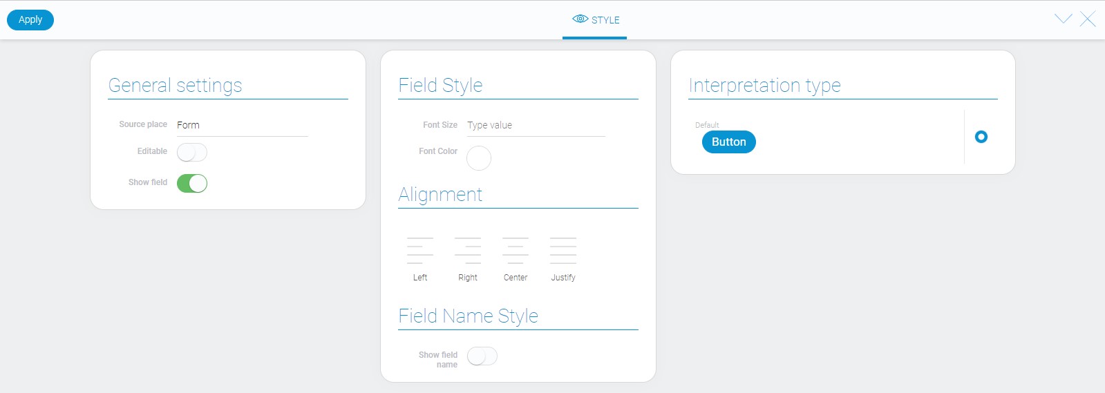
Element Style
This element has no style options other than the standard ones. About all of them you can read in Setting Overview. In addition, you can find information about interpretation.

Filtration
There are no filters which can filter out this element.
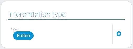
Interpretation
The button has only one interpretation type:

Value Format
The button does not have value.
Data Model
The button data model contains values of the element options:
{
    "data_model": {
        "color": "#0893d2",
        "icon": "box",
        "interpretation": []
    }
}
| Name | Type | Description |
|---|---|---|
| color | string |
contains the hex code of the icon color |
| icon | string |
contains the ID of the icon image |
| interpretation | array |
contains all button interpretation types |

 Edit document