Calendar
Calendar is a gh-element that allows to track different events. It displays calendar items according to the Date value. This is very useful for creating a schedule.
The calendar has a few modes:
-
Month - standard calendar mode consists of day cells. An item can occupy one or more cells.
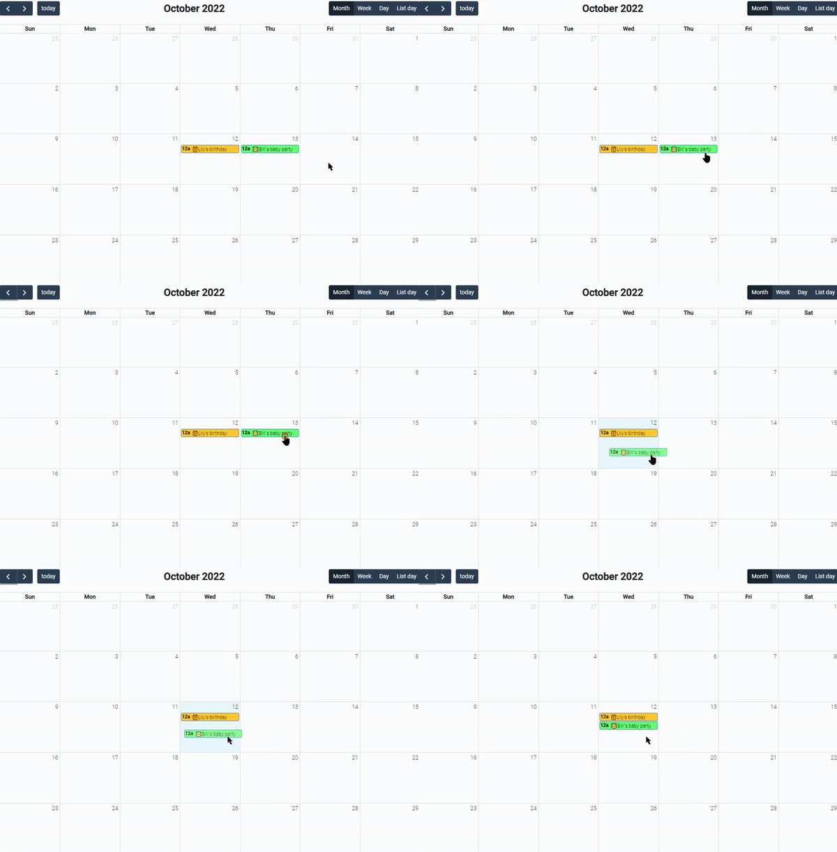
-
Week - days are displayed as columns with rows of the time. Events are rectangles occupying the certain space.
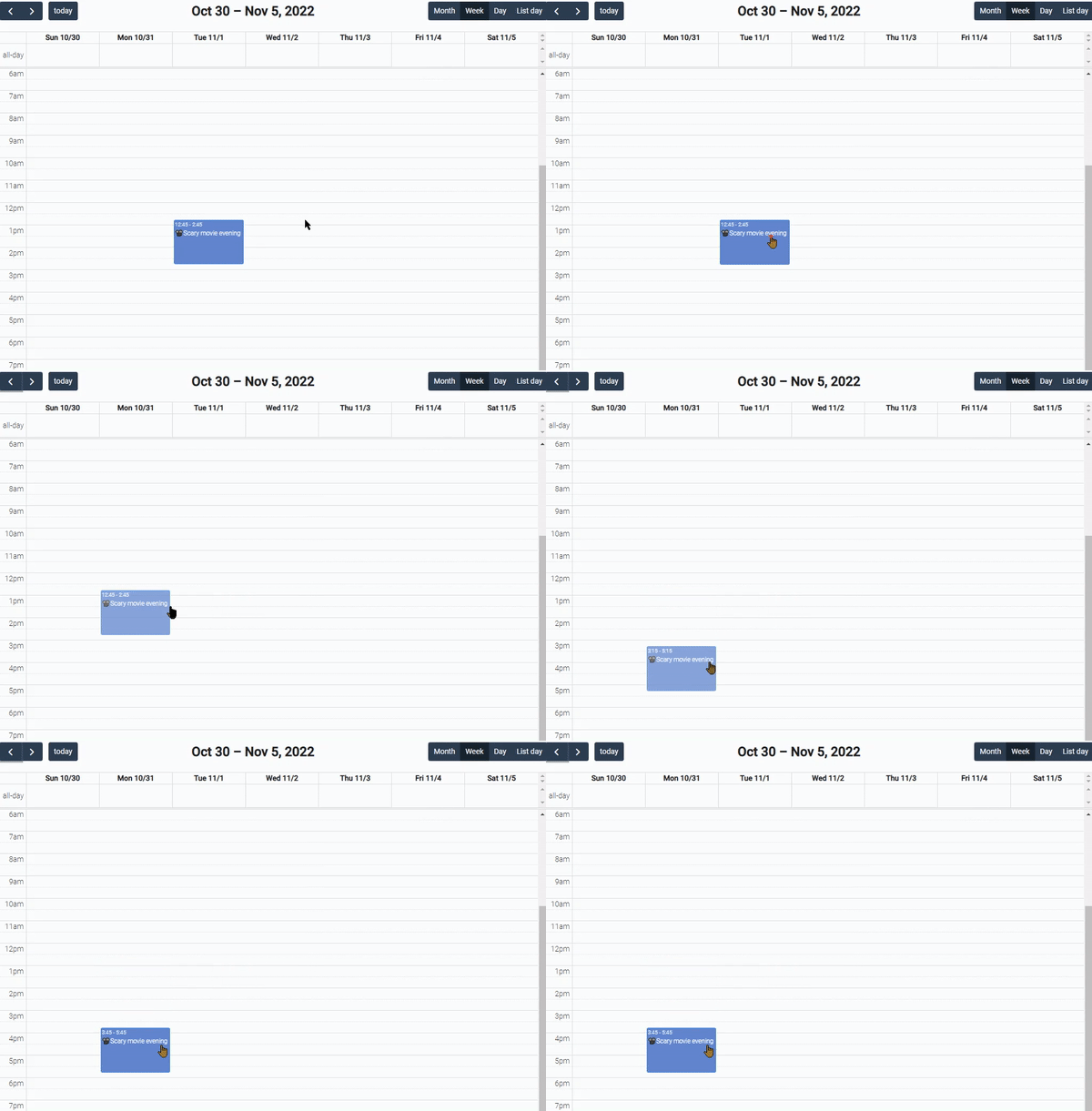
-
Day - shows certain day as a list with hour rows. Event is displayed as the same rectangles occupying the certain space.
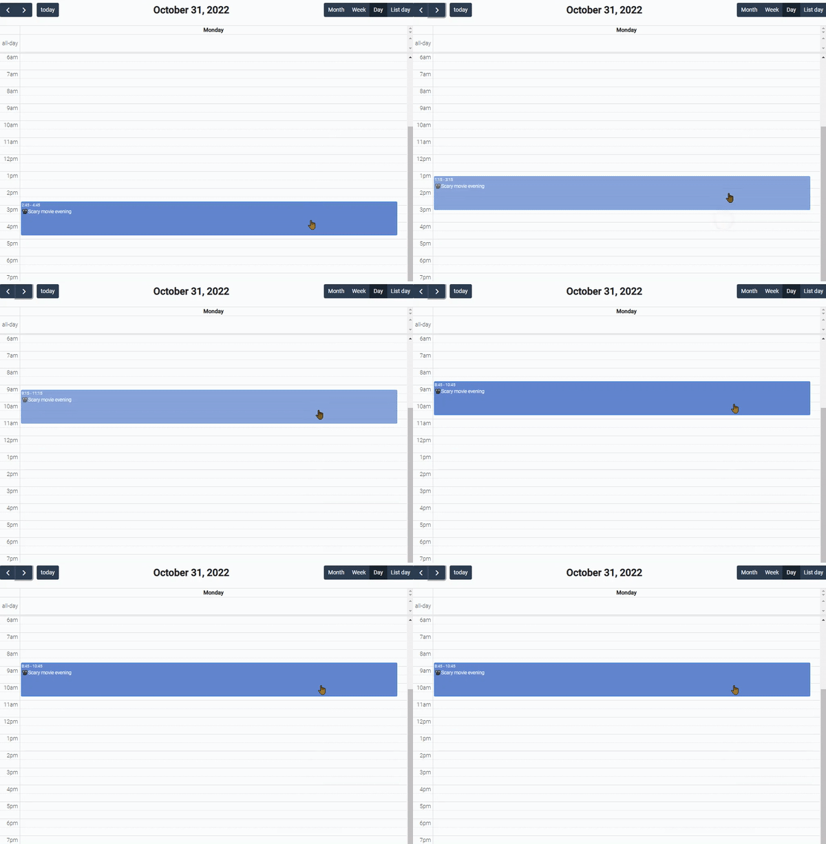
-
List - shows all events of the selected day as a bulleted list.
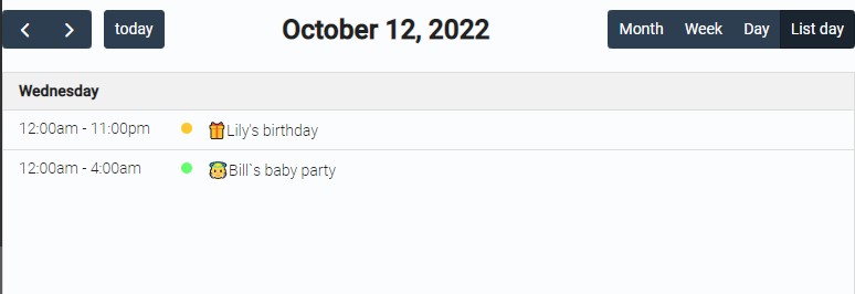
Each user can change the mode using the buttons in the upper right corner of the element.
The buttons in upper left color allows to change the time period and, accordingly, to see all events.
Functional Characteristics
Calendar is used mainly for making convenient interactive schedule. Utilizing it, user can track different events or tasks. Also, each of the calendar modes provides additional options for use.
- The Month mode is universal. So it's suitable for any purpose, such as tracking projects, marking holidays, or planning events for each day, month, or even longer.
- The Week mode is mostly useful for weekly plans. These can be tasks, weekend activities, trainings, meetings, or evening courses.
- The Day mode is useful for daily routine. This allows you to easily plan your day with all the timings, no matter what plans it consists of.
- The List mode simply summarizes all the plans for the day in one list. The order of the items depends on the order in which they were added to the list.
Element Options
The calendar element has three blocks of settings.
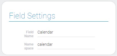
Field Settings
The first one is field settings. It does not have unique for calendar options. There sre only standard Field Name and Name Space.
Main Settings, View Template, Table Filter
The second group allows to configure the calendar work and connections with other elements.
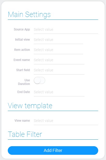
| Name | Description |
|---|---|
| Source App | allows to select the source application; details... |
| Initial view | allows to select the default mode; details... |
| Item action | allows to select calendar mark action; details... |
| Event name | allows to select the field whose value will be displayed in the calendar; details... |
| Start field | allows to select the field with a start date; details... |
| Use Duration | allows to use duration instead of end date; details... |
| End Date | allows to select the field with the end date; available when Use Duration is off; details... |
| Duration | allows to select field with duration; available when Use Duration is on; details... |
| View name | allows to select which view will be opened if the action is configured for this; details... |
| Add Filter | allows to add and configure filters to the filter; details... |
Source App
This is the application whose items will be displayed in the calendar. The views and fields of this application will also be used to configure the calendar.
This may not be the same application where the calendar is located.
Thus, the selected item is the source not only for items but also for Event Name, Start Field, End Date, Duration, View Name, and even for Add Filter.
Initial View
The current setting determines which mode will be the initial one and will be displayed by default. In other words, the selected mode will be displayed when the user opens the application. As you may have already read, there are four modes:
- Month
- Week
- Day
Each of them can be selected as the initial mode.
Item Action
Here you can select the actions that will be performed after clicking on item in the calendar. There are only two possible values:
- Open item
- None
As you can see, the calendar allows you to open items or just display them in the calendar.
Items can be opened when you click on them in the calendar.
Event Name
With this function, you can select the field from which the event name will be taken. These names are used as the title of the item in the Calendar.
The Event Name allows the user to display any text on the calendar and use it to distinguish between items.
Start Field
In this field, select the Date field, the value of which will be the starting point of the item in the calendar. This field defines both the date and time from which the event duration will be counted. And the item will be displayed according to that time period.
Use Duration
This function allow to change the type of field that allows to determine event duration. If Use Duration is off, the End Date is used. Then the item duration will be calculated by the gap between the two dates. Otherwise the Duration is used. This allows the Calendar to receive the duration from the field and set its start to the start date.
This allows you to change the type of duration calculation depending on your needs. Both of them determine how the item appears on the calendar.
End Date
This is the setting that allows to select the end date item event. This defines the end point of the item in the calendar. Here you need to select the Date field you need.
This format for determining the duration is most suitable for long-term events or those with significant interruptions. For example, a project that only works on 8-hour workdays.
It is usually used with the month mode, especially if the selected Date field indicates only the date. Otherwise, if time selection is enabled in the Date field, the End Date can be used for each of the calendar modes.
End Date can be similar to the Start Field. Then the items will take up one day in the calendar.
This feature is only available if Use Duration is not enabled.
Duration
The current setting designed for setting the duration of the item. Here you need to select any Duration field. The countdown starts from the date and time of the Start Field.
The best usage of this function is for creating tasks or any events with a clear duration within one day. In Calendar, it is best used with week and day modes.
This field is not available until the Use Duration is enabled.
View Name
It is the name of the view which is opened after clicking. It is mandatory when Item Action has 'Open item' value.
Add Filter
This button allows you to add filters to the calendar. The main purpose of those filters is to customize which items will be displayed in the calendar and which will not.
Items Styles Settings
The last block of settings is responsible for the style of the items. Each item in Calendar appears as a colored bar with colored text. This means that item styles consist of two colors, as well as conditions of use.
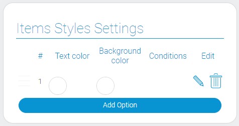
| Name | Description |
|---|---|
| Text color | allows to select color of the text; details... |
| Background color | allows to select the background color of the calendar mark; details... |
| Conditions | allows you to set which colors corresponds to which event; details... |
| Edit | allows to edit or delete the style; details... |
Text Color
The first item style setting is responsible for the color of the item title. This option works like the Color Element, so you can choose any color from the color palette.
The default color is white.
You can change the color only when editing is turned on.
Background Color
The second color you need to set is the background color. This is the general color of the item in the calendar.
It is blue by default.
You can use it to mark specific events with the color corresponding to the type, or tasks according to the status of execution. That is, this function is made to visually distinguish elements. To change the background color, turn on editing.
Conditions
Conditions is just a button for adding filers. You can use it to customize which items the current style will be applied to. This setting is configured for each style separately. Its functionality is similar to the gh-element called Filter.
In two words, the current setting distributes styles between elements according to a certain condition.
For example, we have style with green background and yellow text. So, using the current setting, we can configure tasks with a status of Done to look like this in the Calendar.
Edit
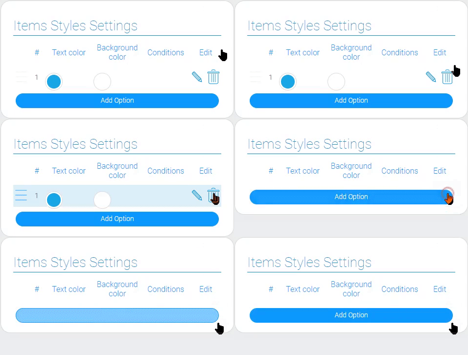
This is the column that consists of two buttons. One of them is an edit button that looks like a pencil. It allows you to change the color of the text and background of the element.
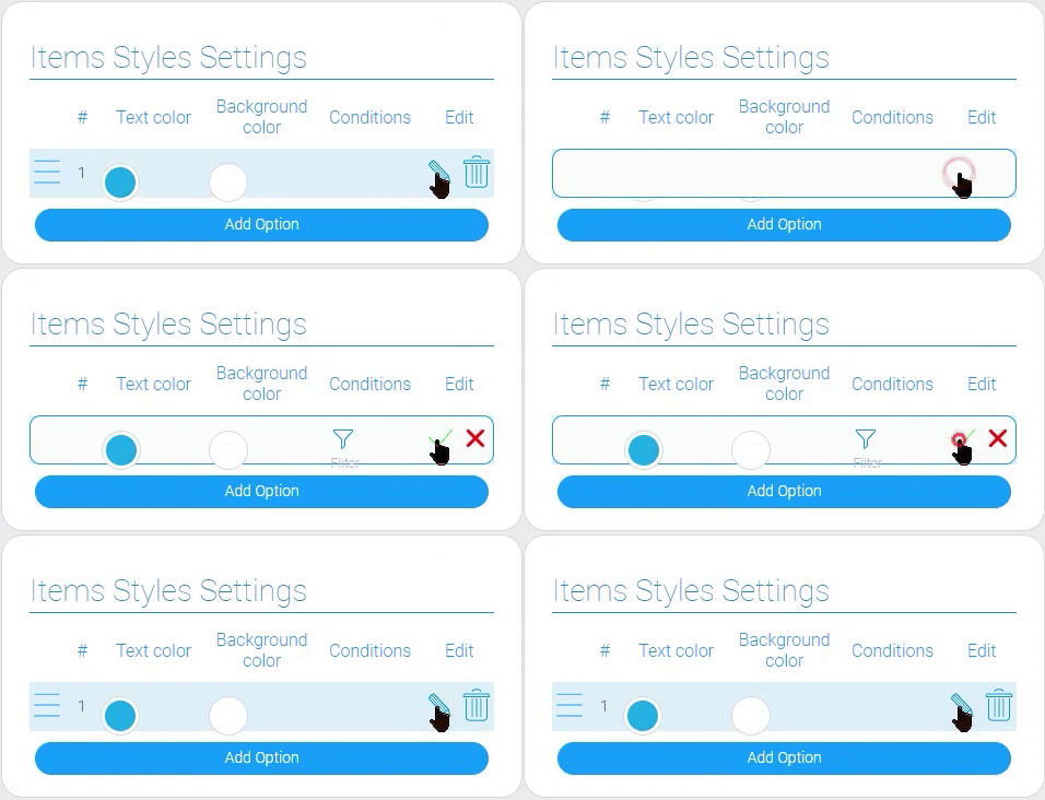
The other button looks like a trash can. This is the button for deleting a style.
Element Style
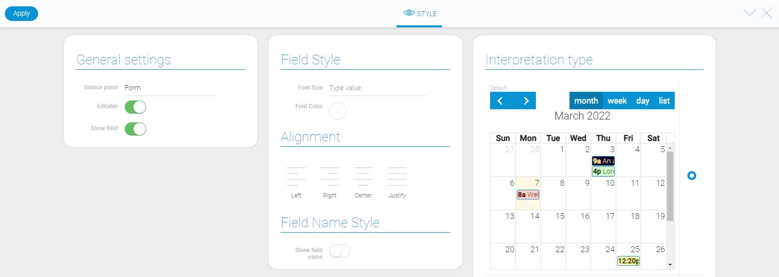
The calendar style does not have special options. As you can see below, there are only standard settings and calendar interpretation types.
Filtration
Items cannot be filtered by this element.
Interpretation
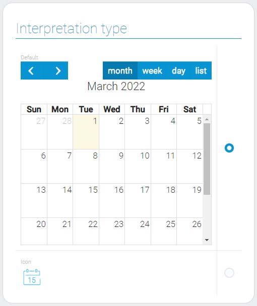
There are two calendar interpretations. Only one of them allows you to display the entire calendar.
Default
This is the interpretation type that allows to display the element as a familiar for user calendar with all events.
Icon
The second and the last interpretation type of calendar element only displays the icon.
Value Format
This gh-element does not have the field value.
Data Model
Despite the number of element settings, calendar element has very simple data model:
{
    "data_model": {
        "interpretation": [],
        "itemsConfig": {
            "displayFieldId": "645900",
            "durationFieldId": "677682",
            "endDateFieldId": "",
            "startFieldId": "677681",
        },
        "itemsStyles": [{
            "background-color": "#67f98a",
            "color": "#6287ce",
            "filters_list": []
        }],
        "source_app_id": "27824",
        "table_settings": {
            "action": "open_item"
        },
        "use_duration": 1,
        "view_id": "1433982"
    }
}
| Name | Type | Description |
|---|---|---|
| interpretation | array |
contains all element interpretations |
| itemsConfig | object |
contains all IDs of the fields which are associated with calendar |
| displayFieldId | string |
ID of the field that will be displayed in calendar |
| durationFieldId | string |
ID of the field from which the duration will be taken |
| endDateFieldId | string |
ID of the field where contains the end date of event |
| startFieldId | string |
ID of the field where contains the start date of event |
| itemsStyles | array |
contains all values of style options |
| background-color | string |
contains the hex code of the background color of the calendar mark |
| color | string |
contains the hex code of the text color of the calendar mark |
| filters_list | array |
contains all filters of the calendar marks |
| source_app_id | string |
contains ID of the source application |
| table_settings | object |
contains the setting of the field action |
| action | string |
shows which action sill be after clicking on the calendar mark |
| use_duration | boolean |
shows whether the duration is used or not |
| view_id | string |
ID of the view which will be opened after clicking on the calendar mark |

 Edit document