Options Element
Options is a gh-element that allows you to create a static list of possible values. Then users can select one or more of these values to fill the field. If the user has certain access, he can update the list in options settings. This element can be used for filling in the invoice or registration form.
It looks very similar to a text field. But its its functionality consists of input field and drop-down list.

Since it has a list of existing values, the user just needs to find the right one. The Text Options allows the user to find the required value by entering a part of it. In other words, the element input field works like a search field for its own dropdown list.
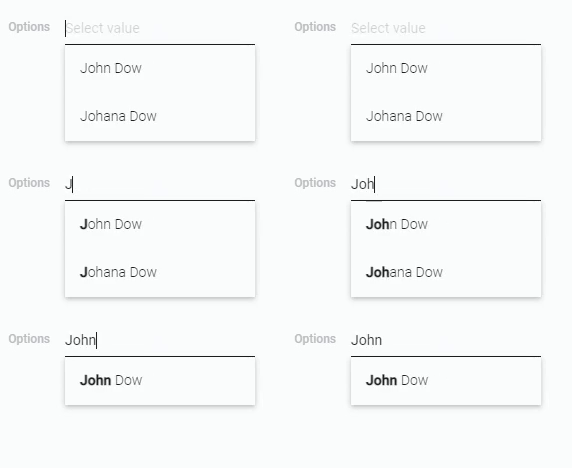
Note that to select a value you must click on it. You cannot just type a value.
Functional Characteristics
The main use of the current element is to create fields with a limited and unchanging set of values that can be used to fill it. This field is useful for various forms, to set the status or project of a task, a position in the company, or a favorite time of year.
That is, text options are suitable for limiting users so that they cannot enter their own data, but only choose from the available ones.
Also, depending on the settings, Text Options can be used to label product by characteristics or track any processes.
Element Options
The options element contains two groups of settings. The first one configures the field while the second one configures its values.
Field Settings
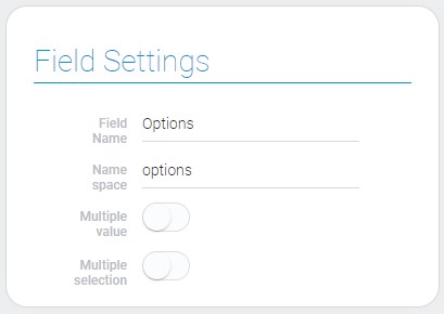
These settings contains all standard and unique field options.
| Name | Description |
|---|---|
| Multiple value | allows to select and save a multiple value; detail... |
| Multiple selection | allows to duplicate selected values; detail... |
Multiple value
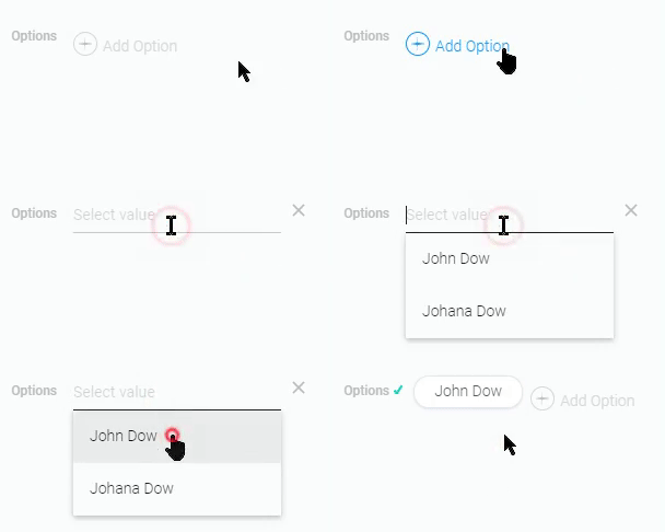
The current mode allows the user to select several unique options simultaneously. That means that field will display all selected values as a different boxes.

The method of choosing an option from list is unchanged. But before the user can select any option, he/she must open the input field by clicking on the Add option button.
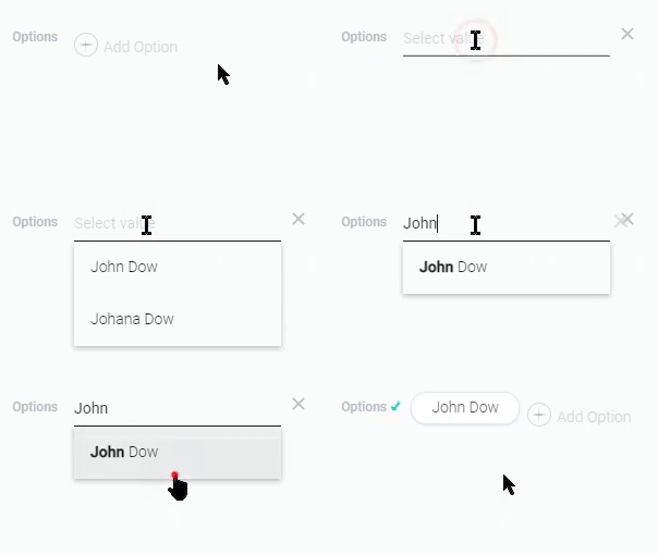
As in the standard mode, you can find the option you need by entering part of its text in the search field.
To delete value user just have to click the delete button that appears in the end of the field when the cursor is hovered on the particular value.

The current feature allows you to use the element both to mark all product characteristics and to list all former employee positions.
Multiple selection
This setting was created as a complement to the Multiple Value. Its main purpose is allow users to add a few similar values to the field.

This feature cannot work without Multiple Value enabled.
This mode allows the you to track sequential repetitive actions. For example, you can use it to track actions with a sent email.
Options Settings
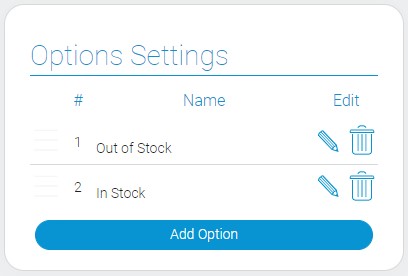
This group of settings allows to configure options of each of values.
| Name | Description |
|---|---|
| Name | column that contains names of the selection options; detail... |
| Edit | column where delete and edit buttons are located; detail... |
Name
The current column contains the text of all available options. You enter each of them yourself. That allows you to create unique set of values for different needs. This can be a list of names, projects, or product characteristics.
Two or more options with the same text are considered different options, not duplicates.
Edit
The second column provides two buttons for every option. One of these buttons, which looks like a pencil, allows you to change the text of an option. The other, in the form of a trash can, allows you to remove the option altogether.
Default Value Settings
These settings allows to configure default value of the options elements.

| Name | Description |
|---|---|
| Use default value | allows to set whether default value will be used or not; details... |
| Default value | allows to enter the default value; details... |
Use Default Value
This is the option that allows you to use the default value for option field. This means that if the user does not fill in the current field when creating a new item, it will be filled with the default value.
Even if this default value exists, it will not be used if Use Default Value is disabled.
Default Value
The Default Value is a value that is the value that will be used to fill the field when creating a new item. But it will be used only if the option field was not filled in when the element was created.
It will be used only if the Use default value is enabled.
Element Style
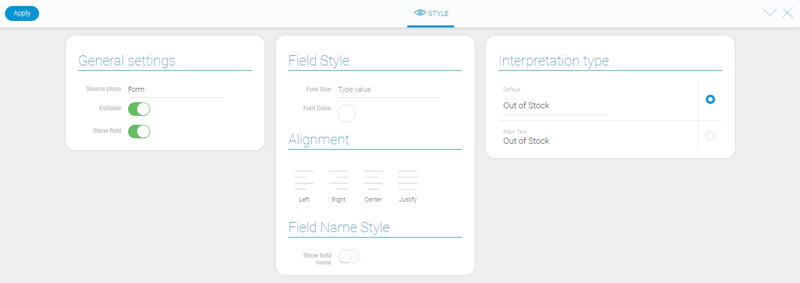
The options element has three groups of style settings. The first two groups are the standard one. About them you can read in Setting Overview. And the third one is a list of interpretations.
Filtration
- Equals(or)
- Equals(and)
- Not equals(or)
- Not equals(and)
- Value
- Checkbox list(and)
- Checkbox list(or)
Interpretation
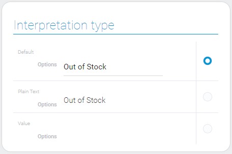
The current element has three different types of interpretation.
Default
The default interpretation type of options element is an editable field that allows to choose on of set values. There are two ways to choose:
- Select value in popup list
- Enter value name in the field
Plain Text
This is interpretation with uneditable string of the selected value.
Value
The last interpretation type displays the selected value.
Value Format
Each of the options has its own value, which is a sequential number obtained immediately after adding an option to the list.
{
    "field_value": "0"
}
Data Model
The options element has a rather complex data model.
{
    "data_model":{
        "default_field_value": 0,
        "interpretation": [],
        "max_value": "1",
        "multiple_selection": 1,
        "multiple_value": false,
        "options": [{
            "name": "Out of Stock",
            "value": 0
        }],
        "use_default_value": false
    }
}
| Name | Type | Description |
|---|---|---|
| default_field_value | number |
shows which value is default |
| interpretation | array |
contains all element interpretation types |
| max_value | string |
contains the ID of the last value |
| multiple_selection | boolean |
shows whether the multiple selection is used |
| multiple_value | boolean |
shows whether the element accepts multiple values |
| options | array |
contains all options from array of variants |
| name | string |
contains name of the option |
| value | number |
contains the unique ID of the value option in the element |
| use_default_value | boolean |
shows whether the default value is used or not |

 Edit document