Delete Item
Delete Item is a gh-element that allows to delete items. Namely, it is a button whose only action is to delete items. It is quite simple in use. The user only needs to select the items he/she wants to delete and then click on this button.
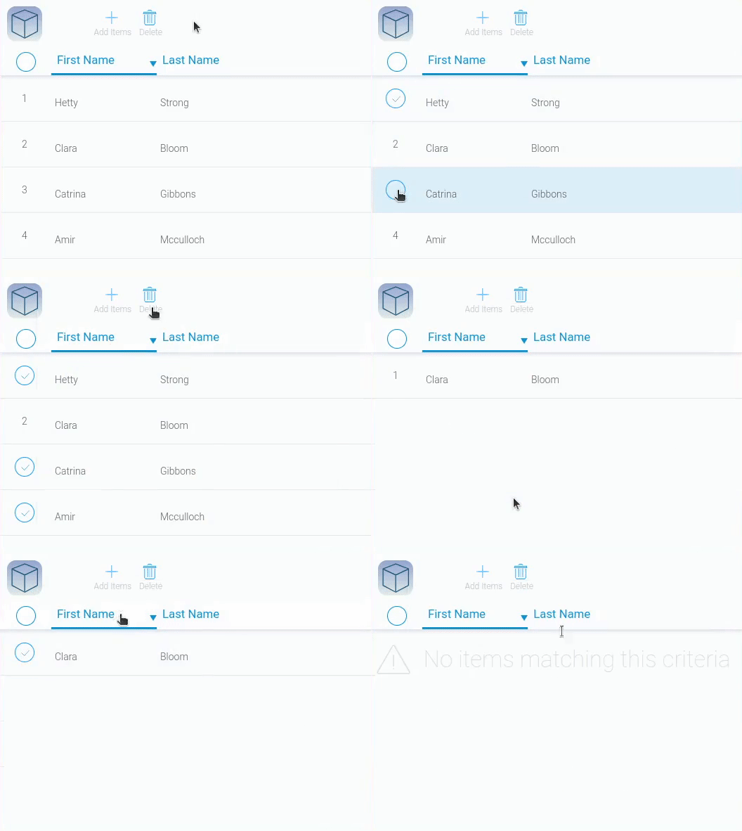
To select the items, you use elements that display them, such as a table and cards.
NPlease note that the selected items must be from the same program that is specified in the Delete Item settings.
Functional Characteristics
The usage of this element is quite simple. It is used to delete selected items. If you place it in an item and change its settings, the Delete button will allow the user to delete the item when it is open. But in general, it removes the item from the specified application.
Therefore, the current gh-element is used only as part of the application's functionality and helps to work with the data in it.
Element Options
This gh-element does not have lots of options. They are all contained in one group called Field Settings.
Field Settings
Among all settings there only two unique ones. Others are the standard options Name Space and Field Name.
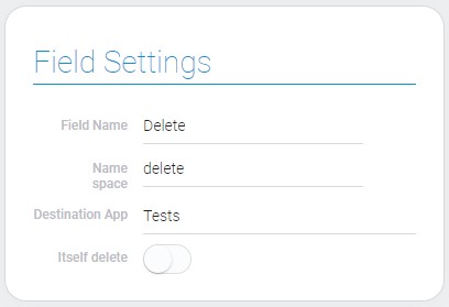
| Name | Description |
|---|---|
| Destination App | allows to select the application from which the items will be deleted; details... |
| Itself delete | allows to delete the item where the element is located; details... |
Destination App
This is the main and mandatory setting for the current item. Here you have to select the application from which the items will be deleted using the current button. So, obviously, the selected items must be from the same application as the one selected here.
But it also means that you can configure it to remove items from other programs remotely. The main condition is only the ability to highlight the application's items.
Itself Delete
The second setting is used when you place an element in the item view. Normally, to delete items, you have to select them. But if the Itself Delete option is enabled, you can delete the current item while it's open.
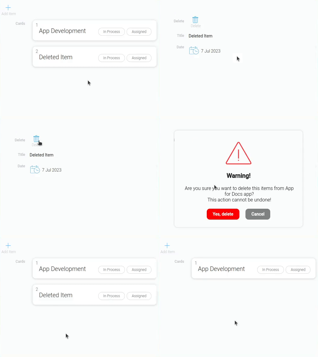
After you click this button and confirm that you want to delete the item, the view is closed and the item is deleted.
Element Style
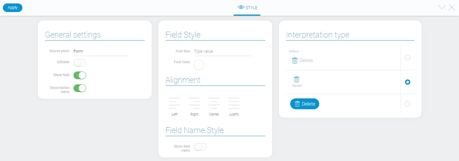
Like all other elements, the delete element has standard style options and its own unique interpretation types.
General Settings
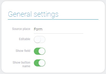
Also, there are one option that does not belong to standard style options of the element.
| Name | Description |
|---|---|
| Show button name | allows to show or hide the button name |
Shown Button Name
Due to this function you can configure where the button name will be displayed or not. The button name you can enter in Field Settings.
Filtration
This element cannot be filtered out.
Interpretation
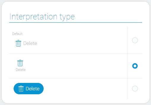
The delete element has three interpretations:
Default
This type of interpretation allows you to display the gh-element as an icon with the name of the button to the right of it.
Name Below
This is the interpretation that display the delete item element as an icon with the button name under it.
Button
This type allows this element to be displayed as a button with icon of the trash can.
Value Format
Delete item is an element that have no value.
Data Model
Besides interpretation array, there are contained the only ID of destination application in the data model.
{
    "data_model": {
        "dest": {
            "app_id": 27824
        },
        "interpretation": [],
        "itself_delete": 0
    }
}
| Name | Type | Description |
|---|---|---|
| dest | array |
contains the destination app ID |
| app_id | number |
contains the ID of the application from which items will be deleted |
| interpretation | array |
contains all element interpretation types |
| itself_delete | boolean |
shows whether itself delete is on or not |

 Edit document