Image
Image is a gh-element that allows user to upload any images to it. It helps users add and save images to the application. To upload an image here, the user should click on the element area, and a file selection window will open. The selected file will be immediately saved in the field.
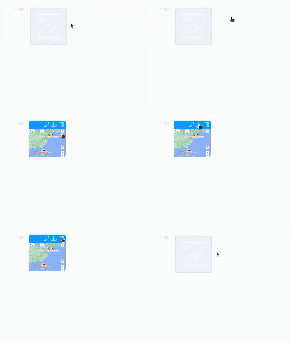
Users can also simply drag and drop images into this area.
After uploading an image, a set of special functions becomes available for it. They are all buttons that appear when you hover over a particular image. Each of them performs a specific function, which includes:
- Copy an image link. Since GudHub generates links for all the files it stores on the server, this feature allows the user to copy exactly the link of a specific image.
- Download an image. With this function, the user can download any image saved in Image.
- Delete an image. Used to remove an image from a gh-element.
These three function are mandatory for the element. The same cannot be said for the following.
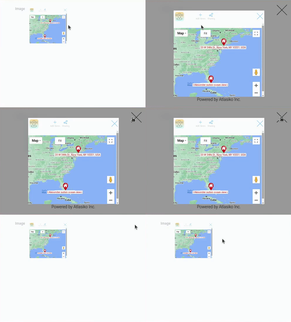
Another feature allows the user to open the image in full screen by clicking on the image. You can turn it off using Popup Image.
Functional Characteristics
This element has many uses. You can use them to attach images to tasks or bug reports. Combined with Cards, you can create an entire online gallery or product catalog for your store.
It is also used in the customization of other gh-elements. For example, this field is the image source for the Slider and the Grapes HTML Editor. For a Web Camera, the current element is the destination field, where the captured photos are saved.
Element Options
Element options of the image element has two groups of settings.
Field Settings
Field settings contains field name, name space, and a few other options.
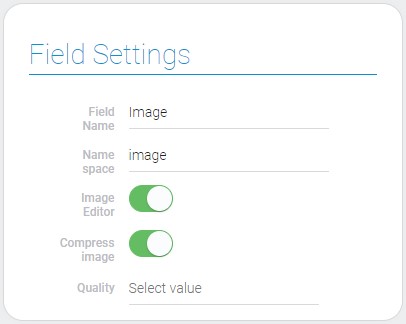
| Name | Description |
|---|---|
| Image Editor | allows to edit selected image; details... |
| Compress image | allows to compress uploaded image; details... |
| Quality | allows to set the quality of compressed image; details... |
Image Editor
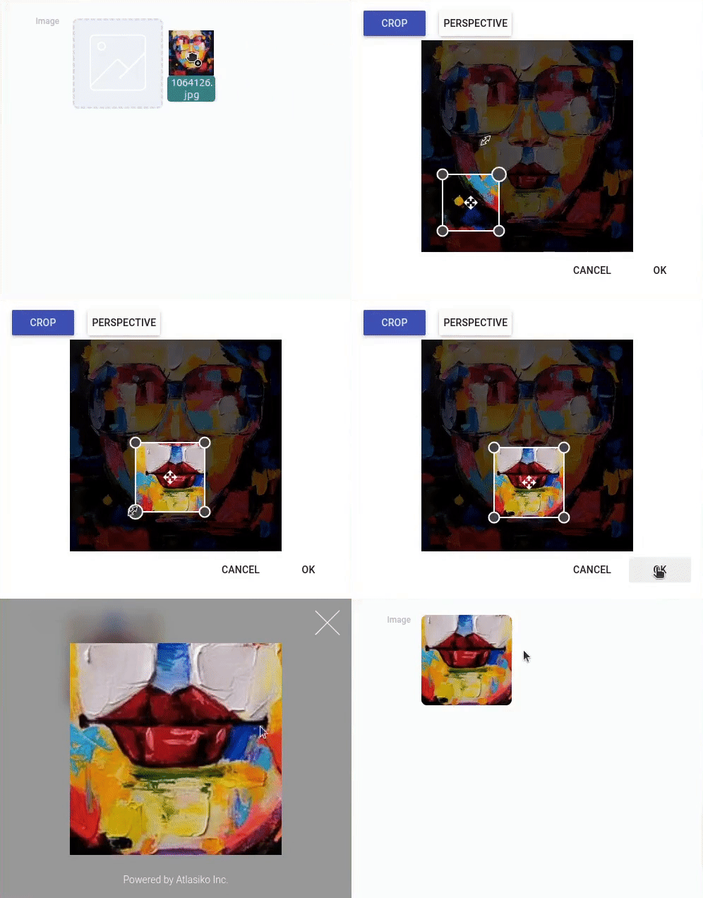
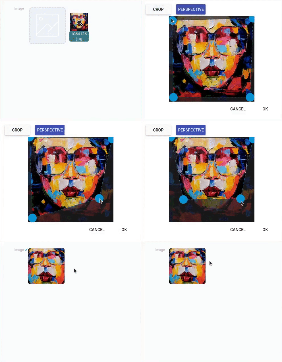
The first setting of the element allows you to specify whether the image editor will be available to the user. Image editor is popup window that allows to edit image then user uploads it in application. The edited image will be saved in the gh-element.
Two editing functions are available:
-
Crop - allows the user to crop the uploaded image and save a part of it in the element.
-
Perspective - allows the user to crop an image with a changed perspective.
Compress Image
The current setting is used to let you determine whether the uploaded image will be compressed or not. That is, if this setting is enabled, all images saved in this element will be compressed to the percentage selected in the next setting.
Quality
This setting allows you to set the quality to which the uploaded images will be compressed. Namely, here you select the percent value. Specifically, here you choose a percentage of the original photo quality.
It's a list of ten options, each of which represents a certain percentage of quality. That is, you cannot enter your own value here, but only choose from the existing ones.
Type
The second block is literally consists of the single setting. Use Type to set the number of images that can be stored in Image. It consists of two options each of which is a mode of element work.
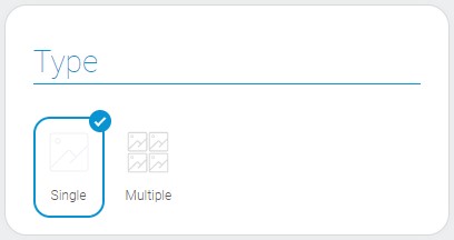
- Single - allows user to upload only one image to an element.
- Multiple - allows user to upload an unlimited number of images.
The default mode is Single.
Therefore, this setting is used to configure the limits for storing values. When you use the Multiple mode, all image functions will be available for each mode separately, including copying a link, downloading, and deleting a photo. Similarly, the image editor will open for each image separately, even if they are uploaded at the same time.
Element Style
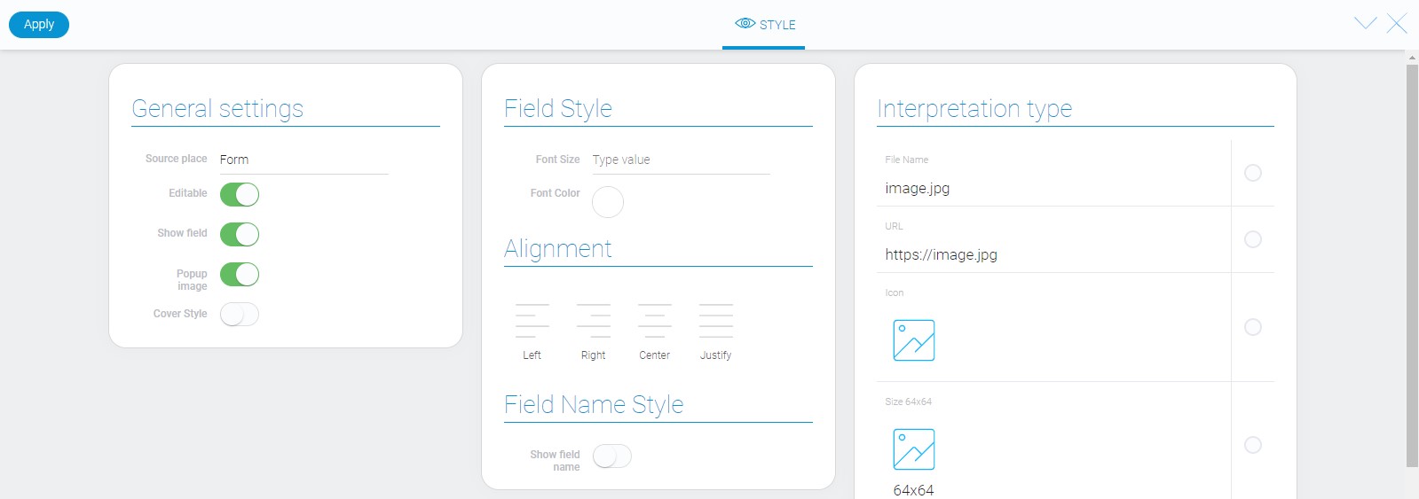
Image element has all standard settings and lots of interpretation types. In addition, it has extra options in General Settings.
General Settings
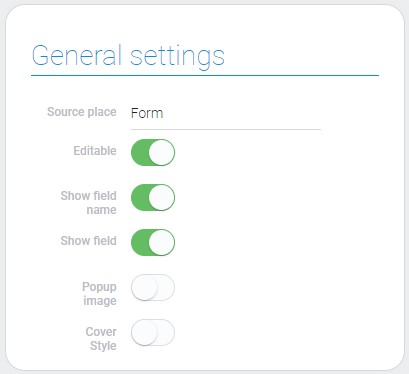
There are two extra options in general settings of the image element.
| Name | Description |
|---|---|
| Popup image | allows to open them full screen when you click on it; details... |
| Cover style | allows to set how an image will be displayed; details... |
Popup Image
The purpose of the current setting is to provide you with a tool to control one of the image features. Namely, if it is enabled, the user can open the image in full screen by clicking on it. Otherwise, clicking on the image will do nothing.
This setting is enabled by default.
Cover Style
Another style option is responsible for image thumbnails. It allows you to select the style of displaying images in thumbnails.
Cover Style is disabled by default.

If this setting is enabled, images will be displayed in cover style. That is, only the part of the image that fits into the thumbnail will be displayed. Otherwise, they will be displayed in full size, even if they don't fit within the thumbnail.
Filtration
As well as file elements, images can be filtered out only by Value.
Interpretation
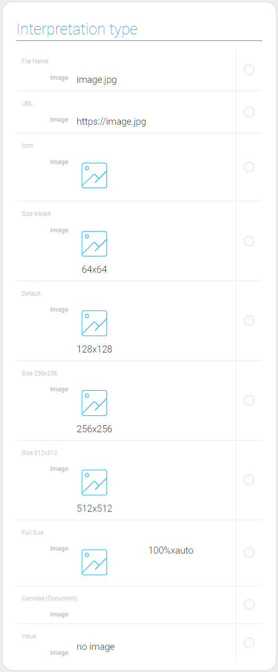
Image element has many types of interpretation, half of which are quite similar.
File Name
Due to this interpretation type images are displayed as a file name and field is not editable.
URL
This interpretation type displays an editable URL of the image page.
Icon
This interpretation allows to display images as icons in a view. When you click on the icon, a particular image will be displayed on the full screen.
Size 64x64
It displays 64x64 images in the field, allows to delete them, add a new one, and open them full screen when you click on it.
Default
This interpretation is similar to previous one, but allows to display 128x128 images.
Size 256x256
Allows to display editable 256x256 images.
Size 512x512
This interpretation type allows to add, delete and display 512x512 image in the application.
Full Size
This interpretation type allows to display full size images in the application, update and delete it.
Canvas(Document)
This interpretation allows images to be displayed as full size images that you cannot delete and edit, or add a new one.
Value
The last type displays a link to the image generated in GudHub.
Value Format
Since image is file we add it in application as an object of file_list. Each of file from that list is located in a separated field and has file_id. Exactly that ID is used as a value for image gh-element. Multiple values are separated by a comma.
{
    "field_value": "928006,928008"
}
Data Model
Image gh-element has a simple data model with intuitive properties.
{
    "data_model": {
        "compress": false,
        "display_mode": "single",
        "image_editor": 1,
        "image_preview_selected_size": 128,
        "interpretation": [],
        "quality": "1",
        "show_field_name": true
    }
}
| Name | Type | Description |
|---|---|---|
| compress | boolean |
shows is the image compressed or not |
| display_mode | string |
shows whether an element accepts multiple values |
| image_editor | boolean |
shows whether image editor works or not |
| image_preview_selected_size | number |
size of image preview |
| interpretation | array |
contains all image interpretations |
| quality | string |
contains the value of the image quality |
| show_field_name | boolean |
shows whether the field name is displayed |

 Edit document