Add Items
Add Items is a gh-element that allows user to add new items to the application. Namely, this is a button that opens the item view, after which the user can fill in the fields and apply the item to add it to the application.
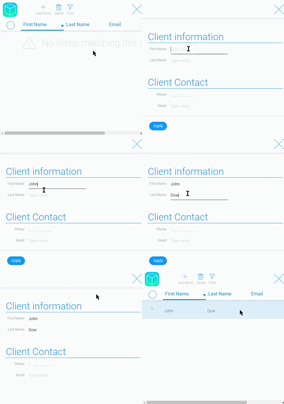
This is the main way to add items to the application.
In addition, the functionality of this element can be customized, but it all comes down to adding items.
Functional Characteristics
Using current element you can configure not only the simple adding items to the current application but also to the other ones. In the Add Items settings, you can set up autofill for created items, use a pop-up window, choose between two types of items, and more.
For example, some company has a few types of waybills which are stored as items in the application. Before adding an item, the user must determine what type of waybill he/she needs. Thus, you can configure Add Items so that the pop-up window with the type selection switcher opens first, and only after selecting the type will the item be created.
This element can also be modified for project management. This mainly concerns the automatic filling of fields with data that already exists or the creation of tasks related to projects.
Element Options
The element options allows to configure the work of the element. They are divided into a few groups.
Field and Reference Settings
The first two groups are responsible for the element field and its reference.
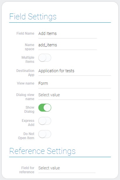
| Name | Description |
|---|---|
| Multiple value | allows user to set the number of items which will be created; details... |
| Destination App | allows you to select the application in which the items will be added; details... |
| View name | allows to select the view of created item; details... |
| Dialog view name | allows to select the view which will be opened in pop-up window; details... |
| Show Dialog | allows to open a template of item as pop-up window; details... |
| Express Add | allows immediately apply the item; details... |
| Do Not Open Item | allows you to set whether the item will open in full screen after creation or not; details... |
| Icon | allows to select the icon for the current element; details... |
| Field for reference | allows to add the value of the selected field to the element template; details... |
Multiple Value
The current mode allows the user to create multiple items at once. When the user clicks on the add button, the usual view opens, but at the bottom next to the Apply button there is a field with a number. By default, the number of items equals one. The user enters the number of items.
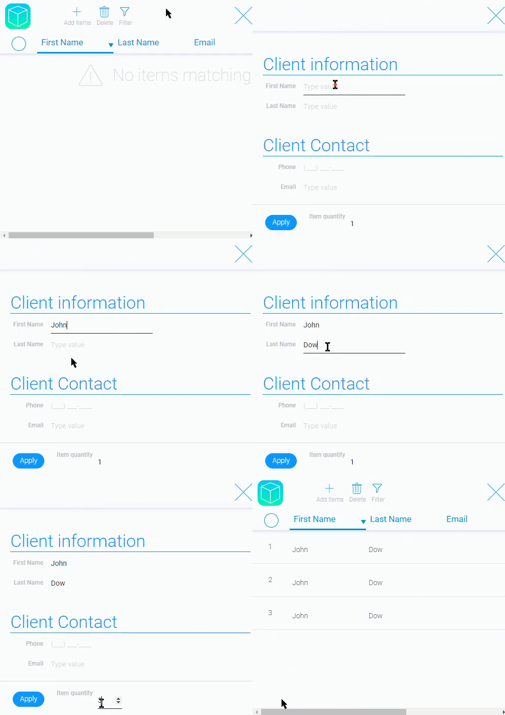
As you can see, all items created using this method are the same. This is useful when a big quantity of items contains the fields with the same data.
So, the main purpose of this mode is to speed up the process of creating repeatable data.
Destination App
Here you must select the application in which the items will be created. This can be the same application where the button is located, or any other application to which you have admin access.
Once you select a program, it will be the source for most of the following settings.
View Name
This setting allows you to select the item view of the Destination Application. This is an empty view that becomes a full-fledged item after filling it out and applying it.
In other words, this is a template for the items.
If this property is not filled in, in most cases, the user will not be able to add new items. The only exceptions are cases when Express Add is enabled.
Dialog View Name
This setting is closely related to the following. Allows you to select the view of the pop-up window, which can be enabled using the Show Dialog setting. This view may differ from the previous one.
This setting can be used to enter some data before creating the item. This is useful when you need to restrict data changes for a user or allows user to determine the type of the item, what will be created.
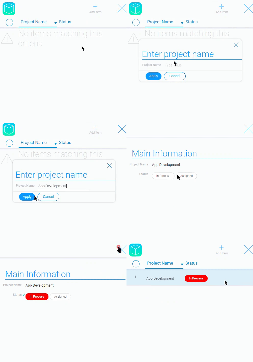
It is useful when you have two types of items with different data and you need to determine what kind of item you need to create. In this pop-up window, you can display only the field that defines the type of item. Then, after applying it, the desired item will be opened.
Of course, it can also be used to display an item as a pop-up window. However, it can only work in this way if the Do Not Open Item option is enabled.
The current option is hidden until Show Dialog is enabled.
Show Dialog
The current function allows you to activate the pop-up window. It opens instead of the full-screen item. The view for it is selected in the Dialog View Name. That is, the view is configured in the previous setting, but the current setting determines whether it will be displayed or not.
If this function is enabled, the Dialog View Name appears in the settings. However, if you have enabled Express Add, the current feature will not be available.
Express Add
When you creates item, you have firstly fill the form and then apply it. If the item is not applied, it will not be saved. The current function allows users to bypass a stage of applying. That means the item will be created already applied.
This feature is useful when you use autofill for any fields in items. This is due to the fact that autofill can be performed only for the applied items. So,it will be the most useful with the current setting.
This means that this option allows the user to create items without filling them in.
Do Not Open Item
As you can gather from its name, this setting allows you to configure whether the item will be opened after clicking on the add button. If this option is enabled, items will not open after clicking the Apply button.
If this option works with Express Add, the item will not be opened at all when created.
That also can be used with the autofill settings. This allows the user to simply add the necessary holistic elements by clicking on the right button.
Icon
The current setting is designed to customize the gh-element. It allows you to choose the icon you like. This setting works like the Icon element.

Field For Reference
A single setting in Reference settings allows you to configure automatic linking between items.
Note that this option only works when Add Items is placed in an item.
Here you must select the item reference from an item in another application, which in turn must be configured to select items from the current application. Then the user will be able to create items with a link to the item where the add button is located.
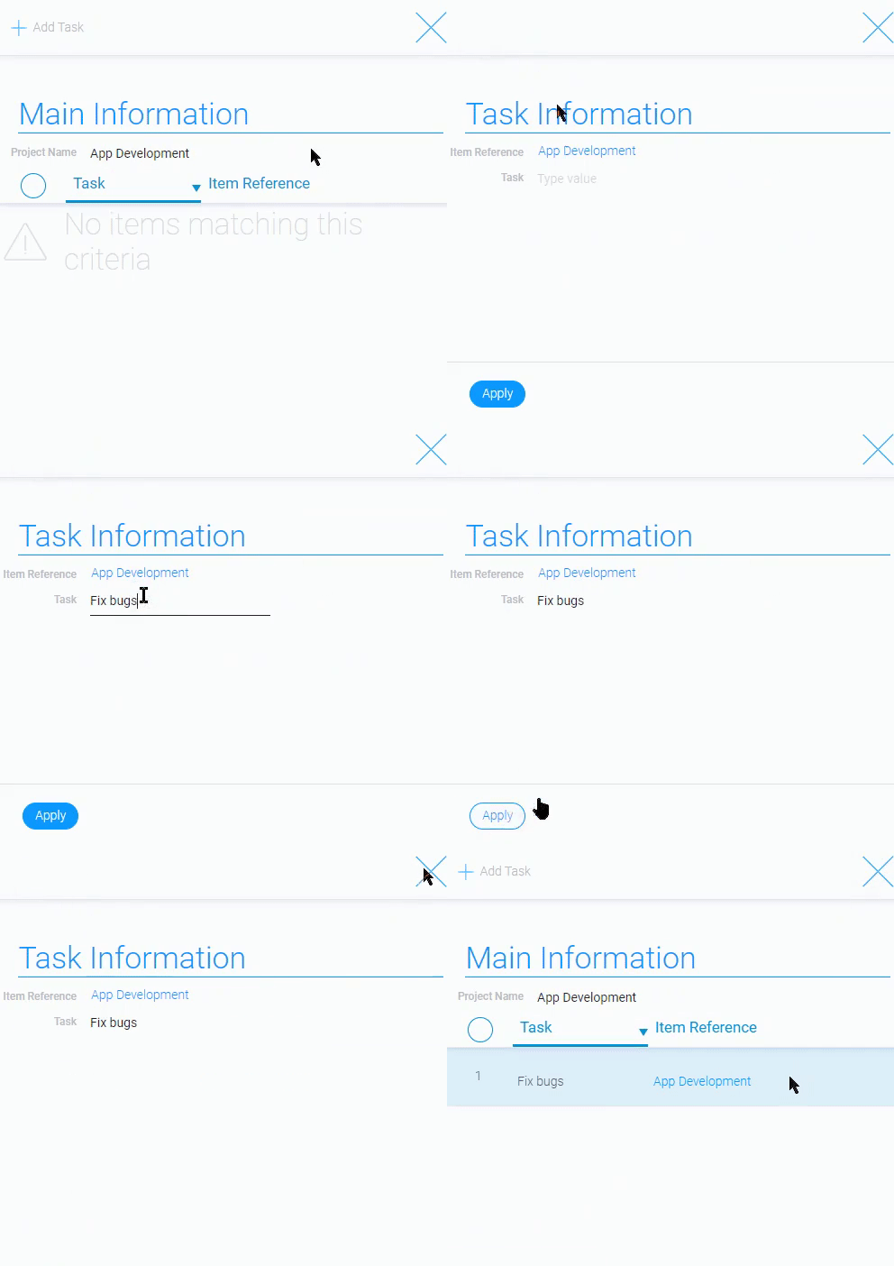
This is very useful setting for project management. The user can easily create tasks in the item of the desired project. Task in turn will be linked to the project with the item reference.
Fields To Field
This is a group of settings to configure default values for all selected fields. The set of these parameters depends on the value of Show Input:
-
No

-
Yes

| Name | Description |
|---|---|
| Source Field | allows to select the source field; details... |
| User value | allows to enter the static value; details... |
| Show input | allows to use the static value instead of field ID; details... |
| Destination Field | allows to select the destination value; details... |
| Edit | contains to button for editing and deleting the field option; details... |
Source Field
This is the setting that allows you to autofill the certain field with the value from the selected field of the current application. That is why it is most useful in cases where the add button is in one application and items are added in another.
By default, this option uses the application where the Add Items button is located. And it cannot be changed.
This option can be used in conjunction with the Reference Field option, which allows you to add items to other applications with a reference to the item from which it was added. This duo allows you to automatically fill in the fields of a newly created item with data from the current item, and at the same time the user can go to the source of that data. This eliminates the need for constant duplication of data.
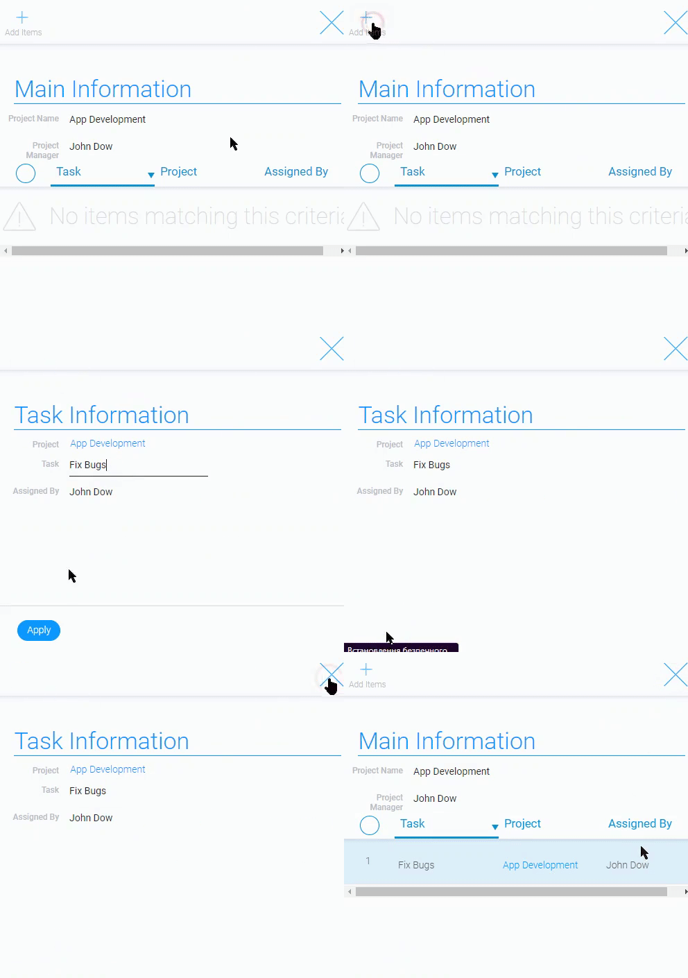
In other words, you can create tasks in projects that automatically add information about the project manager. Just like adding a reference to a project item.
This option is available when the Show Input option is disabled.
User Value
Unlike the previous one, this setting is not connected to any field but allows you to enter your value. This means that here you can set a constant autofill value that does not depend on other fields.
In general, this feature works in the same way as the previous one. But they are two different sources of auto fill value.
Despite its similar purpose, this option can be used with the usual values that are added to the application where the button is located.
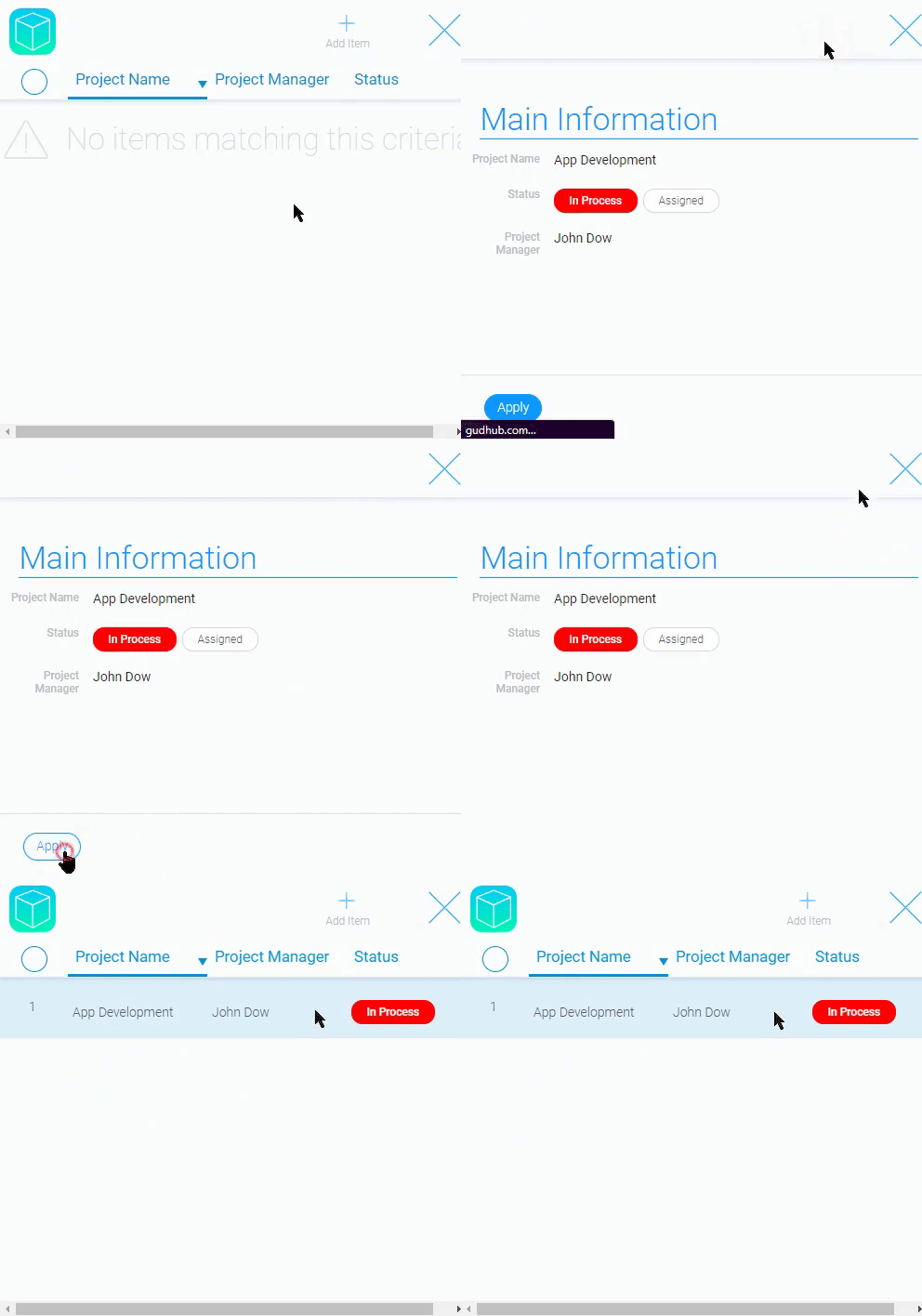
This option is available when the Show Input option is enabled.
Show Input
The current setting is a switch that allow you to set the source of the destination field value. Depends on its value can be two types of source:
- Dynamic means that Source field will be used, and the value for autofill will depend on the value of this field. It is also worth noting that you select the field, and the user of your application can change the value.
- Static is designed to use the User Value. This means that you set the value in the Add Items settings, and your application's user cannot change it.
Destination Field
This is the setting that allows you to select the field that will be automatically filled in. That means the data from the User Value or from the field selected in the Source Field will be used as a value of the destination field. Here you selects the field from the Destination Application.
Regardless of the Show Input, this setting remains, because it is the main one for the current group.
Edit
The last setting in this group consists of two buttons. One of them allows you to edit the setting option. It looks like a pencil. The second, which looks like a trash can, allows you to delete an option.
Element Style
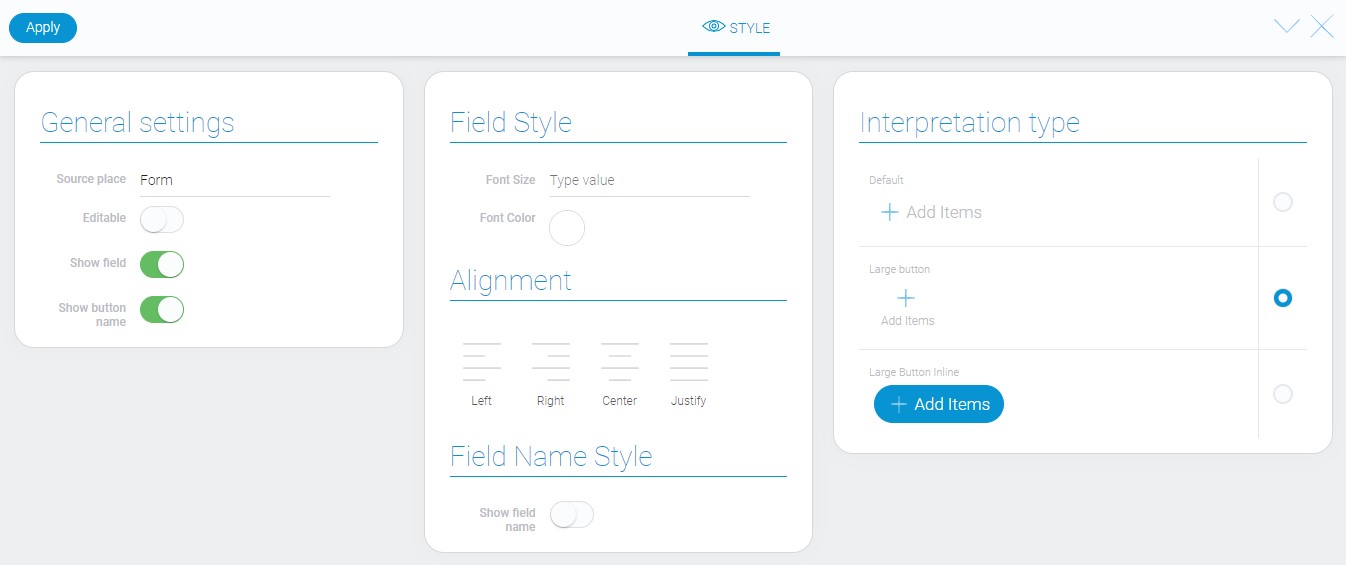
The element style can be customized with the help of standard settings. The only unique option and all interpretation types are described below.
General Settings
Such general options are standard for all buttons.
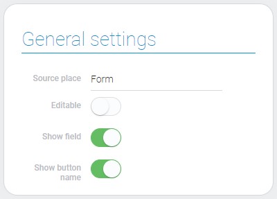
| Name | Description |
|---|---|
| Show button name | allows to hide the button name |
Show Button Name
This style setting allows you to hide the name of the current button.
The Field Name of the Add Items element is used as the name of the current button.
Filtration
Current element cannot be filtered out.
Interpretation
The current item has interpretation types similar to other buttons.
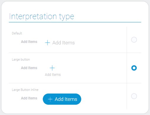
Default
The default interpretation type allows the element to be displayed as an icon with the button name next to it.
Large Button
This interpretation type allows to display the icon with the button name below.
Large Button Inline
This one displays the element as a big blue button.
Value Format
This element does not have a field value
Data Model
This button has a rather large number of settings and, accordingly, its data model contains many properties.
{
    "data_model": {
        "dest":{
            "app_id": 27290
        },
        "interpretation": [],
        "itself_filter": {
            "active": false
        },
        "multiple_items": 0,
        "options": [{
            "dest_field_id": "678845",
            "show_input": 1,
            "source_field_id": "678845",
            "user_field_value": "Kate"
        }],
        "reference": {
            "field_id": ""
        },
        "source": {
            "app_id": ""
        },
        "view_id": 1375042
    }
}
| Name | Type | Description |
|---|---|---|
| dest | object |
contains destination options |
| app_id | number |
contains ID of the destination application |
| interpretation | array |
contains all interpretation types |
| itself_filter | object |
contains options of itself filtration |
| active | boolean |
shows whether the itself filters are used or not |
| multiple_items | boolean |
shows whether the element accepts the multiple value |
| options | array |
contains settings of fields to fields |
| dest_field_id | string |
contains ID of the destination field |
| show_input | boolean |
shows whether the static value is used or not |
| source_field_id | string |
contains ID of the source field |
| user_field_value | string |
contains value entered by user that will be displayed in new items |
| reference | object |
contains reference settings |
| field_id | string |
contains ID of the field reference |
| source | object |
contains source settings |
| app_id | string |
contains ID of the source application |
| view_id | number |
contains ID of the item view that will be added to the application |

 Edit document