Table
Table is a gh-element that gathers all certain items and displays them as rows in the table. It also allows to display only the selected fields of items in the columns.
Functional Characteristics
This element is mostly used for displaying certain data from items in several columns. Also, it allows to sort items by columns values and filter them in different ways.
More important thing is selection. Using table you can select items and delete, export, and update them.
Another use case is using tables for printing. This is possible because of some types of element interpretation.
Value Format
This element does not have value.
Element Options
The table element has different groups of settings.
Field/Table Settings And View Template
The following settings are mandatory for working with the table. The field settings contains only standard options, but other are unique for current gh-element.
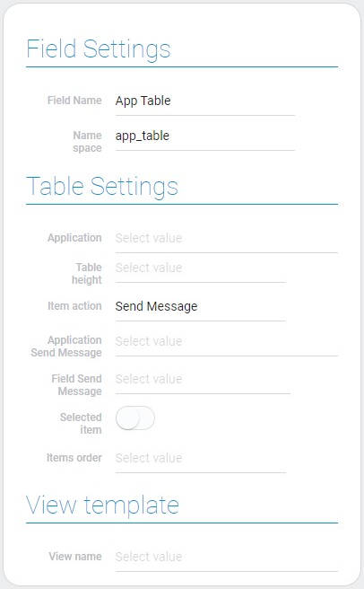
| Name | Description |
|---|---|
| Application | allows select the source application; details... |
| Table height | allows to set the table height; details... |
| Item action | allows to select the action after clicking; details... |
| Application Send Message | allows to select the destination application for sending message; details... |
| Field Send Message | allows to select the destination field for sending message; details... |
| Selected item | allows to configure whether the items can be selected or not; details... |
| Item order | allows to set the items order; details... |
| View name | allows to choose the view that will be opened after opening the item; details... |
Application
This is the source application whose items will be displayed in the table.
Table Height
This function configure how many items rows are displayed in the table. There are three possible values:
- 5 rows
- 10 rows
- 15 rows
Item Action
This is the action that will happen after clicking on an item in the table.
- Open Item
- Send Message
- None. This function cannot be selected. Due to it, after clicking nothing will happen.
Application Send Message
This is the application to which the message will be sent.
Field Send Message
After selecting the destination application you have to set the field to which the message will be sent.
Selected Item
This function allows you to set whether items can be selected in the table. For example, before deleting item you have to select it.
Item Order
Select the order in which the items are displayed, in ascending or descending order.
View Name
This is the view that will be opened after clicking on it in the table.
Table Groupe And Filter
With the following settings, you can group items in the table and filter which ones will be displayed.
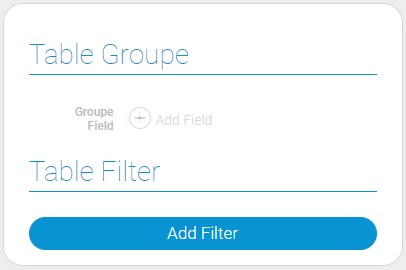
Table Groupe
With this function, you can group items by the values of any selected field.
Table Filter
Add filters to configure which items will be displayed in the table.
Table Columns

| Name | Description |
|---|---|
| Column | contains name of elements that will be used as table columns; details... |
| Show | allows to configure whether the field will be displayed in the table or not; details... |
| Width | allows to configure the width of the column; details... |
Column
This is the column that displays the names of all the fields of the selected application.
Show
With this function you can set whether a certain field will be displayed in the table or not.
Width
Set the width of a particular column. There are only 5 possible values: 50px, 100px, 150px, 200px, 250px.
Element Style
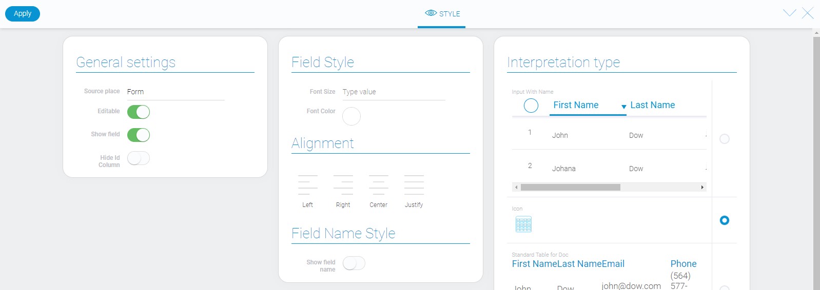
Despite the fact that the table displays all the elements of the application, it is still a gh element, so, just like all the others, it has all standard style settings and its own unique interpretation types.
General Settings
In addition to the standard, there is one unique setting:
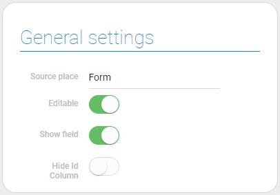
| Name | Description |
|---|---|
| Hide Id Column | allows to hide the ID column |
Hide ID Column
Due to this function you can hide the ID column when document-specific interpretation types are used. Namely, it works only for document generation.
Data Model
You can find all settings in the data model of the table.
{
    "data_model": {
        "app_id": 28793,
        "field_groupe": "679770",
        "filters_list": [],
        "interpretation": [],
        "send_message": {
            "app_id": "27904",
            "field_id": "648760",
        },
        "table_settings": {
            "action": "send_message",
            "columns_to_view": [{
                "field_id": 679453,
                "show": 1,
                "width": "150px"
            }],
            "items_order": "0",
            "selected_item": "1",
            "sort_table_field": "679453",
            "table_height": "15",
            "view_id": 1529231
        }
    }
}
| Name | Type | Description |
|---|---|---|
| app_id | number |
contains ID of the source application |
| field_groupe | string |
contains ID of the field by which items are grouped |
| filters_list | array |
contains all filters of the table and its properties |
| interpretation | array |
contains all element interpretation types |
| send_message | object |
contains all data about sending message |
| app_id | string |
contains ID of the destination application for the message |
| field_id | string |
contains ID of the destination field for sending message |
| table_settings | object |
contains all main data about table |
| action | string |
contains name of the action after clicking om item |
| columns_to_view | array |
contains data about table columns |
| field_id | number |
contains ID of field that will be taken for column |
| show | boolean |
shows whether the column will be displayed in the table |
| width | string |
contains value of the column width |
| items_order | string |
contains ID of the the value of item order |
| selected_item | string |
shows whether the items in board can be selected or not |
| sort_table_field | string |
contains ID of the field by which items in the table will be sorted |
| table_height | string |
contains value of the table height |
| view_id | number |
contains ID of the item view that will be opened after clicking |
Filtration
Items can be filtered by any available field within the table, but not by the table itself.
Interpretation
The table element has quite different interpretation types:
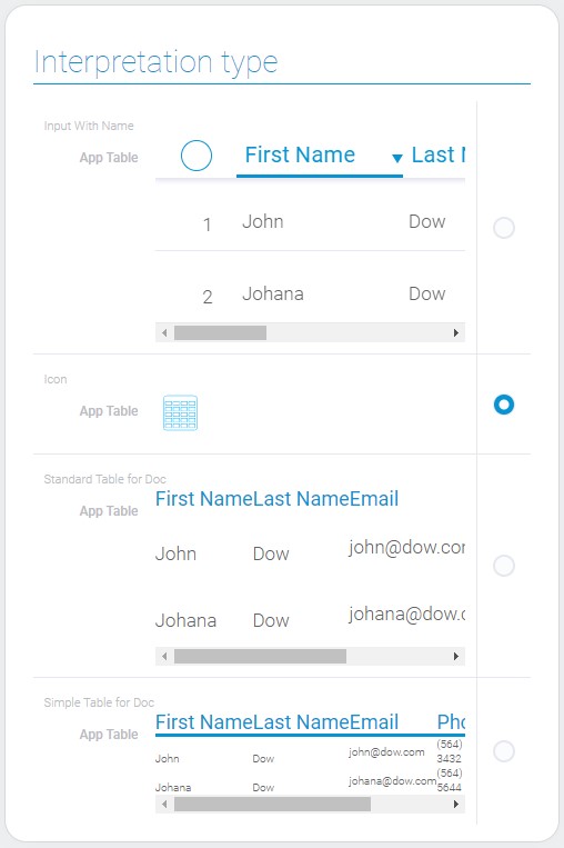
Input With Name
The first table interpretation type allows element to be displayed as an interactive table of items. It is used in applications and allows user to select items, open items or send messages after clicking on them.
Icon
This is the most simple type that displays element as an icon.
Standard Table For Doc
This is the first of types of interpretation for documents. It displays all items but does not allows to interact with them.
Simple Table For Doc
This type is the same to the previous one but the column titles are underlined.

 Edit document