Icon Element
Icon is a gh-element that allows user to add icon to any application. It is one of the most simple element.
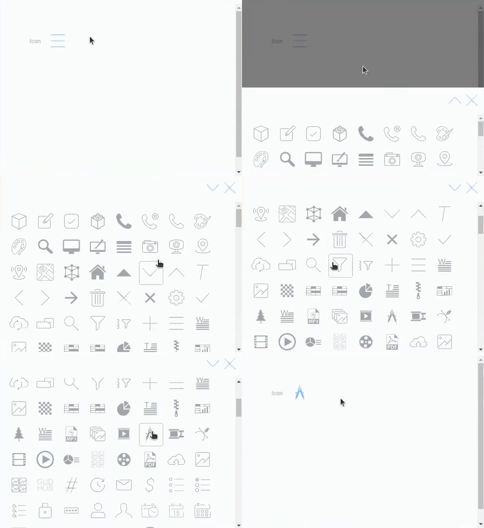
To select an icon, the user just needs to click on it. After that, a list of available icons will open. Then all user need to do is click on the desired icon. It will be immediately saved in the field, and the list of icons will be closed.
Functional Characteristics
This element is mostly found in the settings of other gh-elements. Some of them are: Add Items, Filter Tabs, and Radio Icon.
In casual use, you can use it to label some notes with different categories with icons. It also can be used in automation.
Element Options
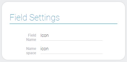
All icon options are limited to field settings. In turn, icon field settings has only standard options like Field Name and Name Space:
Element Style
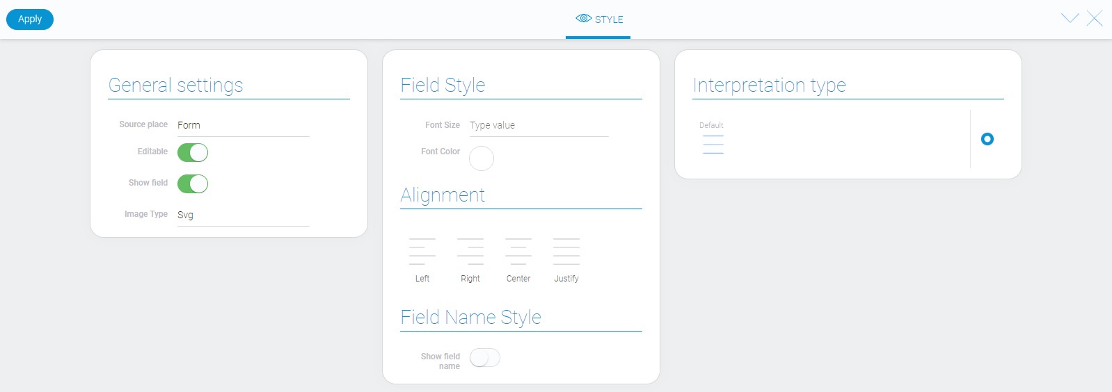
The icon element has one of the simplest list of interpretation types and a standard set of style settings with a single difference.
General Settings
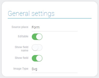
Unlike previous group of settings, element style has one additional option.
| Name | Description |
|---|---|
| Image Type | allow to change the icon format |
Image Type
This option is a special option that is used mostly in development. It allows to change the format of icon. There are two types of format:
- SVG
- Canvas
Image type is useful when the icon element is used in other platforms. Then you can select the needed format. Also, canvas is useful for documents which will be converts in PDF format.
Filtration
This element cannot be filtered out.
Interpretation
The icon element has the two interpretation types.
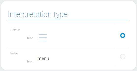
Default
The first type is default. It is the selected blue icon in 40x40 px size.
Value
The second interpretation type displays the value of the current field.
Value Format
This element takes the name of the icon as the value.
{
    "field_value": "box"
}
There are lots of different icons available for using in this element.
Data Model
The icon have no extra properties in data model besides interpretation array.
{
    "data_model": {
        "interpretation": []
    }
}
| Name | Type | Description |
|---|---|---|
| interpretation | array |
contains all icon interpretations |

 Edit document