View Tab
View tab is a gh-element that works with view container. It is designed for switching the views. That's why it doesn't work properly on its own.
Functional Characteristics
The main purpose of this element is to switch views in the View Container. A tab should be created for each species. You can use this element to create a menu in your application.
Value Format
This element has no field value.
Element Options
Three groups of settings allows to configure the element and tabs.
Field and View Settings
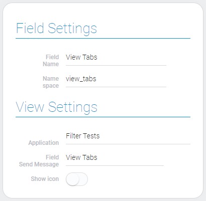
The first group is Field Settings that consists of only standard options. The second one is View Settings. They allow to select the application and the field with which the element will be connected.

| Name | Description |
|---|---|
| Application | allows to select the source application; details... |
| Field Send Message | allows to select the field with which the element will be connected; details... |
| Show icon | allows to add icon to the tab name; details... |
Application
This ias the application from which the list of fields will be taken.
Field Send Message
This is the field that will be associated with the tabs. This means that the tabs will allow you to switch views in this particular field. Therefore, you need to select the view container here.
Show icon
This is the function that allows to display the icon selected in Tabs Settings near the tab name.
Tabs Settings
This is a group of settings that allows you to configure each tab separately. Depends of Show icon function, the number of settings may vary.

When it is on, appears the additional Icon and Color.

The order of the view tabs must match the order of the views in the view container.
| Name | Description |
|---|---|
| Name | allows to enter the tab name; details... |
| Icon | allows to select the tab icon; details... |
| Color | allows to select the icon color; details... |
| Application | allows to select the source application; details... |
| View name | allows you to select the view to which the tab will be linked; details... |
| Edit | allows to update or delete the tab; details... |
Name
This is the name which will be displayed in the tabs.
Icon
This is the icon which will be displayed in element near the tab name.
Color
This function allows to open the color picker and select the color of the icon.
Tab Application
This is the application from which the views for connecting will be taken.
View name
This is the view that is connected with certain tab.
Edit
This column contains two buttons for updating and deleting tabs.
Element Style
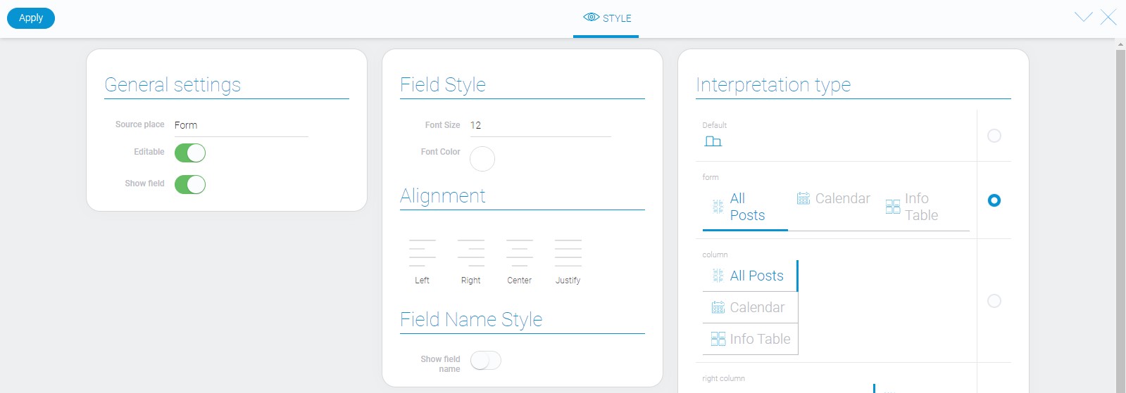
This element have no additional options that could customize its style. You can read about standard settings of element style in Setting Overview and about interpretation below.

Data Model
The view tab has a rather large data model.
{
    "data_model": {
        "current_tab": 0,
        "interpretation": [],
        "options": [{
            "app_id": "23790",
            "color": "#0b73b0",
            "icon": "lock",
            "name": "View 1",
            "view_id": "1524761"
        }],
        "send_message": {
            "app_id": "27290",
            "field_id": "677581"
        },
        "show_icon": 1,
        "use_default_value": false
    }
}
| Name | Type | Description |
|---|---|---|
| current_tab | number |
contains ID of the application that is shown by default |
| interpretation | array |
contains all element interpretation types |
| options | array |
contains all data about application options |
| app_id | string |
contains the ID of the source application |
| color | string |
contains the hex code of the icon color |
| icon | string |
contains name of the tab icon |
| name | string |
contains the name of the tab |
| view_id | string |
contains ID of the view which is connected with the tab |
| send_message | object |
contains data needed for sending message |
| app_id | string |
contains ID of the destination application for sending message |
| field_id | string |
contains ID of the destination field for sending message |
| show_icon | boolean |
shows whether the icon is displayed near the tab name or not |
| use_default_value | boolean |
shows whether the default value is used or not |
Filtration
This is one of that elements which have no ways to be filtered.
Interpretation
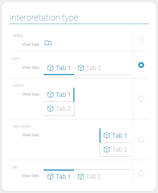
Most types of interpretation differ only in the location in the container.

Default
This interpretation allows the element to be displayed as an icon. It is the only type that does not allows to switch the tabs.
Form
This is the interpretation type that allows to display tabs names above the line. It can be used above the view container.
Column
This type of interpretation allows tabs to be displayed on the left side.
Right Column
This interpretation type allows the tabs to be displayed on the right side.
Top
The last type allows to display tabs names below the line. It is useful when you need to place the tab names below the view container.

 Edit document