View Container
View Container is a gh-element that allow to display any views in the current one. The number of views that can be displayed in container is unlimited. The switching between these views is provided by other gh-element called view tab.
Functional Characteristics
Views in container can be changed depends of some conditions. So you can customize the form so that it adjusts to the previous fields. The form will change depending on the values of the corresponding fields.
There is another use case. Create a separate application for the data you want to share. Use a view container to display the necessary views from another application in it. This is useful for present up-to-date schedules to the customer or task board for employees.
Value Format
This element has no field values.
Element Options
The element options consists of three groups of settings. Each of them is responsible for different functions.
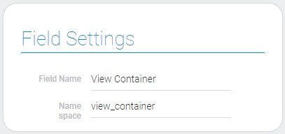
Field Settings
The field settings of the view container are consists of only standard options. So, you can read about them in Setting Overview.

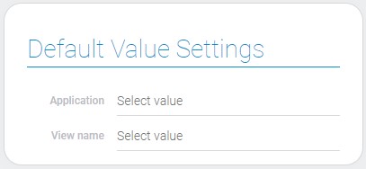
Default Value Settings
This settings allows to select the source application and the default view.

| Name | Description |
|---|---|
| Application | allows to select the source application; details... |
| View name | allows to select the default view; details... |
Application
This is the application from which the views will be taken.
View name
This is the selected view from the source application that will be used as a default view.
Cases Settings
This table allows to select views which will be displayed in container. Since view tab is responsible for switching between views, the views cases have to be in the same order as the tabs.

| Name | Description |
|---|---|
| View name | allows to select the view for displaying in container; details... |
| Filter | allows to add filters for views; details... |
| Edit | allows to update or delete the view case |
Case view name
This option allows to select the view for the case.
Filter
This feature allows you to configure in which cases the view will be displayed.
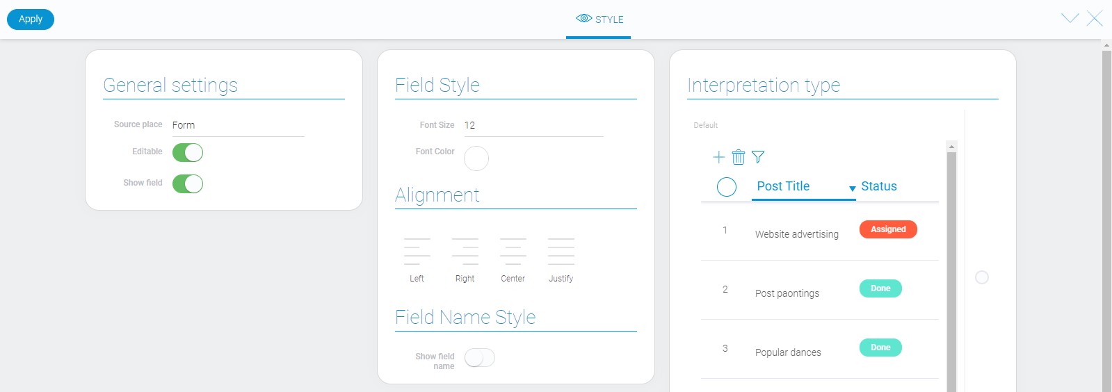
Element Style
Style of this element can be configured with the help of standard options. They are described in article called Setting Overview. As for interpretation, you can read about it below.

Data Model
The view container contains all views IDs and their filters, element settings and all interpretation types.
{
    "data_model": {
        "app_id": "28697",
        "interpretation": [],
        "option": [{
            "filters_list": [],
            "view_id": "1525000"
        }],
        "use_default_value": false,
        "view_id": "1524719"
    }
}
| Name | Type | Description |
|---|---|---|
| app_id | string |
contains ID of the source application |
| interpretation | array |
contains all interpretation types |
| option | array |
contains all views for displaying in container |
| filters_list | array |
contains all filters which are applied to the view |
| view_id | string |
contains ID of the view for displaying in container |
| use_default_value | boolean |
allows to use default value |
| view_id | string |
contains ID of the default view |
Filtration
There are no filters designed to filter the view container.
Interpretation
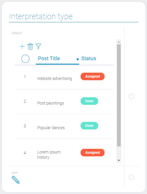
The view container has only two interpretation types.

Default
The first interpretation allows the element to be displayed as a full container with all item fields.
Icon
Allows to display the only icon instead of views.

 Edit document