User
User is a gh-element which allows to select the user and display his/her name and profile picture.
Functional Characteristics
This item is used for GudHub users. It is used to bind an account to an item and therefore control access to items. This is useful for teamwork, for example, when assigning tasks.
Value Format
This element accepts the application ID as a field value.
{
    "field_value": "1271"
}
Element Options
The element options are consists of two settings groups. For the most part, there are standard or familiar options here.
Field Settings
The first group contains all the same default Field Name and Name Space.
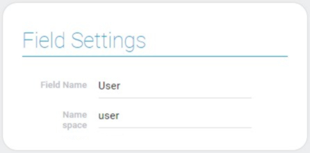
Default Value Settings
This is a group of standard settings that allows to configure the default value.
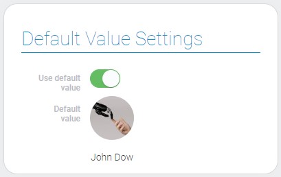
| Name | Description |
|---|---|
| Use default value | allows to use default value; details... |
| Default value | allows to select the default value from users list; details... |
Use Default Value
This is the setting that allows you to use the default value for this element.
Default Value
The current element is created to enter the default value.
Element Style
Besides the option described below, the user element has a set of standard settings to configure its style and its own unique interpretation types.
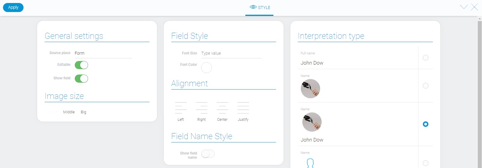
Image Size
Below the general style settings there are one extra option. It allows to select the size of the profile picture.
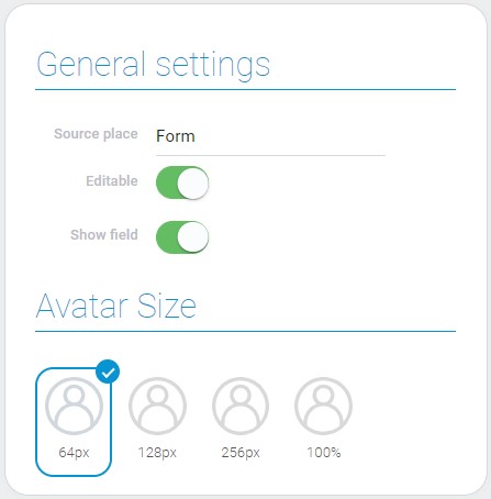
There are four available sizes:
- 64px
- 128px
- 256px
- 100%
Data Model
The element data model contains these properties:
{
    "data_model": {
        "default_field_value": 1547,
        "display_type": "photo_fullname",
        "interpretation": [],
        "photo_size": 64,
        "use_default_value": false,
    }
}
| Name | Type | Description |
|---|---|---|
| default_field_value | number |
contains the default field value |
| display_type | string |
contains the type of the element display |
| interpretation | array |
contains all interpretation types |
| photo_size | number |
contains the size of the user photo |
| use_default_value | boolean |
shows whether the default value is used or not |
Filtration
Since this element has value, user can filter it out.
Interpretation
The user element has many different interpretation types:
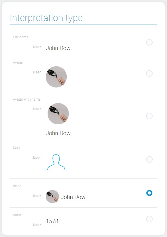
Full Name
The first type allows you to display only the name of the selected user.
Avatar
The second interpretation type is opposite to the previous one. It only displays the account picture of the selected user.
Avatar With Name
This type allows the element to be displayed as an account picture and the user name below it.
Icon
This type does not display user data. The element is displayed as an icon.
Inline
This type displays the account picture with user name next to it.
Value
The last interpretation type displays the selected value of the element.

 Edit document