Update Items
Update Items is a gh-element that allows to update already existed items. It is a comfortable instrument for editing data in lots of items at the same time.
Simply select the items you want, click the Update Items button, and change the data in any field. Once applied, all selected items will be updated.
Functional Characteristics
With this button, the user can update a large number of items much more faster. It also allows user to remotely update application data from another application.
Value Format
It is an element that does not have any value.
Element Options
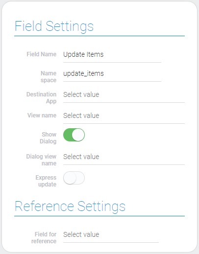
The current gh-element has the same settings as the Add Items button. They consists of three groups of settings.
Field and Reference Settings
The first block contains two main types of settings, Field and Reference Settings. Actually, there are only one reference setting. In turn, the field settings consist of standard options and important configuration options.

| Name | Description |
|---|---|
| Destination App | allows to select the application where the items will be updated; details... |
| View name | allows to select the view of the item; details... |
| Show Dialog | allows to shown popup window instead opening item; details... |
| Dialog view name | allows to select view for dialog; details... |
| Express update | allows to add items without clicking on the apply button; details... |
| Field for reference | allows to select field for reference; details... |
Destination App
This is an application whose items will be updated.
View Name
This name belongs to the view that will be opened after clicking on the Update Items button.
Show Dialog
With this feature, the update view will open as a popup window.
Dialog View Name
This is the view that will be opened in the popup window if the Show Dialog is on. In other case, Dialog View Name is not available.
Express Update
This function is used to update items without opening the corresponding view. Then only fields selected in Fields to Field will be updated.
Field For Reference
The selected field will contain the ID of the destination application after updating items.
Fields to field
These settings are used to set fields which will be updated in any case. Here you also configure new values for these fields. There are two types of that values:
-
Values taken from other fields

-
Value entered in settings

| Name | Description |
|---|---|
| Source Field | allows to select the source field; details... |
| User value | allows users to enter their value; details... |
| Show input | allow to show input; details... |
| Destination Field | allows to select the destination field; details... |
| Edit | allows to edit or delete case; details... |
Source Field
This is the field whose value will be taken for updating the destination field.
User Value
This is the value entered in the settings. It will be used to update the destination field.
Show Input
This function determines what type of value will be used to update the data in a certain field. If enabled, the Source Field is used. In the other case, the User Value is used.
Destination Field
This is the field that will be updated.
Edit
This column contains buttons for editing and deleting the update option.
Element Style
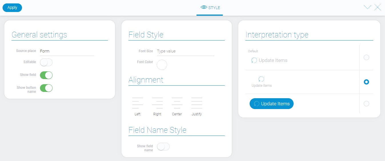
As for the style settings, there are no unique settings except one. Even its types of interpretation are not very unique.

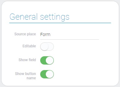
General Settings
The only additional style setting is here.

| Name | Description |
|---|---|
| Show button name | allows to hide the button name |
Show Button Name
This switch allows you to set whether the button name of the current element is displayed or not
Data Model
The item has a rather large data model:
{
    "data_model": {
        "dest": {
            "app_id": "28998"
        },
        "dialog_view_id": "1536017",
        "express_update": 0,
        "interpretation": [],
        "options": [{
            "dest_field_id": "682037",
            "show_input": 0,
            "source_field_id": "682038"
        },{
            "dest_field_id": "682032",
            "show_input": 1,
            "user_field_value": "example@gmail.com"
        }],
        "reference": {
            "field_id": "682037"
        },
        "show_dialog": 1,
        "view_id": "1536017"
    }
}
| Name | Type | Description |
|---|---|---|
| dest | object |
contains data of the destination application |
| app_id | string |
contains ID of the destination application |
| dialog_view_id | string |
contains ID of the view that is used for popup |
| express_update | boolean |
shows whether express add is used or not |
| interpretation | array |
contains all element interpretation types |
| options | array |
contains all settings of updating options |
| dest_field_id | string |
contains ID of the destination field |
| source_field_id | string |
contains ID of the source field |
| show_input | boolean |
shows whether user field value is used or not |
| user_field_value | string |
contains data entered by the user |
| reference | object |
contains data of the reference |
| field_id | string |
contains the identifier of the field that will contain the reference |
| show_dialog | boolean |
shows whether the popup is used or not |
| view_id | string |
contains ID of the view that will be used during the update |
Filtration
This element cannot be filtered.
Interpretation
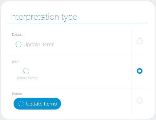
Since this element is a button, it has the appropriate types of interpretation.

Default
In the first interpretation, the item is displayed as an icon with the name of the button next to it.
Icon
Due to the second type, the element is displayed as an icon with the button name below.
Button
The latter interpretation allows you to display the item as a blue button with an icon and the name of the button.

 Edit document