Task Board
Task Board is a gh-element that allows to display items in interactive board. This allows the user to move items between columns, which changes the value of the specific field. Despite its name, the task board can be used for different purposes.
Functional Characteristics
As you can understand from the name, this element is used to track tasks. With it you can change the date, responsible person, status, or any other task details by dragging the task to another column.
Value Format
This element have no field value.
Element Options
At first sign the task board configuring is quite complex. This element has many settings, which makes it very versatile.
Field and Main Settings
The field settings of task board contains only standard options. As for main settings, there are lots of settings that are important for element work. Some of them are constant:
| Name | Description |
|---|---|
| Application | allows to select the source application; details... |
| Column type | allows to select the type of columns; details... |
| Card View Id | allows to select the view that will be displayed in task board; details... |
| Card action | allows to select the action after clicking; details... |
| Open card view | allows to select the view which will be opened after card action; details... |
| Duration field id | allows to select the duration field; details... |
| Sort type | allows to select the type of sorting; details... |
Others vary depending on the types of columns. They appear individually for a particular column type, of which there are only three:
-
Date Type
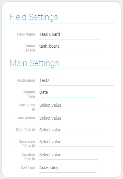
For date board you have to select the date field that will determines in which column the item will be located. The days of the current week are columns.
| Name | Description |
|---|---|
| Date field id | allows to select the date field; details... |
-
Status Type
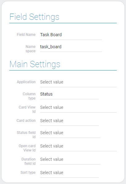
As a status field can be used elements like radio button, radio icon, or options. Their options will be used as columns.
| Name | Description |
|---|---|
| Status field id | allows to select the status field; details... |
-
Field Item Reference Type
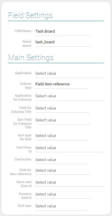
This type takes all the values of the selection item's reference field as columns.
| Name | Description |
|---|---|
| Application for Columns | allows to select the source application for columns; details... |
| Field for Columns Title | allows to select the field from which values will be taken for columns titles; details... |
| Sort Field for Columns Title | allows to select the field by which the columns will be sorted; details... |
| Sort type for field | allows to select the sort type; details... |
| Field for item reference | allows to select the field for item reference; details... |
Application
This is the source application. Its items will be displayed in the task board.
Column type
These types determine what data the board will be based on.
Card View ID
This is the view which will be displayed as task card in the board.
Card Action
This is the action that happens after the user clicks on the item card. There are only two possible actions:
- Open Item. The specific view of the selected item will open in a new window.
- View Dialog. The view of selected item will be opened as a popup window.
If nothing is selected, nothing will happens after clicking on the item.
Open Card View
This is the view that will be opened after clicking on the item in the board.
Duration Field ID
Select the duration field for item cards.
Sort Type
This type determines the order in which the elements in the columns will be displayed.
Date Field ID
This is the field that determines the column in which the item is located.
Status Field ID
This is the field from which values will be taken for status type columns.
Application For Columns
This is the source application from which fields for column will be taken. It can be used only when columns has field item reference type.
Field For Columns Title
All possible values of this field will be used as columns of task board.
Sort Field For Columns Title
This is the field by which columns will be sorted.
Sort Type For Field
This function determines the sort type for task board columns.
Field For Item Reference
This is the item reference field by which the item cards are distributed in columns.
Filters
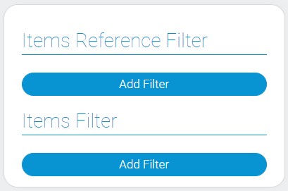
Current element has two types of filters. One of them is applied to only one column type, another filter all items.
| Name | Description |
|---|---|
| Item Reference Filter | allows to configure which columns will be displayed; details... |
| Items Filter | allows to configure which items will be displayed in the task board; details... |
Item Reference Filter
Add the filters to configure columns of the board. Namely, they allows to configure which values of item reference field will be displayed as columns.
Items Filter
You can configure which items will be displayed in the task board using different filters.
Color Styles
The last group of options allows to make different styles for different items.

| Name | Description |
|---|---|
| Text color | allows to select the color of the item card; details... |
| Conditions | allows to configure which items will be displayed in which color; details... |
| Edit | allows to edit and delete the color style; details... |
Text color
This function allows to set the color for specific items.
Conditions
With this function, you can add filters that customize which elements have which colors.
Edit
This function allows to edit and delete the color style.
Element Style
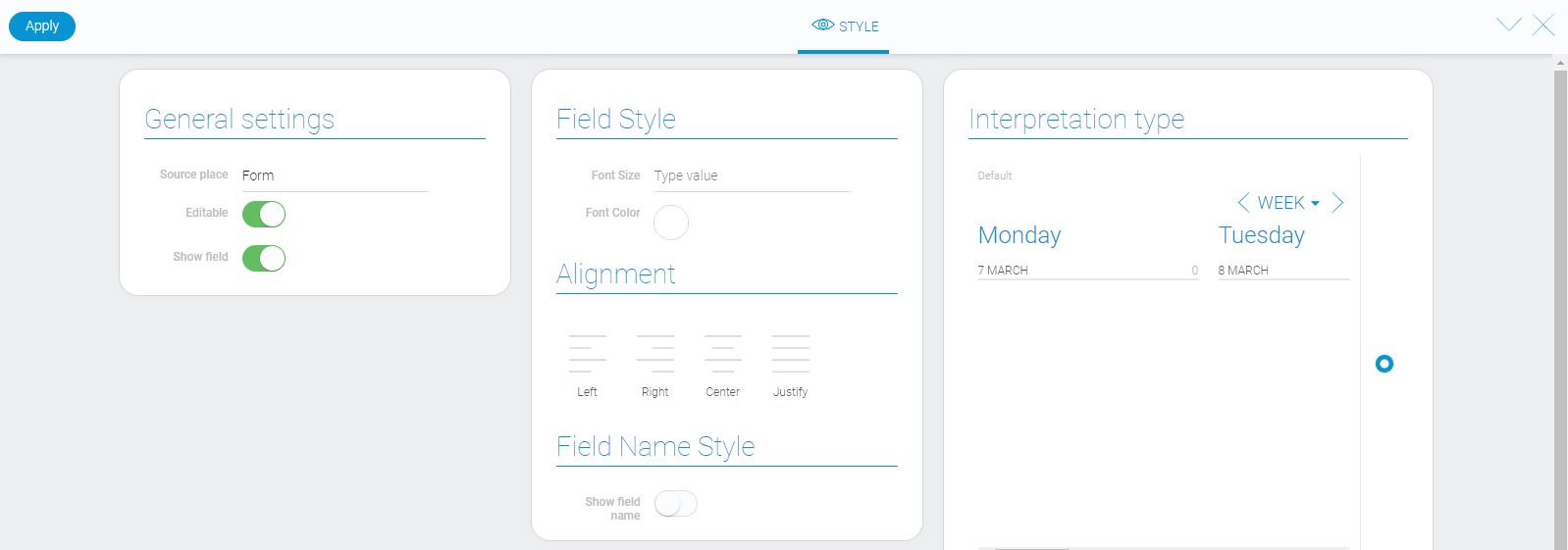
Despite the fact that this element is quite complex, it has only standard style options. It also has only a few types of interpretation.
Data Model
The full item data model has the following properties:
{
    "data_model": {
        "action": "open_item",
        "app_id": "28793",
        "app_id_item_ref": "28793",
        "card_view_id": "1529247",
        "column_type": "0",
        "date_field_id": "679556",
        "duration_field_id": "679457",
        "field_id": "679456",
        "field_id_item_ref": "679456",
        "filters_list_color": [{
            "color": "#08aeea",
            "filters_list": []
        }],
        "filters_list_item_ref_items": [],
        "filters_list_items": [],
        "interpretation": [],
        "open_card_view_id": "1529231",
        "sort_field_id": "",
        "sort_type": "ascending",
        "sort_type_field": "ascending",
        "status_field_id": "679590"
    }
}
| Name | Type | Description |
|---|---|---|
| action | string |
contains the name of the action after clicking on item cards |
| app_id | string |
contains ID of the source application |
| app_id_item_ref | string |
contains ID of the application from which the fields for column will be taken |
| card_view_id | string |
contains ID of the view that is displayed in the board |
| column_type | number |
contains ID of the selected column type |
| date_field_id | string |
contains ID of the date field |
| duration_field_id | string |
contains Id of the duration field |
| field_id | string |
contains ID of the field from which the values will be taken to form the columns |
| field_id_item_ref | string |
contains ID of the field of item reference |
| filters_list_color | array |
contains all color styles of items |
| color | string |
contains hex code of the selected style |
| filters_list | array |
contains all filters for current color style |
| filters_list_item_ref_items | array |
contains all filters for item reference |
| filters_list_items | array |
contains all filters for items |
| interpretation | array |
contains all element interpretation types |
| open_card_view_id | string |
contains ID of the view that will be displayed in task board |
| sort_field_id | string |
contain ID of the field by which items will be sorted |
| sort_type | string |
contains selected type of sorting items |
| sort_type_field | string |
contains selected type of column sorting |
| status_field_id | string |
contains ID of the field from which value will be taken as columns of status type |
Filtration
Since this element displays items, you can filter them within it, but not across the task board.
Interpretation
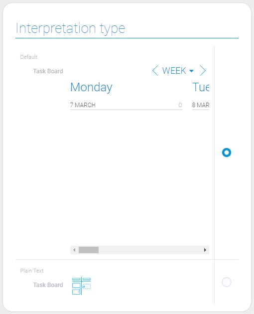
The task board has only Two types of interpretation:
Default
This interpretation type allows to display a full board with all tasks. It also allows users to drag and drop items.
Plain Text
This type allows element to be displayed as an icon.

 Edit document