Slider
Slider is a gh-element that allows to make a slideshow of images from items. Due to it, the images can be swiped like a slider.
Functional Characteristics
This element can be used to display advertising banners or to display products.
Value Format
Slider does not contain any value.
Element Options
Slider settings are consists of three blocks.
Field Settings
The first block of settings configures the main aspects of the element. It also contains standard field settings.
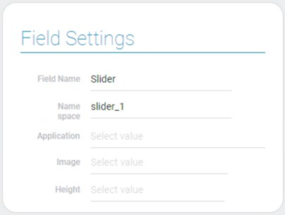
| Name | Description |
|---|---|
| Application | allows to select the source application; details... |
| Image | allows to select the source field; details... |
| Height | allows to set the element height; details... |
Application
This is the application from which all needed data will be taken.
Image
This function allows to select the field from which images will be taken for slideshow.
Height
You can set the slider height due to this function. There are seven possible values:
- 64
- 128
- 256
- 384
- 512
- 768
- 1024
Advanced Settings
This group of settings allows you to add a link and an image name to the item image, in addition to the main settings.
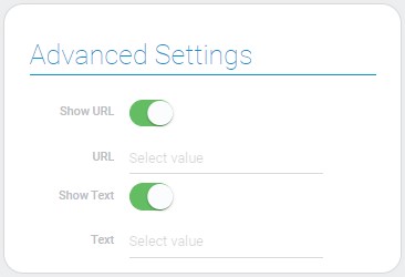
| Name | Description |
|---|---|
| Show URL | allows to add link to the image; details... |
| URL | allows to select the field from which links wil be taken; details... |
| Show Text | allows you to show the text associated with the image; details... |
| Text | allows to select field from which text will be taken; details... |
Show URL
This setting allows you to add URLs to images. When a user clicks on an image, he goes to a specific link.
URL
This is the setting where you have to enter the link which will be used in the slider.
Show Text
This function allows to configure whether any text will appears when user hover his/her cursor over the image in the slider.
Text
This is the text that will be displayed when user hover his/her cursor over the image in the slider.
Filter
This block contains the standard filter element. Due to this, you can customize which items will be displayed by using different filters.

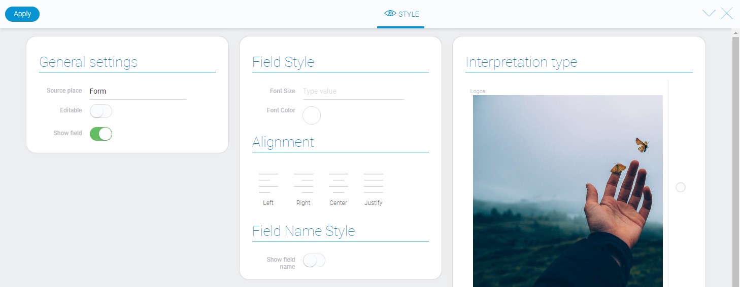
Element Style
The slider is the element whose interpretation types are more useful for its style than all other style settings, which are standard.
Data Model
The slider data model contains all element settings:
{
    "data_model": {
        "app_id": "28560",
        "filters_list": [],
        "height": "512",
        "image": {
            "field_id": "671841"
        },
        "interpretation": [],
        "text": {
            "active": 1,
            "field_id": "671831"
        },
        "url": {
            "active": 1,
            "field_id": "679766"
        }
    }
}
| Name | Type | Description |
|---|---|---|
| app_id | string |
contains ID of the source application |
| filters_list | array |
contains all filters that are applied to the element |
| height | string |
contains value of height of the slider |
| image | object |
contains settings of the image for slider |
| field_id | string |
contains ID of the field from which images will be taken for slider |
| interpretation | array |
contains all element interpretation types |
| text | object |
contains text settings |
| active | boolean |
shows whether the text will be shown in slider or not |
| field_id | string |
contains ID of the from which text will be taken for slider |
| url | object |
contains URL settings |
| active | boolean |
shows whether links will be used in slider |
| field_id | string |
contains ID of the field which URL will be taken for slider |
Filtration
This element cannot be filtered out.
Interpretation
Both types of slider interpretation display images of items and allows to follow specific links, but they still have few differences:
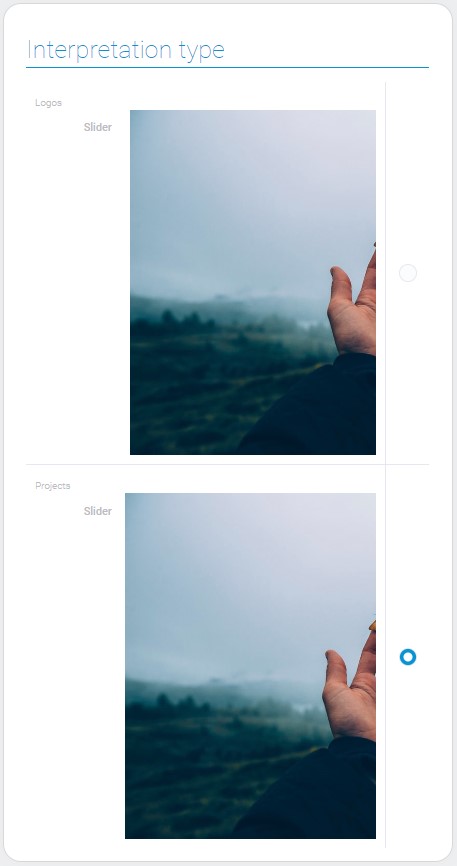
Logos
The first type of interpretation displays images of items with gaps between them. It also do not allow image names be displayed.

Projects
This type displays images without gaps. In addition, when you hover your cursor over any image, it is shaded and its name is displayed on it.


 Edit document