Radio Icon
Radio Icon is a gh-element that allows to set the value options and select one of them in application. These options are displayed as color icons.
Functional Characteristics
This element can be used to label elements, divide them into categories and give them different statuses. This also allows you to make useful filter tabs for different items or separate items by column in items such as task board.
Value Format
As a value, the radio button contains the ID of the selected option.
{
    "field_value": "5"
}
Element Options
The radio button options are divided into three groups.
Field Settings
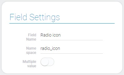
Besides standard settings like Field Name and Name Space, this group includes only one extra one:
| Name | Description |
|---|---|
| Multiple value | allows to select the multiple value |
Multiple value
The multiple value for a radio icon means that the user can select as many icons for as many values as he wants.
Option Settings
| Name | Description |
|---|---|
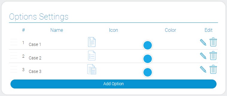
| Name | allows to enter the name of the field; detail... |
| Icon | allows to select the icon of the option; detail... |
| Color | allows to select the color of the icon; detail... |
| Edit | contains two buttons for editing and deleting the option; detail... |
Name
This is the name of radio icon option that is used for filtration. In some interpretations, it is displayed below the icon or by itself.
Icon
The icon of the element option is the main feature of radio icon. You can choose it from the full list of icons.
Color
This setting allows to open the color picker and select the color of the icon.
Edit
This is the column tha contains buttons for editing and deleting option.
Default Value Settings
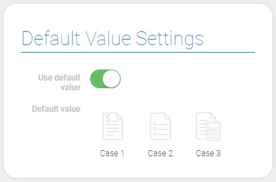
As you might have guessed from the title, these settings are responsible for configuring the default values.
| Name | Description |
|---|---|
| Use default value | allows to use default value |
| Default value | allows to select the default value |
Use Default Value
This setting allows you to use the default value.
Default Value
The default value of the radio icon is one of its icon which was selected in settings.
Element Style
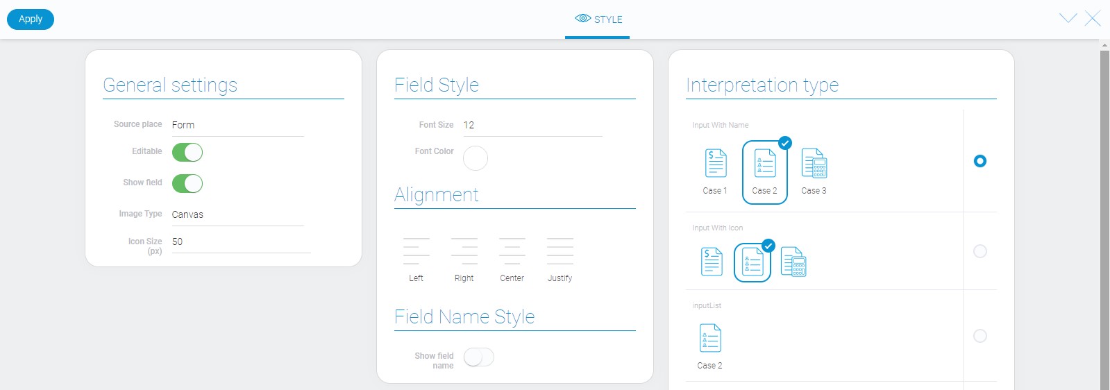
The style of radio icon element has not only standard options but also a few additional. Read Setting Overview for introduction the standard options. The radio icon interpretation is described below.
General Settings
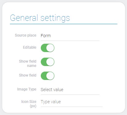
There are extra options for radio icon style. They allows to configure icon size and format.
| Name | Description |
|---|---|
| Image Type | allows to select the type of icon image; detail... |
| Icon Size(px) | allows to set the icons size; detail... |
Image Type
This option allows to image type of icon. It has two possible values: SVG and Canvas.
Icon Size(px)
This option allows to enter the size of the icons in pixels.
Data Model
The most part of the element data model is taken up by options and their properties.
{
    "data_model": {
        "interpretation": [],
        "multiple_value": 0,
        "options": [{
            "color": "#18a9e8",
            "icon": "invoices",
            "name": "Case 1",
            "value": 0
        }],
        "use_default_value": false
    }
}
| Name | Type | Description |
|---|---|---|
| interpretation | array |
contains all interpretation types of the element |
| multiple_value | boolean |
shows whether the element accepts the multiple values |
| options | array |
contains all value options and their properties |
| color | string |
contains he hex code of the selected icon color |
| icon | string |
contains the name of icon image |
| name | string |
contains the name of the option |
| value | number |
contains the option ID |
| use_default_value | boolean |
shows whether the default value is used or not |
Filtration
The element could be filtered out by the option name.
Interpretation
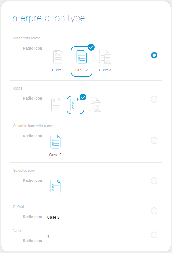
This element has lots of interpretation types. Most of them has icons.
Input With Name
Displays the value options as an icon with the name below.
Input With Icon
This interpretation type allows to display the element options as different icons.
InputList
Allows to display the value options as an icon with the name below and makes them uneditable.
Icon One
Displays the icon of the selected value and does not allows to edit it.
Default
Allows you to display the name of the selected value only.
Value
The last type displays the selected field value.

 Edit document