Radio Button
Radio Button is a gh-element that allows to add the set of different buttons and select one of them. Also, you can customize the buttons.
Functional Characteristics
This useful item allows you to set any status for items. It is also used to configure other elements, such as the task board or filter tabs, and to easily filter items in gh-elements such as table, cards, etc.
Value Format
The value of the radio button is an ID of the option selected by user. It can only be one in the element. The value can be selected in the drop-down list.
{
    "field_value": "4"
}
Element Options
Radio button has three sets of options. One of them relate to field, others to values.
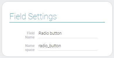
Field Settings
All field settings that you can configure are standard for all gh-elements. About them you can read in Setting Overview.
Options Settings
These settings allows to add, update, and delete options of the value.
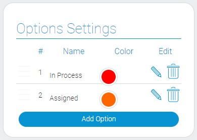
| Name | Description |
|---|---|
| Name | field that allows to enter the name of the option; detail... |
| Color | allows to select the color of the button; detail... |
| Edit | contains buttons for updating and deleting existed options; detail... |
Name
The name of the option is the name that will be displayed on the button.
Color
The color button allows to open the color picker and select the color of the option.
Edit
This column contains the buttons for editing and deleting options.
Default Value Settings
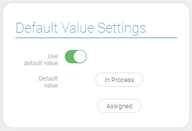
The group of settings that configure the default value:
| Name | Description |
|---|---|
| Use default value | allows to take advantage the default value; details... |
| Default value | allows you to select the variant of the value that will be used by default; details... |
Use Default Value
This setting allows you to use the default value of this element.
Default Value
This setting allows you to enter the value that will be used as a default value.
Element Style
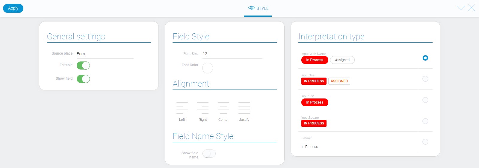
The radio button element has all standard style settings that you may have already seen in Setting Overview. Also, it has a list of interpretation types those are described below.
Data Model
The whole uniqueness of its data model lies in the array of options.
{
    "data_model":{
        "interpretation": [],
        "options": [{
            "name": "In Process",
            "value": 0,
            "color": "#FF0000"
        }],
        "use_default_value": false
    }
}
| Name | Type | Description |
|---|---|---|
| interpretation | array |
contains all element interpretation types |
| options | array |
contains all data of every option |
| name | string |
contains options name |
| value | number |
unique ID of element options in the element |
| color | string |
contains hex code of the selected color |
| use_default_value | boolean |
shows whether a default value is used |
Filtration
Radio button fields can be filtered out by filters that deal with full values:
- Equals(or)
- Equals(and)
- Not equals(or)
- Not equals(and)
- Value
- Checkbox list(or)
Interpretation
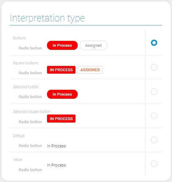
A most interpretation types of voting element has color text, background, or the both. The color of each option is set in the Field Settings.
Input With Name
This interpretation allows to display value options as rectangular blocks with strongly rounded conners. The selected option is displayed in a color background and with the white text.
inputOne
Due to this interpretation the value options are displayed as rectangular blocks with slightly rounded corners. The unselected option is displayed as a color text on the white background. The selected one is contrary, white text on the color background.
inputList
This is a type that allows to display the only selected value with color background and white text. The shape of value block is rectangular blocks with strongly rounded conners.
InputSquare
The selected value is displayed as rectangular blocks with slightly rounded conners, color background and white text.
Default
This is the interpretation type that displayed only the selected value as an uneditable text.
Value
The last interpretation type displays the selected value of the element.

 Edit document