Nested List Element
Nested list is a gh-element that allows to create list of items. With its help, the user can structure items in the application in any way. Because a nested list allows you to reorder items and create folders by dragging and dropping.
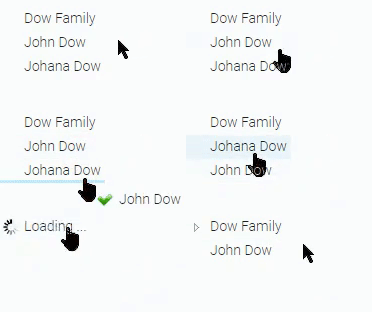
This element is created to work in conjunction with View Container.
Functional Characteristics
This element can be used as an interactive content. The Nested List can be configured in such a way that the clicking on the item in list opens the relevant item in the View Container. Using it, you can create a full-fledged website with articles, a notebook, documentation, and many other things.
Let's take the GudHub documentation as an example. Here we use four elements: Nested List, Text element, View Container, and Markdown Viewer.
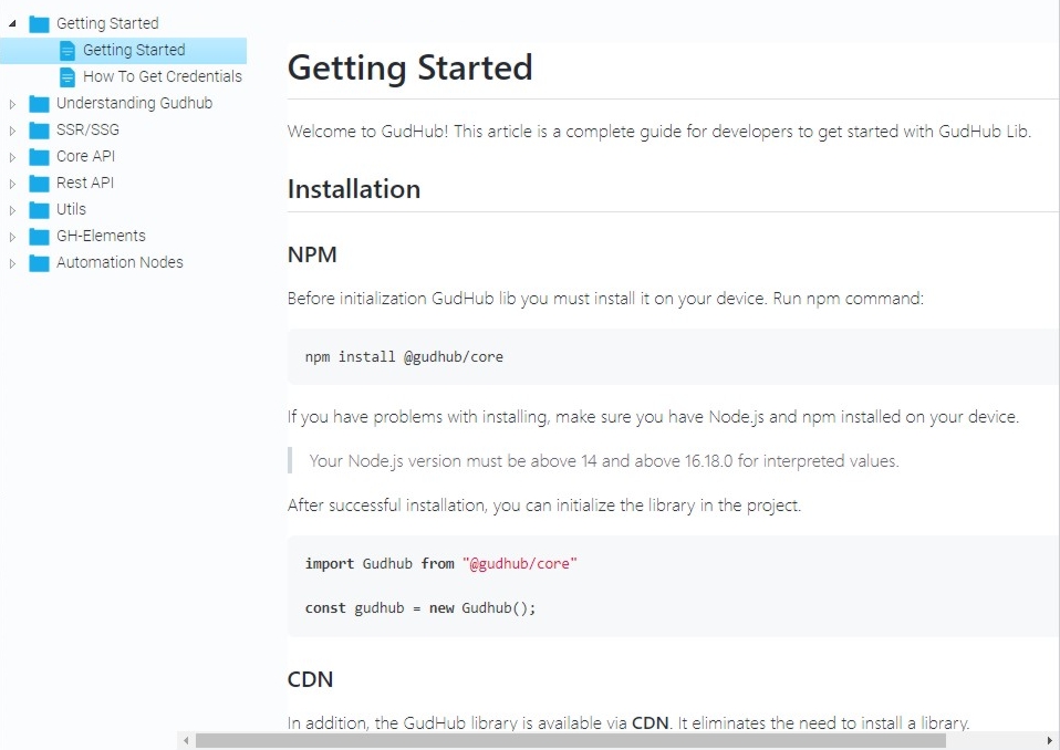
Each item consists of the Markdown Viewer and Text field with article title. Items are displayed in the View Container which is linked with the Nested List. Then user can read articles and switch between them. This way, we get documentation with a list of all articles.
Element Options
The current element has only one block of settings.
Field Settings
The first group of settings allows you to customize the list and use two standard field settings.
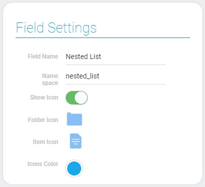
| Name | Description |
|---|---|
| Show Icon | allows you to customize whether icons will be displayed or not; details... |
| Folder Icon | allows to select icon of the folders; details... |
| Item Icon | allows to select icon of the separate items; details... |
| Icons Color | allows to select the color of folder and items icons; details... |
Show Icon
The Nested List has two display modes. This is a list with and without icons. Switching between modes is provided by the current setting.

All of the following field settings are available only if the Show Icon option is enabled.
Folder Icon
The single icon is used for all folders. The current settings allow you to choose the appearance of this icon.

This setting is available only if the Show Icon option is enabled.
Item Icon
When Show Icon is enabled, each item has the same icon. This icon can be changed using the Item Icon option.

Icons Color
The last option allows you to set the color of all the icons in the nested list. To do this, use the color picker in the settings.

The color selected in the current setting will be applied to each item and folder icon.
Nested List Settings
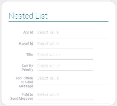
| Name | Description |
|---|---|
| App Id | allows to select the source application for list; details... |
| Parent Id | allows to select the field with the parent item; details... |
| Title | allows to select field from which titles will be taken; details... |
| Sort By Priority | allows to select the field by which options in list will be sorted; details... |
| Application to Send Message | allows to select the destination application of the message; details... |
| Field to Send Message | allows you to select the field where the message will be sent; details... |
App ID
This is the application from which data for generating the nested list will be taken. That is, a nested list consists of items in the current application. And its fields are used to customize the list.
The nested list is used with View Container. This pair allows you to display and switch items of the current application.
The nested list is used as a table of content for the selected application.
Parent ID
The current setting allows you to select a field to create folders. The relations between items are based on item references. If an item has another item in its attachment, it becomes a folder.
So, here you have to select Item Reference field to create the folders of items.
User can create folders interactively by dragging and dropping item into other item.

After that, the reference to the folder will be saved in the current field.
Title
This is the setting where you need to select the item name field. This field must be a Text element.
The text in the fields should be meaningful and understandable. Because they are displayed in the nested list as item titles. They help the user to understand what kind of item it is.
From these titles, the user can create a full-fledged table of contents. This is very convenient for switching between items.
Sort By Priority
Items in the nested list are sorted by the numbers assigned to them. More precisely, items are assigned numbers and then they are placed in ascending order of numbers. It goes from top to bottom and cannot be reversed.
The sequence of items starts from zero and then goes to the largest number. The user can change the sequence by dragging and drop items. Then item number will be changed in accordance with the sequence.
The field that is recommended to be selected here is the Number element.
Application To Send Message
Since the Nested List works in conjunction with the View Container, it has special settings to configure the interaction between them. The first of them allows you to select the application in which the view container is located. This also means that switching items will be performed in this application.
The Nested list and the View Container must be located in the same application. Otherwise, switching items will not work.
Field To Send Message
The second setting that is responsible for the connection between elements is Field To Send Message. Here you have to choose a View Container from the application you selected earlier.
When the user clicks on any item in the nested list, a notification will be sent to that item, and then the desired item will be displayed in the View Container.
Element Style
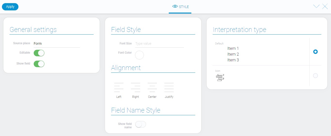
The nested list, as lots of other, have no special style settings. It contains only a standard set of options and a few interpretation variants.
Filtration
The current element cannot be filtered out.
Interpretation
The nested list have two types of interpretation:
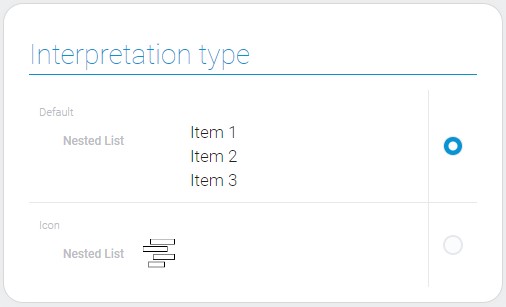
Default
The first type of interpretation displays a complete list.
Icon
The second type allows element to be displayed as an icon.
Value Format
The current element have no value.
Data Model
The data model of the current gh-element contains all element settings:
{
    "data_model": {
        "application_id": "29655",
        "interpretation": [],
        "parent_id": "694995",
        "priority": "694993",
        "send_message": {
            "app_id": "29655",
            "field_id": "694996"
        },
        "title": "694993"
    }
}
| Name | Type | Description |
|---|---|---|
| application_id | string |
contains ID of the source application |
| interpretation | array |
contains all element interpretation types |
| parent_id | string |
contains the field ID, which specifies the parents of the items |
| priority | string |
contains ID of the field by which the list will be sorted |
| send_message | object |
contains all settings of sending message |
| app_id | string |
contains ID of the application to which the message will be sent |
| field_id | string |
contains ID of the field to which the message will be sent |
| title | string |
contains the identifier of the field from which the data for the headers will be taken |

 Edit document