Link
Link is a gh-element that allows users to store links and provides various functions for working with them. First of all this element makes links active. To add a link here, the user should click the add button in the element.

After that, an input field with settings buttons will appear. When the user has entered a link, to save it, they need to click on the checkmark icon. The other two icons are the cross button, which cancels the action without saving the value, and the trash can button, which deletes the existing value. In addition, for these buttons to appear for a Link field with a saved value, the user must click the pencil button.
Functional Characteristics
The main advantage of this element is that it stores active links. But to be more precise, this element makes all the links it stores active. This greatly simplifies the work with data in the application. Due to its features, the user can, for example, create a shopping list and store all product links in one field. In addition, the user can preview the site or even use its tools from within the elements.
Element Options
The element options consists of only one group of settings.
Field Settings
As usual, the field settings contains two standard options, Field Name and Name Space, and a few extras.
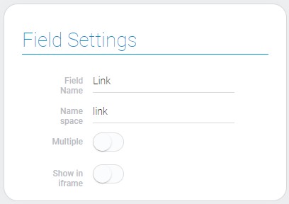
| Name | Description |
|---|---|
| Multiple | allows to add multiple values; details... |
| Show in iframe | allows you to display the site via a link in the application as a small window; details... |
Multiple
The first setting of the current gh-element allows you to determine how many values the field stores. More precisely, it determines whether the value is single or multiple.
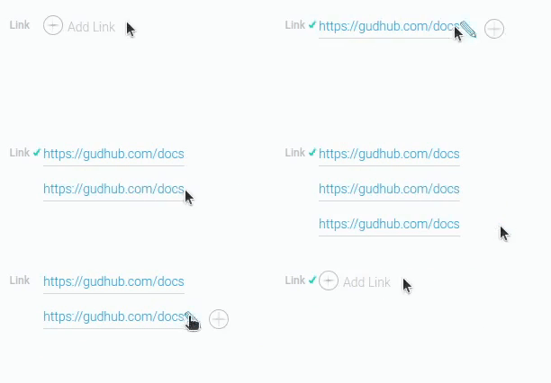
If this option is enabled, the field takes a multiple value. Multiple mode is almost no different from single mode. Only the add button appears. It is obviously used to add a new value.
Show in Iframe
The second setting is also the switch that is responsible for the additional feature. Namely, when it is enabled, the link's website will be displayed in a small window below the input field.
Some sites cannot be displayed here because they do not allow it.
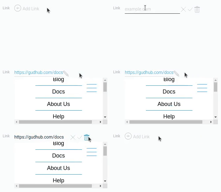
In this window, all the functionality of the entered site will be available. But its default size is often too small for this. You can change it using certain settings in the Element Style options.
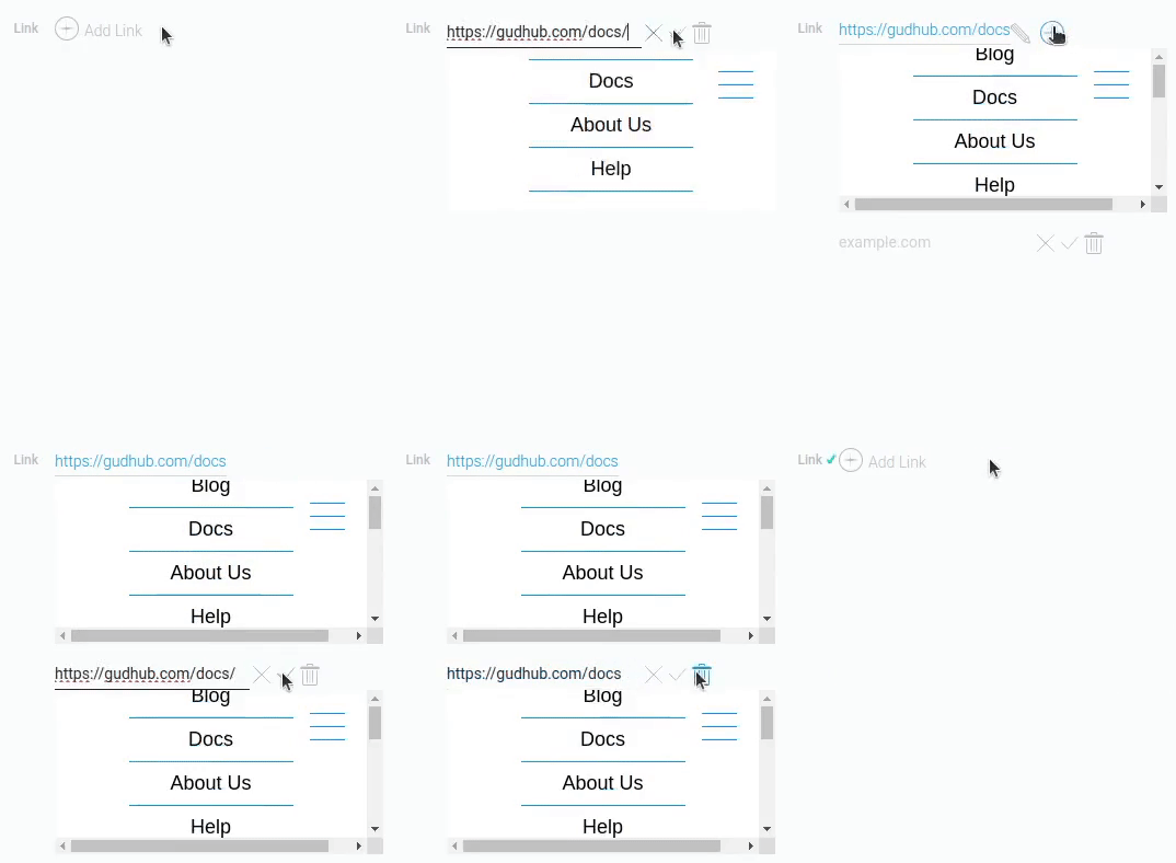
In case of simultaneous use of the Multiple and Show in Iframe, the corresponding site will be displayed under each of the values separately.
In general, absolutely all settings and tools that are valid for a single value are available for each value individually in multiple mode. Also, the custom frame size will be applied to all links.
Element Style
The style has only standard options until one of field settings is enabled. About standard set of options you can read in Setting Overview and interpretation types are described below.
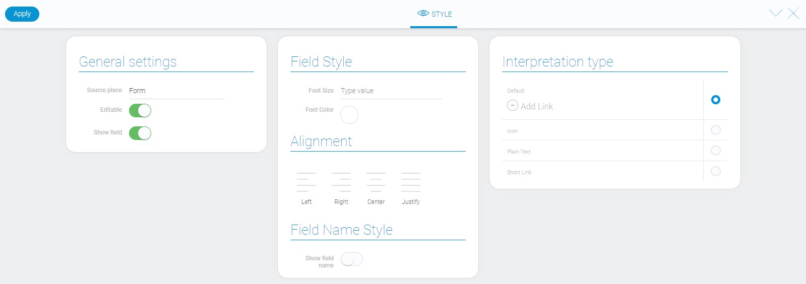
General Settings
Link element has two special style options. They appear only when iframe is enabled in field settings.
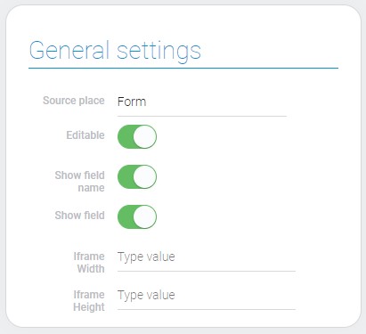
| Name | Description |
|---|---|
| Iframe Width | allows to set the width of Iframe |
| Iframe Height | allows to set the height of Iframe |
Iframe Width and Height
There is a special function that allows you to display the site under the link field in a small frame. You can change its size using 2 settings: Iframe Width and Iframe Height. They are literally additional settings for Show in Iframe.
Both settings default to pixels if no other units are specified.
The list of measurement units that accept these settings is quite small. This table lists all of them:
| Name | Description |
|---|---|
| % | works relative to the container where the iframe is located |
| px | the only absolute length; it is used when the entered units are not available for this element |
| vw, vh | works as usual, but the location is shifted relative to the container |
By default, the width is 300 pixels and the height is 153 px.
Filtration
Link value is very similar to text element one. So, there many filters for its filtering too.
- Contains(or)
- Contains(and)
- Not contains(or)
- Not contains(and)
- Equals(or)
- Equals(and)
- Not equals(or)
- Not equals(and)
- Value
Interpretation
Almost all interpretation types allows to follow the entered link. After clicking, the appropriate site will be opened in a new browser tab.
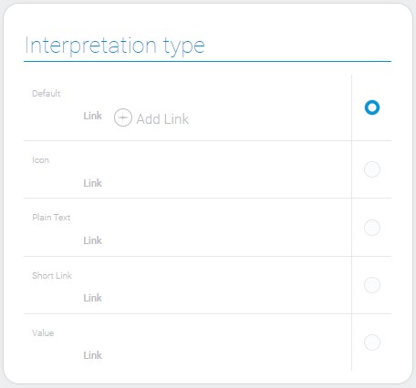
Default
The default interpretation allows to enter link into field, update and delete it, and displays it as a text.
Icon
This is the only type of link interpretation that does not allows to follow the entered link. It displays link as an icon.
Plain Text
This is an interpretation type that displays links and allows to follow them after clicking, but does not allows to edit them.
Short Link
This interpretation displays only word 'Link' instead of full name but steal allows to open site by clicking on it. In this case, link is uneditable too.
Value
This type displays only the link entered in this field.
Value Format
The value of the link element is an entered URL as a string type. For multiple values, URLs are saved separated by commas.
{
    "field_value": "gudhub.com,example.com"
}
Data Model
This element has quite small data model.
{
    "data_model": {
        "interpretation": [],
        "multiple": 0,
        "showIframe": 1
    }
}
| Name | Type | Description |
|---|---|---|
| interpretation | array |
contains all link interpretations |
| multiple | boolean |
shows whether the element accepts a multiple value |
| showIframe | boolean |
shows whether iframe active or not |

 Edit document