Google Map
Google Map is a gh-element that allows you to display items on a map depending on their location coordinates. Those coordinates are determined by the related GPS Coords element.
Items for which this field is not filled in are not displayed on the map.

Each mark on the map corresponds to a specific item. Therefore, when you click on any of the marks, the item associated with it will open.
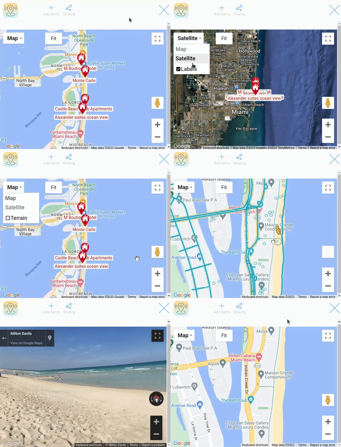
The current element also has functionality for easy map navigation. They allow you to change the map resolution, change the display style, use Street mode and Full screen mode.
Functional Characteristics
The Google Map is a unique gh-element that is used when you use location in items. It can be used to create a real estate application. There, the user can map apartments for rent and sale. Such an application would also be suitable for travel agencies. Here you can mark all available tours and store information about them. In the case of personal use, it can be a travel diary. That is, the user can save the places they visit with photos and notes. Also suitable for trip planning.
And this is only a small number of places where the card can be used.
Element Options
The google map has six groups of settings. Each of them configures different parts of element.
Field and Map Settings
The first group is the standard field settings. It does not have any additional options.
The second group allows to configure the map and source data.
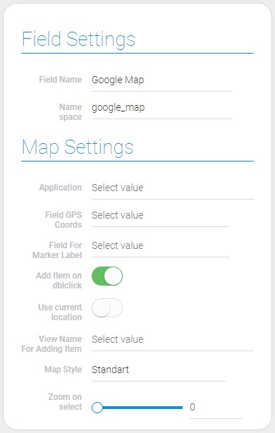
| Name | Description |
|---|---|
| Application | allows to select the source application; details... |
| Field GPS Coords | allows to select the field from which the GPS coordinates will be taken; details... |
| Field For Marker Label | allows to select the field whose value will be used as the marker name; details... |
| Add Item on dblclick | allows the user to add a new element after double-clicking on the map; details... |
| Use current location | allows to mark the current user location on the map; details... |
| View Name For Adding Item | allows to select which view will be opened after double-click; details... |
| Map Style | allows to select the style of the map; details... |
| Zoom on select | allows to set the zoom value; details... |
Application
The first element setting is the most important one. It allows you to select the source application from your app list for the current gh-element. Most of the following settings get their data from this application.
Items of the current application will be displayed on the map as marks.
Field GPS Coords
This is the setting that determines the coordinates of the item mark on the map. Here you have to select the GPS Coords element from the app.
To be displayed on the map, each object must have this field filled in.
Also, this field will be automatically filled in when the item is created by double-clicking. This feature is made available by Add Item on dblclick.
Field For Marker Label
The map marker consists of marker itself and its label. To display any text on this label, you need to select the field from which the text for it will be taken in this setting.
You can use many different gh-elements in it. In general, any element that can display data in text format, such as Text, Number, Item Reference, Date, etc. will do.
Add Item On Dblclick
This is a setting that allows you to enable the items adding by double clicking on the required location. This means that if it is enabled and the user double-clicks anywhere on the map, an item with the saved marker coordinates will be created.
Specifically, a view for adding items will open, allowing the user to fill in the item and then apply it.
When it is enabled, an additional setting appears below that is important for configuring the feature.
Use Current Location
The current setting allows you to enable user location detection. This means that the user's current location will be displayed on the map as an unlabeled mark.
In order for this feature to work, the user must authorize the use of their location in browser security settings.
View Name For Adding Item
The current setting is important for setting up double-click addition of items. Here you have to select the view that will be opened as an item template.
This setting appears after you enable the Add Item On Dblclick setting.
After the user fills in the item and applies it, the item's mark will appear on the map.
Map Style
The current setting is designed to customize the map. It allows you to set one of three available styles.
- Standart - looks like the classic Google map
- Retro - displays map in pink colors with a retro marks
- Night - allows the map to be displayed in dark colors
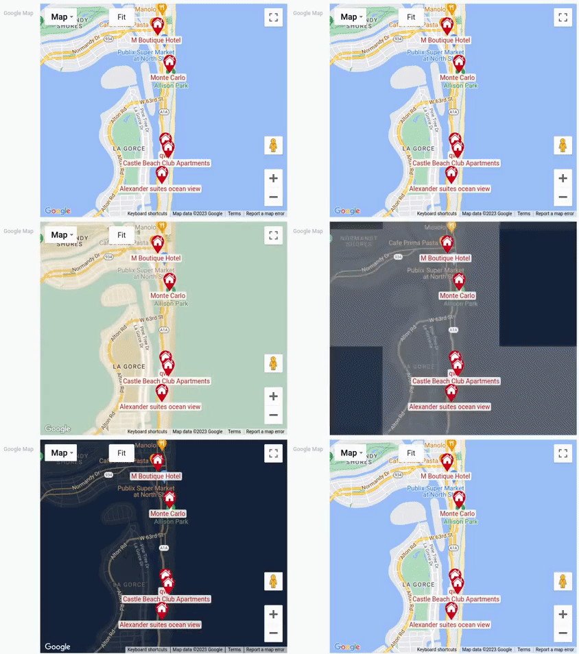
After selecting the map will be constantly displayed in that style.
Zoom On Select
This is the range bar where you adjust the map zoom value. It zoom out of the map around the selected label by a certain amount. This allows you to focus on the map label.
The zoom value ranges from 0 to 23, where the last number is the maximum value. You can set the zoom amount using the slider or by typing in the field next to it. In general, this setting works like the Range element.
Hover/Click Action and Marker Filter
The following three groups of settings allow you to configure marker actions and filter items for display on the map.
The first one configures the hover action. The second one configures the click actions. And the last one allows you to add filters to customize which objects will displayed on the map as markers and which will not.
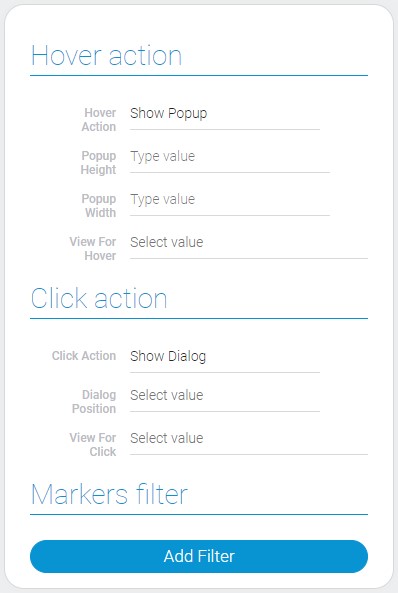
| Name | Description |
|---|---|
| Hover Action | allows you to select an action after hovering the cursor; details... |
| Popup Height | allows to set the height of the popup; details... |
| Popup Width | allows to set the width of the popup; details... |
| View For Hover | allows to select the view that will be displayed in the popup; details... |
| Click Action | allows to select the action after clicking on the marker; details... |
| Dialog Position | allows to select the position in the browser window; details... |
| View For Click | allows to select the view that will be displayed after clicking on the marker; details... |
Hover Action
This is the main setting of the current block. It helps you determine how a mark on the map will react when user hovers over it. Currently, there are only two types of pop-ups or disabling action available.
- Show Popup - enables a pop-up window, the size of which you can customize using the following settings.
- Google Popup - enables the default Google pop-up window.
- None - allows you to disable the hovering action.
Depending on the selected value, other settings will differ.
Popup Height
The next setting allows you to configure the height of the custom pop-up. The size of the pop-up window is specified in pixels. So, here you can enter the height value in pixels.
Along with the following setting, the current setting is only available if Show Popup is selected in the Hover Action.
Popup Width
Just like the previous setting, the current one allows you to configure the size of the custom pop-up. The height of this window depends on it.
As noted above, this option is available only if the Show Popup option is selected.
View For Hover
If you selected a pop-up window as a hover action, you also need to select the view that will be displayed there. The current setting allows you to select a view option from the application.
The view selected here is used when Show Popup or Google Popup is selected in the Hover Action.
Click Action
The current setting allows you to select the action that will happen after clicking on the markers. There are three options, but only two of them are actions. The last one allows you to disable any action.
- Open Item - allows user to open certain items by clicking on any marker.
- Show Dialog - allows the user to open items in a large pop-up window, the location of which is determined by the following setting.
- None - allows you to disable any action after clicking on a map marker.
Dialog Position
The current setting is unique to the Show Dialog action. This lets you set the position of the dialog window in relation to the screen. Namely, you have to choose the side from which the pop-up window will open.
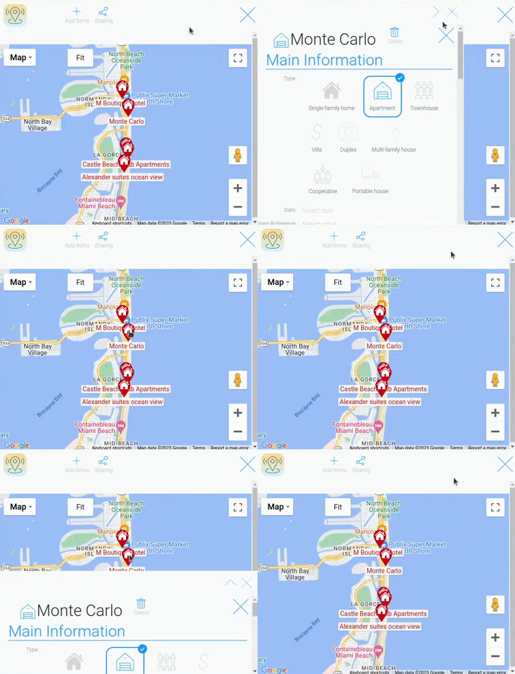
There are three available positions for the dialog:
- Left
- Right
- Bottom
They indicate the location from which the pop-up will be opened. You can also open the dialog tab in full screen.
View For Click
Since the main action after clicking on the mark is aimed at opening items, you need to select a view. So, the current option where you have to select the view.
The selected view will open when Open Item is selected and will be displayed in a pop-up window when Show Dialog is selected.
Markers Filter
This is the block that consists of only one setting. This setting is a filter that allows you to determine which items are displayed on the map and which are not. It works as a Filter element.
Markers
This group of settings allows to create and customize different styles of markers.

| Name | Description |
|---|---|
| Icon Color | allows to select the color of the marker icon; details... |
| Icon | allows to select the marker icon; details... |
| Background Color | allows to select the color of the marker background; details... |
| Conditions | allows to set the conditions of the marker usability; details... |
| Edit | allows to edit or delete the marker style; details... |
Icon Color
The first customization setting allows you to set the color of the icon on the map mark. It works in the same way as the Color element. Therefore, you can choose any color for the icons of a particular group of items.
Icon
Use the current setting to select the icon for the current item group. This is literally an Icon that opens a set of available icons. Like the rest of the settings in this block, icons are selected for each type of marker separately.
Background Color
Just like the color of the icon on the marker, you can change the color of the marker itself. The Color allows you to choose an any color for the markers of the current option.
Conditions
This setting allows you to define which items will use the current style. Items are selected according to the conditions of the filters. Conditions consists of the Filter element, which provides tools for customizing filters.
Edit
The last setting is designed to allows you edit or delete the current option. It contains two buttons, each of which is responsible for different functions.
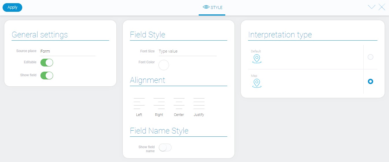
Element Style
Despite the large number of settings and complex functionality, the google map has only standard style settings. There is also not much variety in the types of interpretation.
Filtration
You can filter the item by whether the map contains markers. Only the Value filter allows to do that.
Interpretation
The google map has two interpretation types:
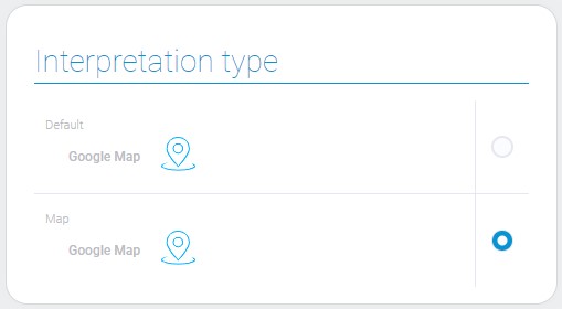
Default
The first interpretation displays the element as an icon.
Map
The second type is an interactive map that displays markers.
Value Format
This element does not have any field value.
Data Model
The google map data model contains all the configurations of the current item:
{
    "data_model": {
        "app_id": "28752",
        "click": {
            "side": "bottom",
            "type": "open_item"
        },
        "click_view_id": "1528082",
        "field_id": "679192",
        "filters_list": [],
        "filters_list_color": [{
            "background": "#5e3987",
            "color": "#ee4eb9",
            "filters_list": [],
            "marker": "configuration"
        }],
        "hover": {
            "side": "",
            "type": "show_popup"
        },
        "hover_view_id": "1528082",
        "interpretation": [],
        "label_field_id": "679191",
        "map_style": "retro",
        "popup_height": "10",
        "popup_width": "10",
        "zoom": 0
    }
}
| Name | Type | Description |
|---|---|---|
| app_id | string |
contains ID of the source application |
| click | object |
contains click action settings |
| side | string |
contains the side of the browser window where the popup will be opened |
| type | string |
contains the type of the action after clicking on the marker |
| click_view_id | string |
contains ID of the view that will be opened after clicking on the marker |
| field_id | string |
contains ID of the field containing the gps-coordinates to determine the location of the markers on the map |
| filters_list | array |
contains all items filters and their settings |
| filters_list_color | array |
contains all markers styles and their settings |
| background | string |
contains the hex code of the marker background color |
| color | string |
contains hex code of the color of the marker icon |
| filters_list | array |
contains all filters that determine which items will use current marker style |
| marker | string |
contains name of the marker icon |
| hover | object |
contains hover action settings |
| side | string |
contains the side where the popup window will be located after hovering over the marker |
| type | string |
contains the type of the action after hovering over the marker |
| hover_view_id | string |
contains ID of the view that will be displayed in the popup window after hovering over the marker |
| interpretation | array |
contains all element interpretation types |
| label_field_id | string |
contains ID of the field that will be used for markers labels |
| map_style | string |
contains selected style of the map |
| popup_height | string |
contains height of the popup window |
| popup_width | string |
contains width of the popup window |
| zoom | number |
contains value of the map zoom |

 Edit document