Filter Tabs
Filter tabs is a gh-element that allows to create different groups of items using filters and to switch them with the help of created tabs. This means that you create a tab in the element's settings and then set filters that define the items that will be included in this tab.
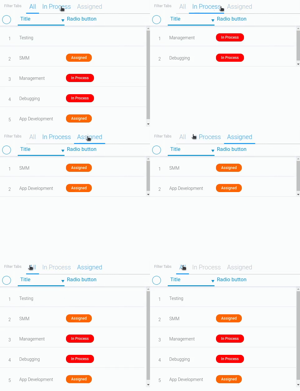
By switching tabs, the user can toggle the filters that can be applied to items. This allows you to organize the content of the application.
Functional Characteristics
This gh-element is mainly used to organize items in the application. It allows you to create a more functional application with a minimum number of gh-elements. The advantage of this filter is that user can find the items you need in one click. Set up filters and create categories or groups of items by subject, status, date, or other fields.
Element Options
Options of the current element are divided into tabs settings and, actually, settings of the element field.
Field Settings
As usual, the field settings consist of standard and unique additional options.
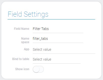
| Name | Description |
|---|---|
| App | allows to select the application for connection; details... |
| Bind to table | allows to select the element to which the filter will be connected; details... |
| Show icon | allows to display the icon near the filter tab name; details... |
App
A filter is designed to filter items that are stored in an application. So, obviously, you need to select the application whose items will be filtered. This is what the first Filter Tabs setting is for. Here you have to select the elements of the application that you want to divide into tabs.
This application must be the same as the one selected in the item from the next setting. Because the filtering results will be displayed there.
Bind to Table
The list of all items is displayed in elements like Table and Cards. The filtered groups of items are also displayed there. So, in this setting, you have to select the gh-element to which the Filter Tabs will be bound, and where the matching items will be displayed depending on the tab user clicks.
The gh-element selected here must be from the same application as the Filter Tab. And they must both have the same application in their settings.
Show Icon
The last setting in this block is the customization setting. It allows you to define whether there will be icons before the tab names. If this option is enabled, new options will appear in the Tabs settings.
Most often, icons on tabs are used for additional labeling of tabs by items theme or simply as decorations.
Tabs Settings
These group of settings allows to configure each of your tabs and add the new ones. They vary depending on the Show Icon mode.
-
If Show Icon is off, tabs settings do not consist extra options.

-
If Show Icon is enabled, the two additional options will appear.

| Name | Description |
|---|---|
| Name | allows to enter the name of the filter tab; details... |
| Icon | allows to select the icon for the filter tab; details... |
| Color | allows to select the icon color; details... |
| Filter | allows to filter the items that will be displayed in filter tab; details... |
| Show by Default | allows you to determine which tab will be opened by default; details... |
| Edit | allows to edit or delete the tab; details... |
Name
This is a setting that allows you to enter tab names. There is a separate setting for each tab. This name will be displayed in the tab menu and will allow the user to distinguish between tabs.
Icon
The current setting is intended to select an icon for each of the tabs separately. When you click on it, a pop-up window with icons opens. There you can choose one of the icons for your tab. That is, this setting works in the same way as the Icon element.
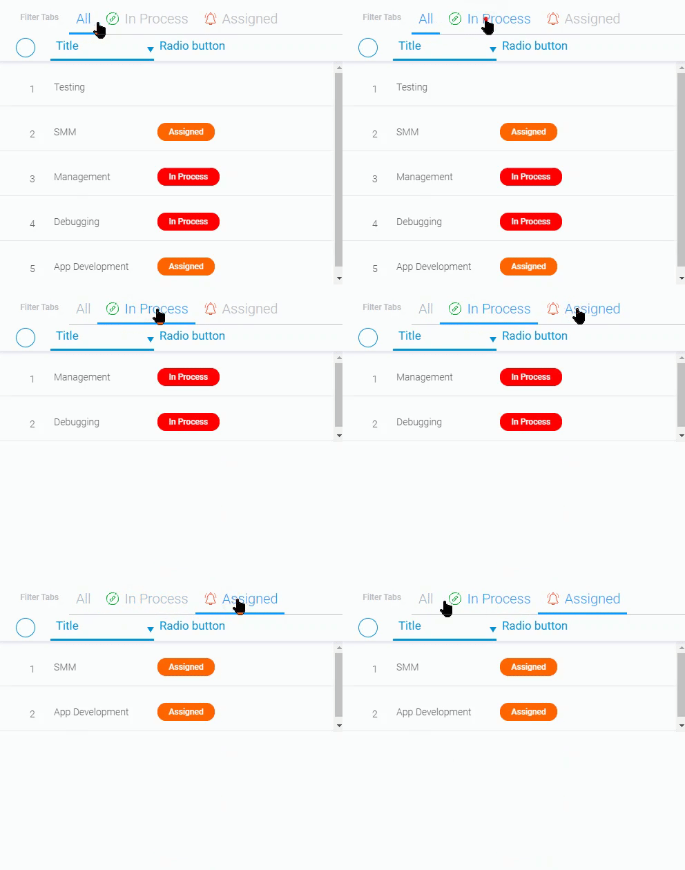
After all the icons are selected and the settings are applied, each customized tab will be displayed with the corresponding icon at the beginning.
This setting appears when the Show Icon setting is enabled.
Color
This is another setting that appears after you enable Show Icons. It allows you to set the color for each of the icons separately on different tabs. The Color setting works in the same way as the Color element. Use it to customize your tabs.
Filter
As mentioned earlier, items are divided into tabs using filters. Filters for each tab are configured separately using the current settings. It works the same way as the Table Filter. This means that when you click on it, a sidebar will open where you can choose to which fields and what types of filters will be applied.
Show by Default
This setting allows you to define the tab that will open by default as soon as the application is opened. Each tab has such a switch in its settings and the current setting works separately for each of them. So, if you want a particular tab to open first, you should enable this switch for that tab.
Only one tab can be the default at a time.
Edit
The last setting allows you to edit and delete the tab of the filter. It consists of two buttons that are responsible for its functionality. Each tab has a separate Edit setting.
Element Style
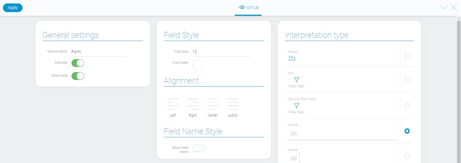
The style of the filter tabs can be configured with the help of standard options. They are detail described in Setting Overview. Since each item has unique interpretation types, the current types are shown in end of article.
Filtration
This element is designed to filter other elements, but cannot be filtered itself.
Interpretation
The filter tabs has a big number types of interpretations, but most of them are quite similar.
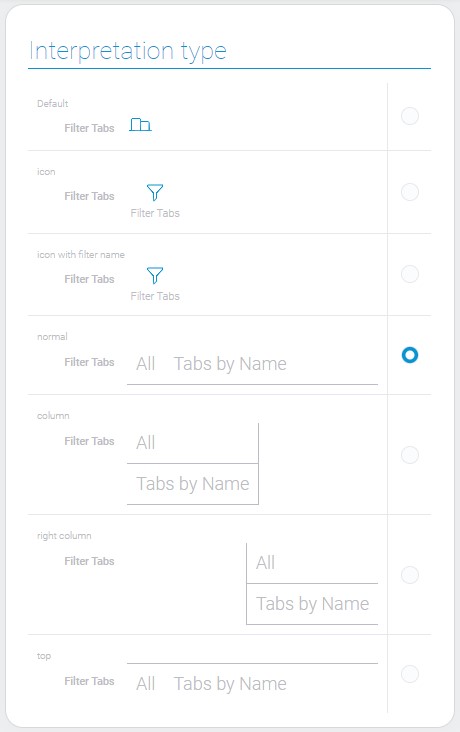
Default
This interpretation type allows to display the element as an icon. This is the only one which does not have any action after clicking.
Icon Interpretation
This is the interpretation type that displays the element as an icon that opens the list of filter tabs after clicking.
Icon with Filter Name
This is the same type of interpretation as the previous one, but with the filter name underneath it.
Normal
It allows to display filter tabs above the line. This is useful for placing the element above some table or container.
Column
This element displays the tabs as a column of tabs names in the left side of the container.
Right Column
This is the column of tabs names that is displayed in the right part of the container.
Top
This interpretation type that allows the tabs names to be displayed under the line. It is convenient to place it under some element.
Value Format
Such as other filters, this one does not have any value.
Data Model
Since filter tabs has many parts which have to be configured, it also has large data model.
{
    "data_model": {
        "app_id_bind_to": "28704",
        "current_tab": 0,
        "field_id_of_table": "677653",
        "filter_settings": {
            "fields_to_view": [{
                "field_id": 677648,
                "show": 0
            }]
        },
        "interpretation": [],
        "options": [{
            "color": "#05b52c",
            "filters_list": [],
            "icon": "home",
            "name": "All"
        }],
        "send_message": {
            "app_id": "33922",
            "field_id": "239818"
        },
        "show_icon": false,
        "use_default_value": false
    }
}
| Name | Type | Description |
|---|---|---|
| app_id_bind_to | string |
contains the ID of the application to which the item is associated with |
| current_tab | number |
contains the ID of the current filter tab |
| field_id_of_table | string |
contains the identifier of the table that is associated with the filter |
| filter_settings | object |
contains all filter settings |
| fields_to_view | array |
contains all application fields |
| field_id | string |
contains the field ID |
| show | boolean |
shows whether the field is displayed in the filter list or not |
| interpretation | array |
contains all element interpretation type |
| options | array |
contains all filter tabs and their settings |
| color | string |
contains the hex code of the icon color |
| filters_list | array |
contains all filter settings of the option |
| icon | string |
contains the name of the selected icon |
| name | string |
contains the name of the tab |
| send_message | object |
contains the data from settings |
| app_id | string |
contains ID of the application with that the element is connected |
| field_id | string |
contains the table field with which the element is connected |
| show_icon | boolean |
shows whether the icon is displayed or not |
| use_default_value | boolean |
shows whether the default value is used or not |

 Edit document