Date
Date is a gh-element that allows user to store date and time. Namely, it allows you to select any value in the Date Picker and save it for later use.
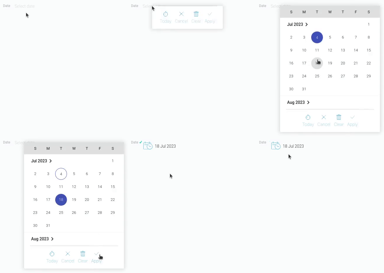
To open the picker, the user needs to click on the field. It has a fairly big set of settings for editing and can be modified using element settings.
Date Picker
Date Picker is a pop-up window that opens when user clicks on the date field. It is the main instrument for the value editing.
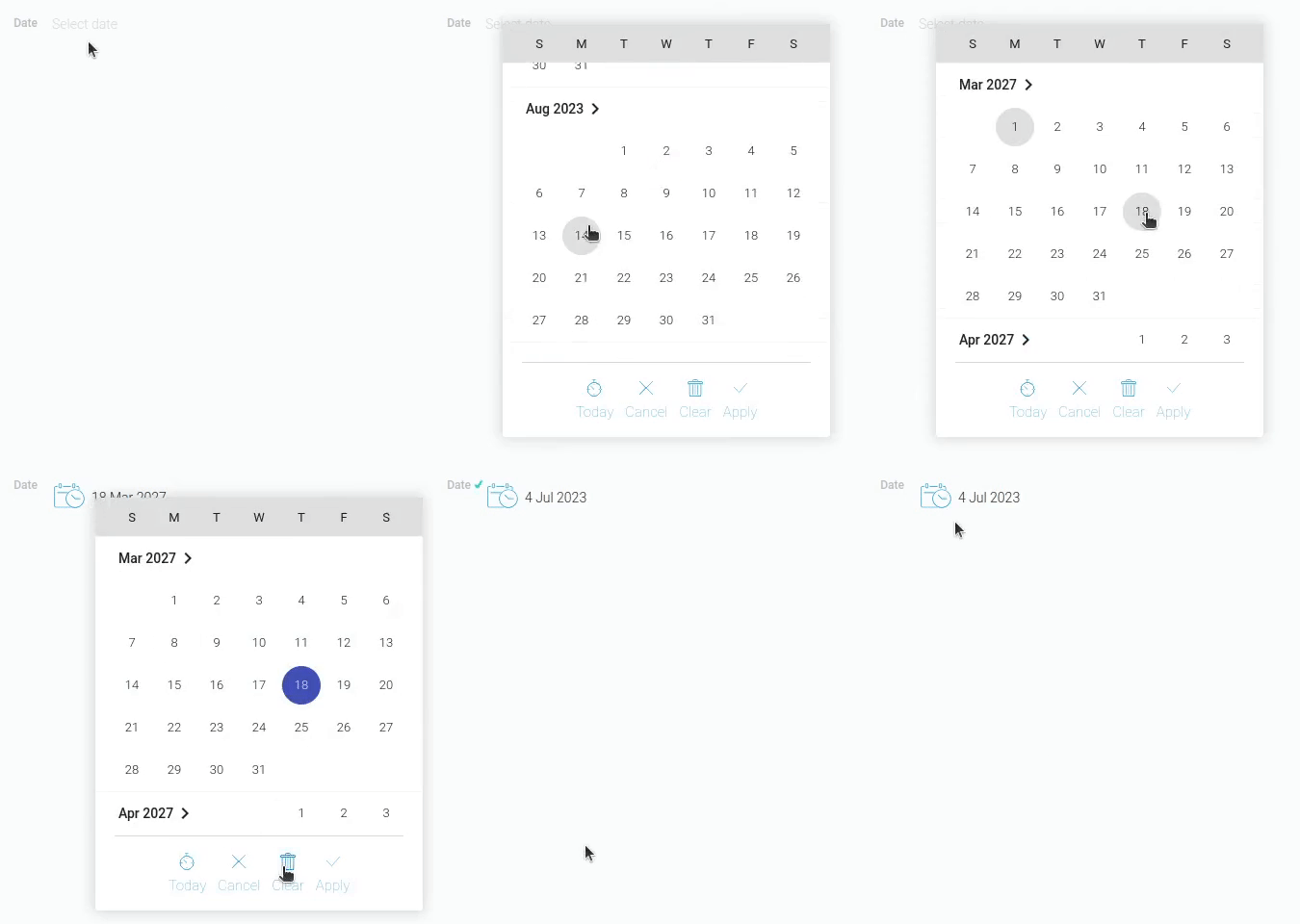
It consists of three different parts:
- Calendar
- Set of Buttons
- Time Picker
The first two of them are required by default, and the last one is optional. Time picker is available only when a particular option is enabled.
Calendar
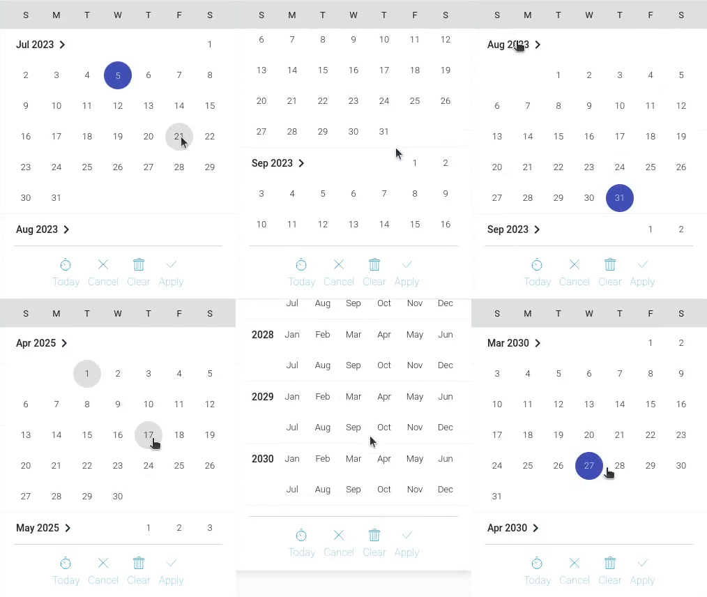
This is a big area that looks like a calendar. This is where the user has to select the dates. There is also a list of months. It allows the user to select a month of a particular year and then open it as a day calendar.
Set Of Buttons
All buttons of the picker are collected at the bottom of the window. There the user can find the following buttons:

- Today - automatically set the current time and day as values.
- Cancel - close the window without saving changes.
- Clear - clear the current field.
- Apply - allows user to save the selected value.
Functional Characteristics
The element main purpose is to store any date and time. It allows users to create different reminders and manage their schedules. Date can be used as an independent element and as an auxiliary element for other elements. So, use it to configure:
Also, like many other gh-elements, it can be used in automation.
Element Options
This gh-element has not many options, but it has its own specificity.
Field Settings
In addition to standard Field Name and Name Space, date element has only two options in field settings.
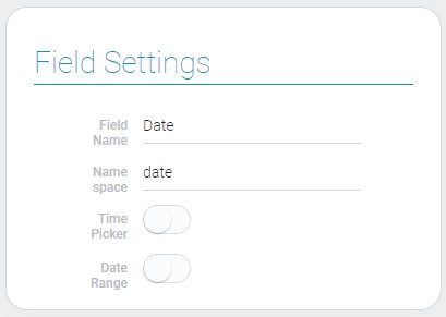
| Name | Description |
|---|---|
| Time Picker | allows to display and update time along with date; details... |
| Date Range | allows to use period of time as a value; details... |
Time Picker
This setting allows you to configure whether the time picker will be available. It is part of the date picker, so it will appear in it. Accordingly, this will allow the user to specify the time in the element. It is very useful to specify the time of an event.
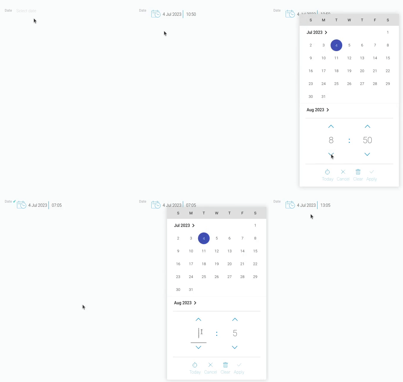
The time can be displayed in two formats, depending on the Time Format option. However, user can only enter the time in 24-hour format.
Date Range
This is an option that allows the user to save a certain period of time in the current element. The user can select one of the proposed period options, but after that the value can be edited.
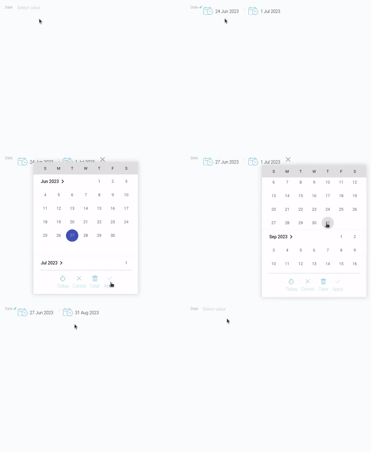
There are quite a few time periods offered:
- Yesterday
- Tomorrow
- Now
- Today
- Past Week
- Current Week
- Next Week
- Next 7 Days
- Past 7 Days
- Past Month
- Current Month
- Next Month
- Next 30 Days
- Past 30 Days
- Current Year
- Next Calendar Year
- Past Calendar Year
This option causes the value to be saved in a different format.
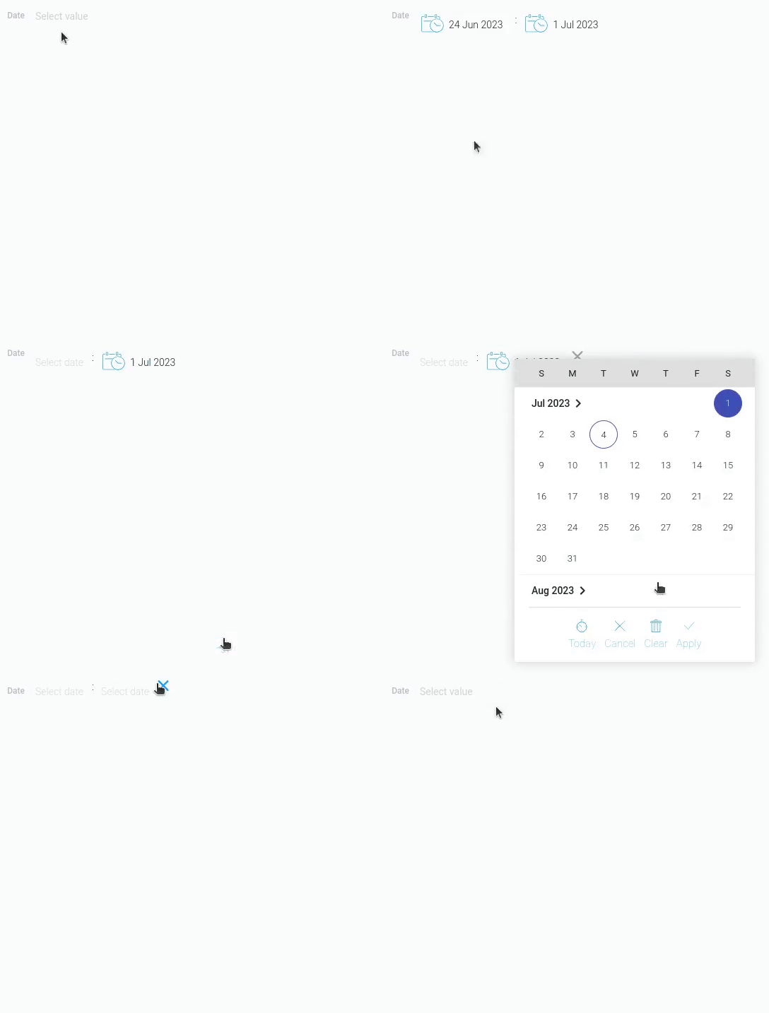
To clear a full field and select another period option, user can click the cross at the end of the field. To clear one of the slots, clear the value in the corresponding date picker.
Time Format
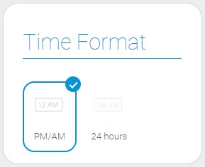
This option allows you to select the time display format. There are two main time formats used in different countries.

And it is between them that you can switch in the current setting.
Note that this setting works only when Time Picker is enabled.
| Name | Description |
|---|---|
| PM/AM | displaying time in 12-hour time format |
| 24 hours | displaying time in 24-hour time format |
Default Value Settings
This set of options allows to configure the date default value. The date element has only two such parameters.
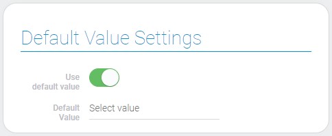
| Name | Description |
|---|---|
| Use default value | shows the default value is used or not; details... |
| Default value | allows to update default value; appears when Use default value is on; details... |
Use Default Value
This is the setting that allows you to use the default value for the current element. This switch determines whether the default value is available or not.
If enabled, the option to select a default value will be available.
Otherwise, the default value is not displayed.
Default value
This is the main setting for determining the default value of the gh-element. Here you can select the time period that will be saved in the field when the item is newly applied.
It appears only when the Use Default Value option is enabled.
As noted above, only one of the existing periods can be selected from the list. All of them are counted from the moment the account is created:
- Today
- Tomorrow
- Next 7 days
- Next 10 days
- Next 14 days
- Next 30 days
- Next Calendar Year
- Yesterday
- Past 7 days
- Past 10 days
- Past 14 days
- Past 30 days
- Past Calendar Year
Then the default value is Today, the element will store the date and time the item was applied. That value is in the time zone of the location where user applied an item. It will not adapts if the item is opened in other time zones.
That is, if in London the product is applied at 8 pm, in Washington it will show 3 pm.
Element Style
Despite of variety of interpretations, date element has all standard style settings. You can read more about them in Setting Overview. Also, this element has additional functions that allows to configure the format of the element value.
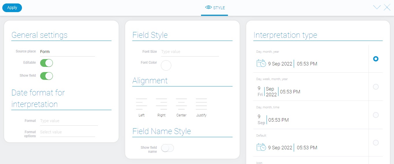
General Settings and Date Format For Interpretation
The first block of style options contains the standard general settings and settings of date interpretation format. As was mentioned above, these settings allows you to customize the value of the date gh-element. This format can be displayed in GudHub using only the Value interpretation type.
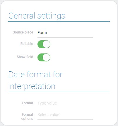
| Name | Description |
|---|---|
| Format | allows to enter the format of the date value; details... |
| Format options | allows to select one of ready-made formats; details... |
Format
The current setting allows you to set the custom format of the date value. It accepts absolutely any format. For example:
- MM/dd/yyyy
- dd-MMM-yy
- yyyy-yyyy
In this format, the value will be displayed to the user in the element. It can be displayed in this way only if the Value interpretation type is used.
When entering your own format, Format Options must be empty.
Otherwise, the format of the selected option in Format Options will be entered in the current setting field.
Format Options
Unlike the previous setting where you have to enter your own value format, this one allows you to select one of five formats:
- 2020/6/22 16:30:45 (Default)
- 22.06.2020
- 06-22-2020
- 22.06 16:30
- 22.06.2020 16:30
When you select one of them, the formatting function will be filled with the appropriate format.
Thus, the current option works in the same way as the previous one, differing only in the way the format is entered.
Filtration
There are special filters for date elements:
Interpretation
This gh-element has a big variety of interpretation types. Interpretations can be slightly different, depends of Time Format, Time Picker, and Date Range values.
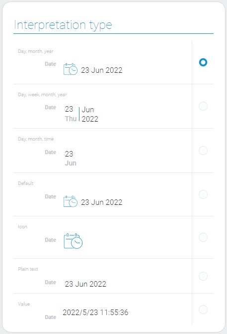
Day, month, year
The first interpretation allows to display full date with an icon and time.
Day, week, month, year
This one allows to display full date, weekday, and time.
Day, month, time
Allows to display date as day and month, and time.
Default
Default date interpretation type is the same to the first one. It displays date as full date with icon and time.
Icon
Allows only the icon to be displayed and makes the date value uneditable.
Plain text
This is an interpretation type that allows date to be displayed as a full date and time.
Value
This type displays only the value of the field.
Value Format
Date element has quite simple value format.
{
    "field_value": "1640210419989"
}
Date value is a quantity of milliseconds from 1970 year to the specified date and time.
If Date Range is true, then the value will look like two dates in milliseconds separated with colon.
{
    "field_value": "1643621340000:1645090140000"
}
These values are added to the element due to Date Picker.
Data Model
Since this gh-element has not a big number of options, its data model is quite simple and small.
{
    "data_model": {
        "dafault_value": "",
        "data_range": 0,
        "default_field_value": 0,
        "hour_format": "hh",
        "interpretation": [],
        "time_picker": 1,
        "today_as_default_field_value": false,
        "use_default_value": false
    }
}
| Name | Type | Description |
|---|---|---|
| dafault_value | string |
contains date default value |
| data_range | boolean |
shows whether the date range is used or not |
| default_field_value | boolean |
shows whether default value is used or not |
| hour_format | string |
shows which time format is used |
| interpretation | array |
contains all date interpretations |
| time_picker | boolean |
shows whether time picker is used or not |
| today_as_default_field_value | boolean |
shows whether todays date is used as a default value |
| use_default_value | boolean |
shows whether the default value is used |

 Edit document