Color List
Color List is gh-element that consists of a list of colors and allows user to select one or few of them. To select any option, the user needs to click on the desired color. Selected colors are highlighted with a check mark.

To remove the check mark, click on the color a second time. When the user selects a different color, the check mark from the previous color is automatically removed.
Functional Characteristics
The current element is used mostly when you need the color selector for any products. So, it is mostly used for description of any products.

You also can use it in other cases. For example, use it as markers for your notes. That could be any statuses or hashtags.

That could be even a part of some surveys. Of course you can create your own usage for this element.
Element Options
This element has options that allows to configure it or set its values.
Field Settings
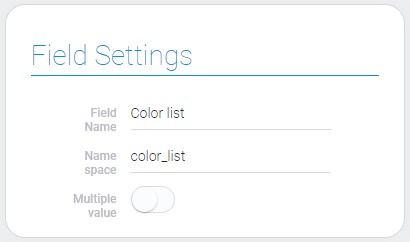
Field settings of this list contain options we are already familiar with. Field Name and Name Space are standard for all gh-elements.

| Name | Description |
|---|---|
| Multiple value | allows to select a few colors at the same time when it is on |
Multiple value
This is an option that allows you to configure how many colors the user can select. If it is true, user can select a multiple colors at the same time.

So this setting can be used for selecting a multiple color of some product. It can also be used as a status marker or as tags.
Options Settings
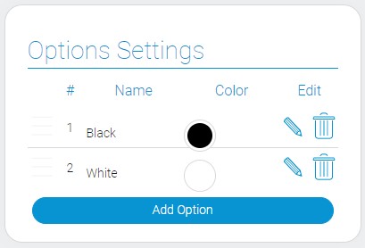
Options Settings is a table of options and their properties.

| Name | Description |
|---|---|
| Name | column that contains; details... |
| Color | selected option color; details... |
| Edit | buttons that allows to edit options;details... |
Name
The current setting allows you to specify any name for the color option. Here you can enter either color name for each option, product code, or even statuses and hashtags.

Selected values can be used to crate orders or for any automation processes.
The name is entered for each option separately.
Color
To choose the colors of the element options, you need to use the current setting. It allows you to choose a color for each option separately.

To select a color, open the color picker. It has two modes, which are described in Color article.
Edit
This is a setting that consists of two buttons. One of them allows you to edit an option and the other one allows you to delete it. There is a different pair of buttons for each option.

Editing an option means that you can change the name and color of a particular option. Deleting a color means removing it from the color list.
Element Style
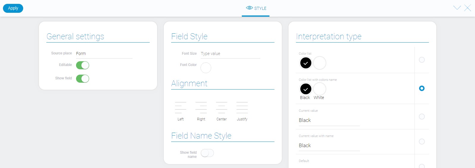
The style of this element can be configured with the only help of standard options and interpretation. Read about that in Setting Overview article.

Filtration
The color list elements can be filtrated out by the value name or by the presence of any value.
Interpretation
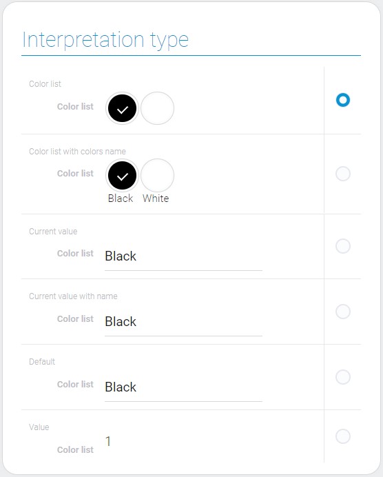
The color list has only many interpretation types:

Color list
This interpretation allows display list elements as color circles. Selection is marked with a check mark.
Color list with colors name
This type allows to display list elements as color circles with names under them. Selection is marked with a check mark.
Current value
This interpretation type allows to select color from the popup list and display its name.
Default
That allows the list to be displayed as an entry editable field. After clicking on it, the pop-up list will be appeared.
Value
This type displays only the ID of the selected color option.
Value Format
The color list value is the ID of the option that is selected in a string type.
{
    "field_value": "2"
}
If multiple value are enabled, IDs of all selected values will be stored in the field_value, separated by commas:
{
    "field_value": "2,4,5"
}
Data Model
The color list has data model which contains all of its options.
{
    "data_model":{
        "interpretation": [],
        "multiple_value": 0,
        "options": [{
            "color": "#000000",
            "name": "Black",
            "value": 1
        }]
    }
}
| Name | Type | Description |
|---|---|---|
| interpretation | array |
contains all interpretation types of the color list |
| multiple_value | boolean |
shows whether user select one or more colors |
| options | array |
contains option objects |
| color | string |
contains the color hex code |
| name | string |
contains the color name |
| value | number |
unique option ID |

 Edit document