Color
Color is a gh-element that allows users to select different colors and save them in the application. To select a color, the user needs to click on the circle. After that, the color picker will open.
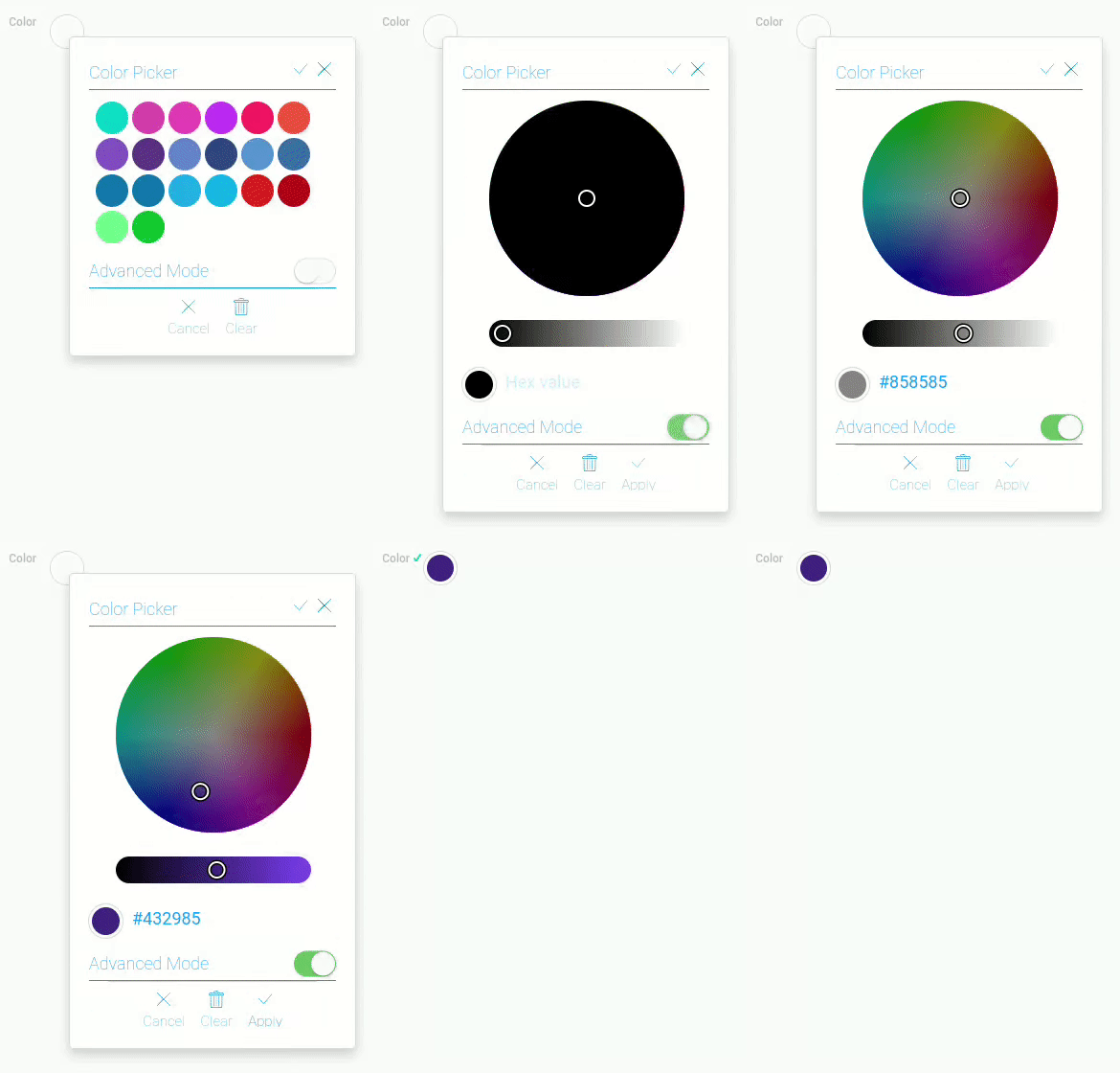
If the element already has a color, the circle will be colored in that color.
Color picker
Color picker is a pop-up window that allows to select the color. Two types of windows are offered for a comfortable choice:
Both allow the user to select a color value, but the difference is in the number of colors available.
Color picker is available only for Input With Name interpretation type.
There a standard set of options in both types of picker:
- Close button - allows to close the pop-up window
- Apply button - allows to save the selected color as a field value
- Clear button - allows to reset the field value
- Cancel button - allows to close the pop-up window without saving value
- Advanced mode switcher - allows to switch between picker modes
In addition, both modes have additional options, which are described in separate chapters below.
Standard Mode
The first element mode is the Standard mode. It offers a set of 20 colors for quick selection. It allows user to work quickly with the element and provides a wide range of colors.
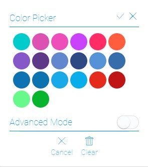
As mentioned above, this mode has both a standard set of options and a unique one. So, for this mode, a unique option is a list of ready-made colors that can be selected by clicking on them.
Advanced Mode
The Advanced mode is used to set any color from the color selector. Unlike the previous mode, this one allows the user to choose absolutely any color. This is all thanks to its unique settings.
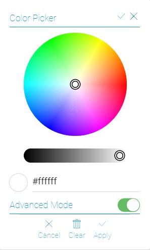
The options of this mode allows you to set any color:
- Color Wheel - allows to select the color hue
- Luminance slider - allows to set the luminance of the color and color wheel
- Hex code field - returns the hex code of the resulting color. You can also enter a hex code for the color you want. This color will be saved in the field.
These options, along with the standard ones, are in the current mode to expand the capabilities of the color picker.
Functional Characteristics
The current element is used in cases you need to save the color of something. For example, here you can choose the color of a product or set the color palette of any illustration. In addition, this gh-element can be used to get a Hex code of any color.
The Color element is also used in settings of different gh-elements:
It can also be used in online stores to set the color of the product.
Element Options
Color element has not variety options. You can only configure its field settings.
Field Settings
In field values you can set standard options and default mode.
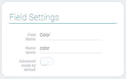
| Name | Description |
|---|---|
| Advanced mode by default | allows to use advanced color settings by default |
Advanced Mode By Default
This option allows to set a default mode of color picker. If this option is enabled, advanced mode is the default mode.
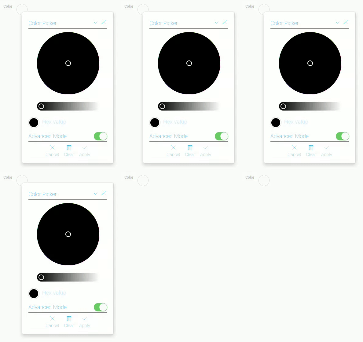
The default mode is the mode that opens first when you click on an item.
This is useful if you always need a large set of available colors, and it allows you to avoid wasting time switching between modes.
Element Style
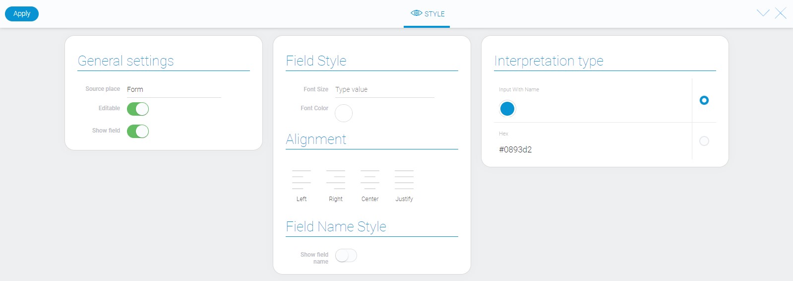
Style of the color element can be configures with help of standard options about that you can read in Setting Overview. Also, here you can configure its interpretation. Read more about it below.
Filtration
Despite that color value is a string, color element supports filtration by only Value filter.
Interpretation
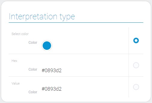
Color has only two interpretation types.
Input With Name
This is a type of interpretation that allows you to display the selected color in a small circle and open an interactive window after clicking on it.
Hex
This interpretation displays the hex code of the selected color and do not allows to edit this value.
Value
Through this type of interpretation, the value of the field is displayed.
Value Format
Color value is a string type data with a hexadecimal code of the selected color.
{
    "field_value": "#ffffff"
}
Data Model
Color data model contains only two properties.
{
    "data_model":{
        "advanced_mode_by_default": 1,
        "interpretation": []
    }
}
| Name | Type | Description |
|---|---|---|
| advanced_mode_by_default | boolean |
shows whether the advanced mode is used as a default one |
| interpretation | array |
contains all color interpretations |

 Edit document