Close Element
Close is a gh-element that allows to close the view of the application. More precisely, it is an action button that deletes the form and returns for previous view. It is used to close items and even applications.
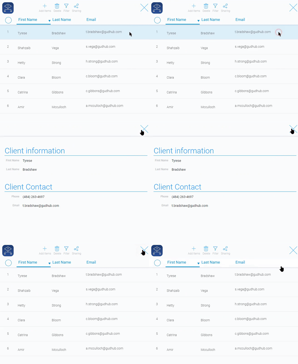
If this element is not in use, the only way to close any view is to click the Back button in your browser.
Functional Characteristics
The current element has one specific use case. Its purpose is to close application views.
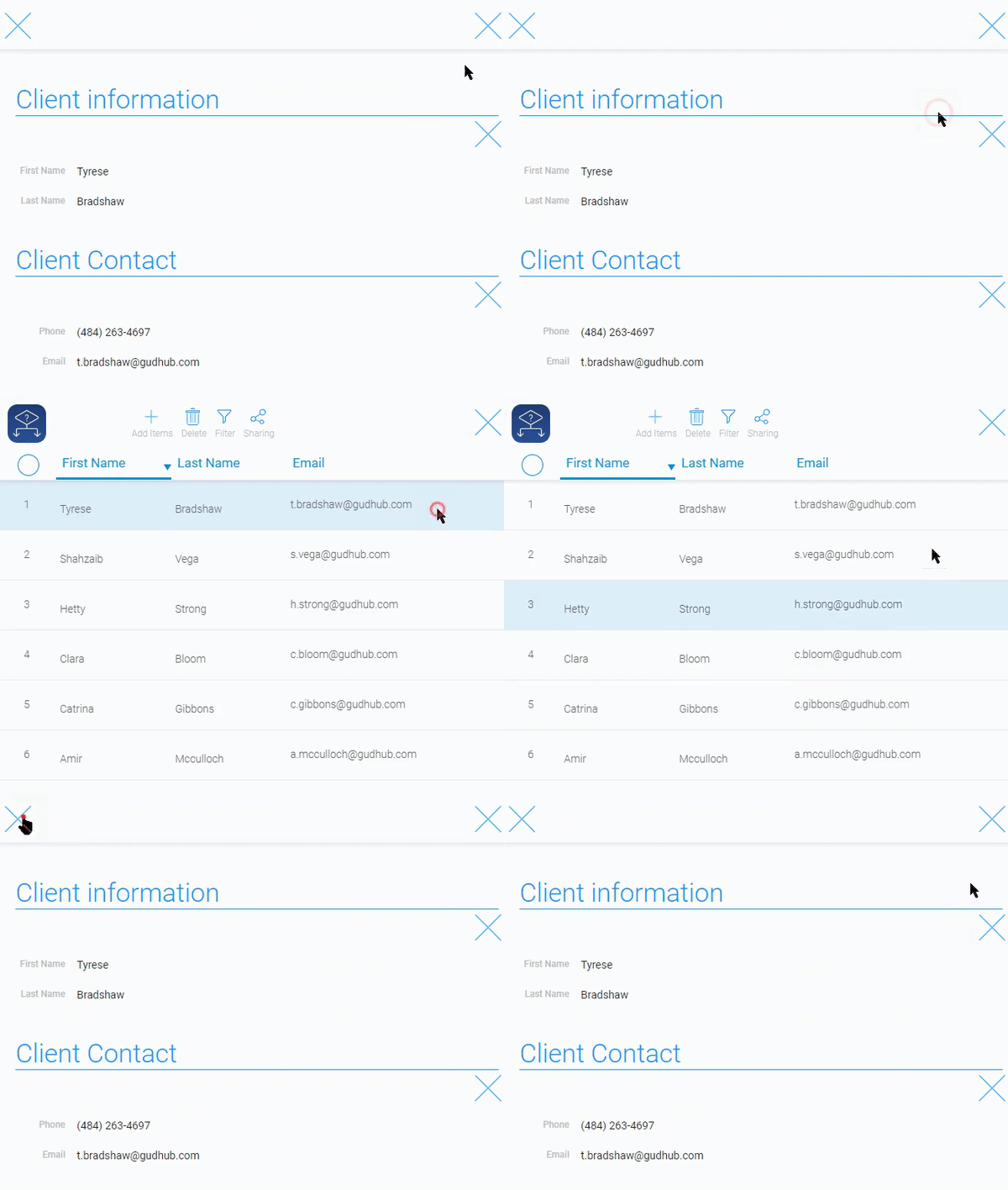
Usually, there is need to use more than one Close element in your application. Because it can be used an unlimited number of times in the same view.
Element Options
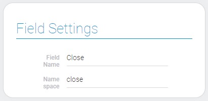
All element options are contained in Field Settings. Namely, close has only two options: Field Name and Name Space, that are standard for all gh-elements.
Element Style
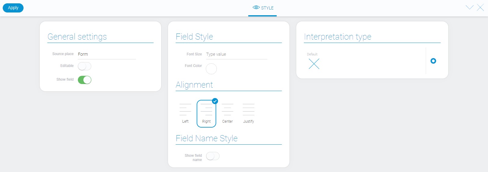
About style options of the close element you can read in Setting Overview, because they are standard. As for interpretation type, it describes below.
Filtration
The Close element is not filtered.
Interpretation
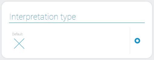
The close element has only one interpretation type called Default. Due to this the element is displayed as uneditable icon.
Value Format
Element Close does not have a value.
Data Model
This element has a pretty simple data model. There are only one property called interpretation.
{
    "data_model": {
        "interpretation": []
    }
}
| Name | Type | Description |
|---|---|---|
| interpretation | array |
contains all element interpretations |

 Edit document