Cards
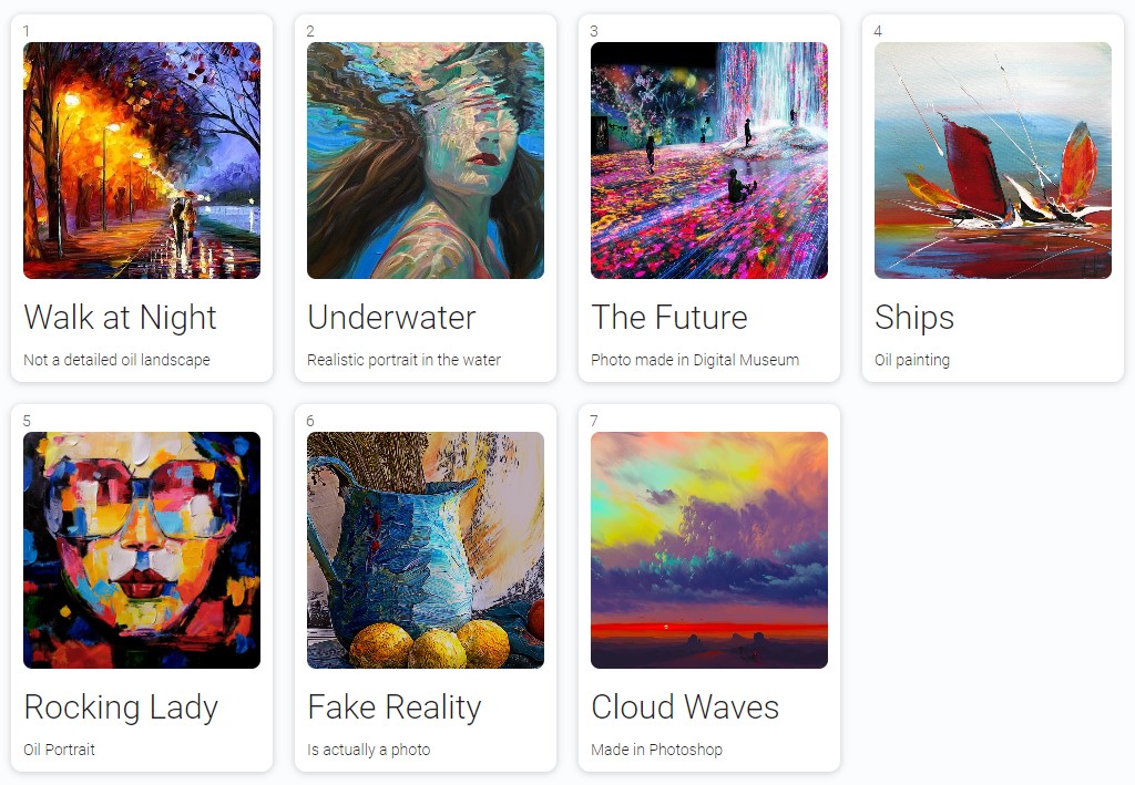
Cards is a gh-element that allows to display application items as cards. To be more precise, it can display view of items in it. This allows you to display all items on one page.
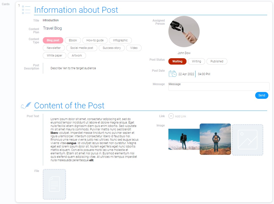
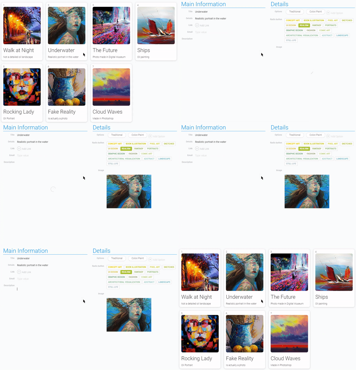
The peculiarity of this element is that the view displayed in it may differ from the view it opens. This allows you to create an interesting previews for your items.
Functional Characteristics
The Cards is quite similar to the table element by the logic of its work. But its customization options make the difference more significant. That all is because of work with different views. Depending on the appearance of the view in the card, the overall picture may be completely different. Add to this custom settings of this element and you will be able to redesign Cards for any of your needs.
Element Options
The element settings contains three groups of settings.
Field Settings
Cards settings contains of lots of different options for configuring the element.
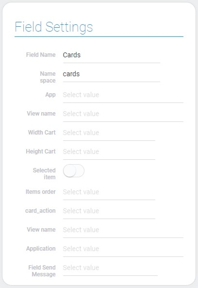
| Name | Description |
|---|---|
| App | allows to select the source application; details... |
| View name | allows to select the view that will be displayed in cards; details... |
| Width Cart | allows to select the width of cards; details... |
| Height Cart | allows to select the height of cards; details... |
| Selected item | allows to select cards; details... |
| Sort cards by | allows to select the field by which items will be sorted; details... |
| Items order | allows to select the type of cards order; details... |
| card_action | allows to select the action after clicking on card; details... |
| View name | allows to select the view that will be opened after the card action; details... |
| Application | allows to select the source application from which the field for the message will be selected; details... |
| Field Send Message | allows to select the field to which the message wll be sent; details... |
App
The current setting allows you to select the application from which data will be taken for the Cards configuration. Namely, the views of the selected application will be displayed in the cards and will open when you click on the card if the Card Action is open item.
You will be able to access application items through Cards, in other words, open them using cards.
View Name For Displaying
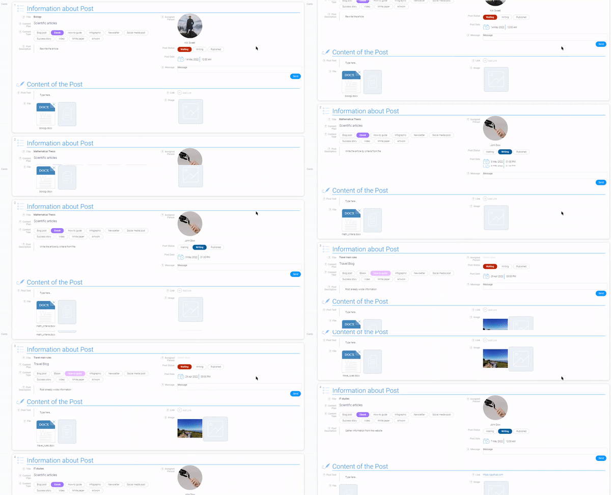
During the Cards configuring you have to select two views. They can be the same or different. The first view is the one displayed in the cards. That allows you to display the data you need. Or it can be used as an item preview.

It can also display the items themselves so that you don't have to open them.
Width Cart
This setting allows you to set the width of each individual card. Due to this you also can control the number of cards in a row. There are four card sizes available:
- 128px
- 256px
- 512px
- 100%

The last option means that the card will occupy the entire width of the container.
Height Cart
Unlike the width, the current setting allows you to set the height of the entire element, not a single card.
The height of each card depends on the view containers that are displayed in it.
But the values of the height options of the element are the same as for the Width Card:
- 128px
- 256px
- 512px
- 100%
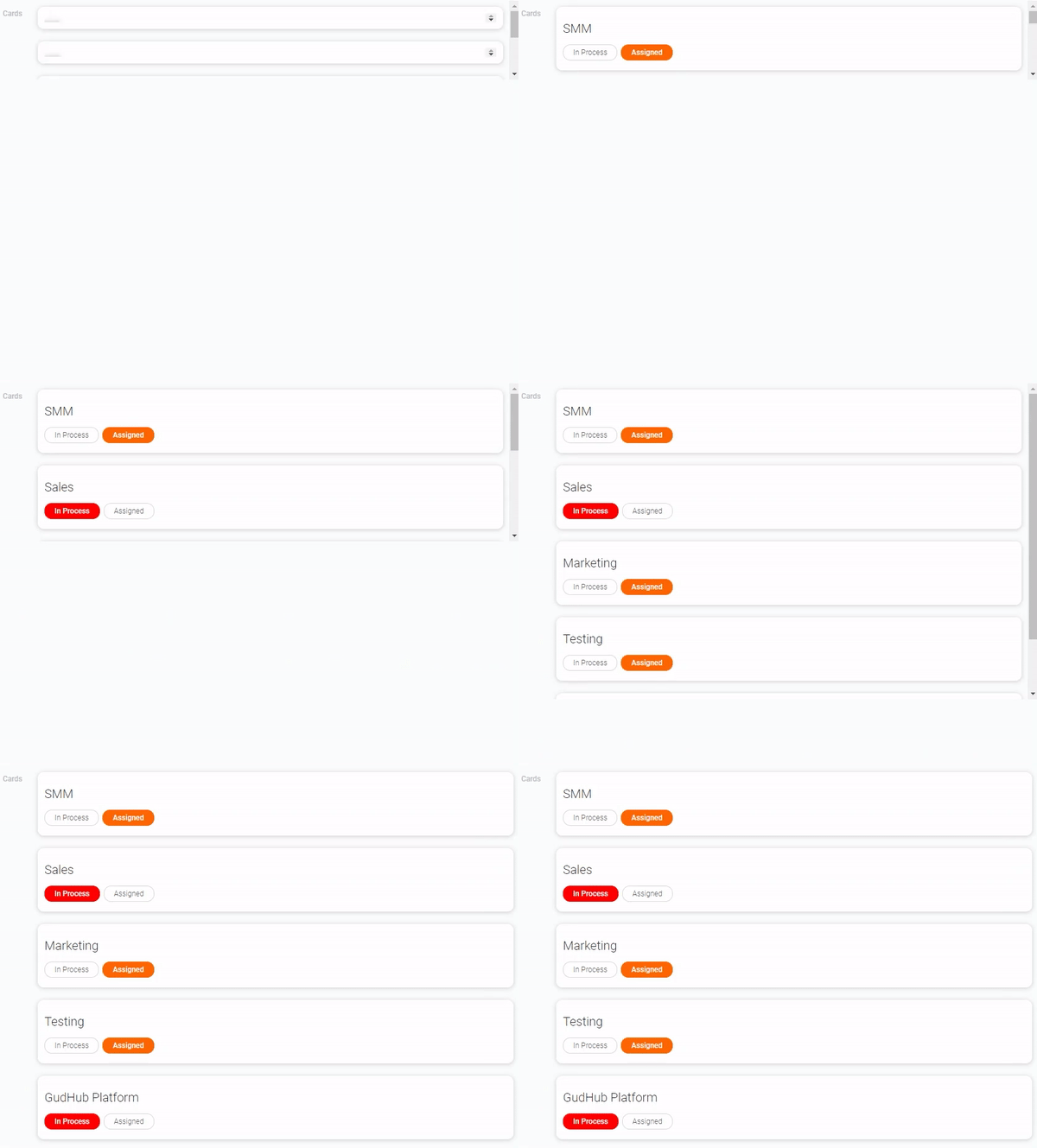
100% means that the element occupies the entire available height of the window.
Selected Item
The purpose of this option is to make items in cards available for selection. The user can select an item and, for example, delete it using Selected Item. Many gh-elements require this function to interact with the item:
When this setting is enabled, every card receives its sequence number depending on the placement of cards. And when the user hovers the cursor over this number, it changes to a circle.
This function is based on Item Selection
Sort Cards By
As you already know, items can be sorted by the value of the specific field. So, the current setting allows you to add the sorting of items for cards by default. Namely, here you can select the field by which they will be sorted.
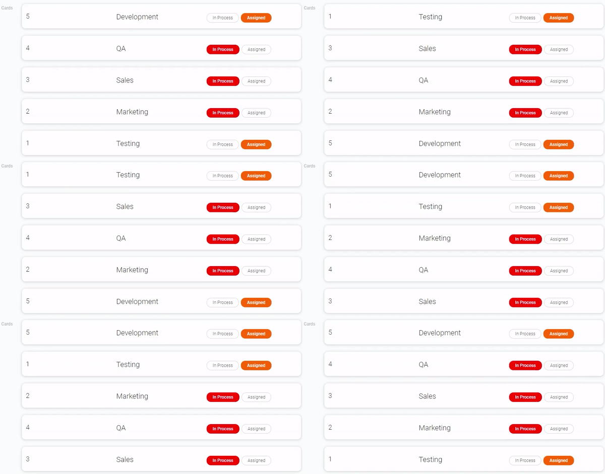
If you don't use this feature, the default sorting is by the order in which the items were created.
Sorting is performed depending on the type of field value. This means that for string data, this will be alphabetical order, for numbers - in ascending or descending order, and so on.
Items Order
This option allows you to select the type of the items order that determines the order of cards. So, you need to choose the right type from a small list:
- Ascending
- Descending
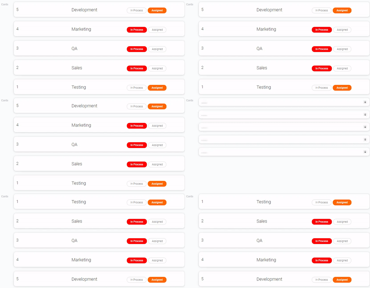
The default items order is Descending.
In the case of ascending order, the order of the cards is from the upper left corner or simply from top to bottom and right. In the case of descending order, it is the other way around, from the bottom right corner or from bottom to left and top.
Card Action
The Cards element can perform different actions depending on your needs. The current setting allows you to set the specific action. There are four available actions:
- Open Item - opens the corresponding item by clicking on the card.
- View Dialog - opens item as in the dialog. That is, when you open the item, the link parameters will not change.
- Send Message - allows cards to interact with other elements.
If the action type does not selected, nothing will happens. That is nothing will happen when interacting with cards.
The following settings are additional settings for different actions.
View Name For Action
The current settings is an option were you select the view for two card actions: Open Item, View Dialog. They involve the opening of the atoms in different forms. Therefore, in this setting, you need to select the view that will open after clicking on the card.
The views you have to choose from are taken from the application selected in App option.
This view may differ from what is displayed on the cards.It is used for saving space and ease of use of cards. That is, for example, to display only brief information about the full item on the main view.
Application
In this setting you have to select the application where the message will be sent to. This may not be the same application that was selected in the App. This allows you to customize the interaction of different applications through the Cards element.
Field Send Message
Here you must select the field to which the message will be sent after clicking on the card. This means that clicking on a card starts a process in the selected field.
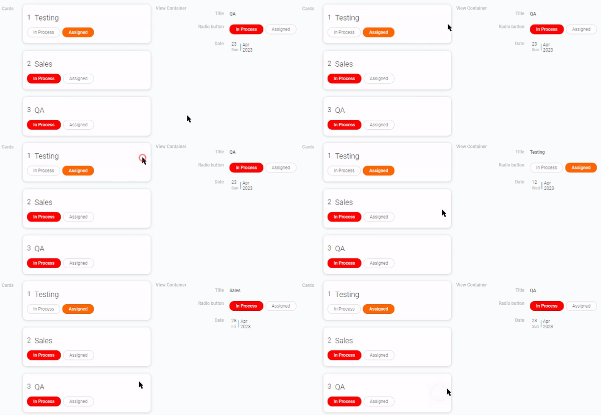
For example, if you select the View Container with the required configuration of settings here, you can change the view in it by clicking on the desired card.
Cards Filter and Table Groupe
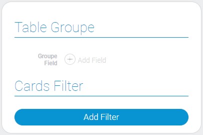
These two groups of settings allow you to sort and group the items to be displayed.
| Name | Description |
|---|---|
| Table Groupe | allows to make the group of cards; details... |
| Cards Filter | allows to add filters that customize which items will be displayed in the cards; details... |
Table Groupe
This function allows to make groups by values of the selected field. This means that all items that have the same value for the selected field will be grouped and displayed as one card.
This card displays the first created item with this selected value.
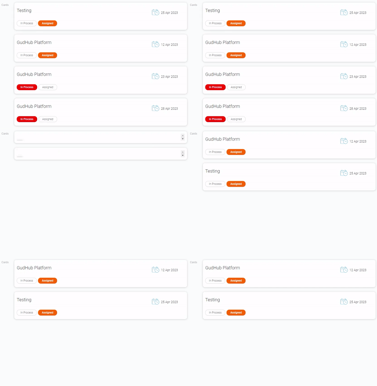
This option is useful for creating some categories in which clicking on them will open a list of specific items or, for example, statistics for a product category. But, of course, its use is not limited to this. Grouping elements can be used for any of your needs.
Cards Filter
This setting allows yo to add filters to the cards. Its purpose is to determine which items will be displayed on the cards and which will not. Specifically, you use it to customize the display of elements.
This option works like the Filter element
Element Style
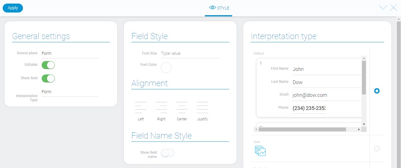
The cards have unique appearance. It can be configured using standard style settings. Also it depends of the element interpretation type.
General Settings
As usual the only additional setting is located in general style settings.
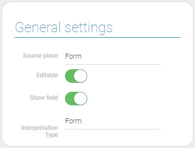
| Name | Description |
|---|---|
| Interpretation type | allows to change element interpretation type |
Interpretation Type
These types of interpretation are different from those given in end of article. They allow you to adapt cards to different locations. There are three types of such places:
- Document
- Table
- Form
Filtration
Cards cannot be filtered using any filters other than its settings.
Interpretation
The current item has several not very diverse types of interpretation.
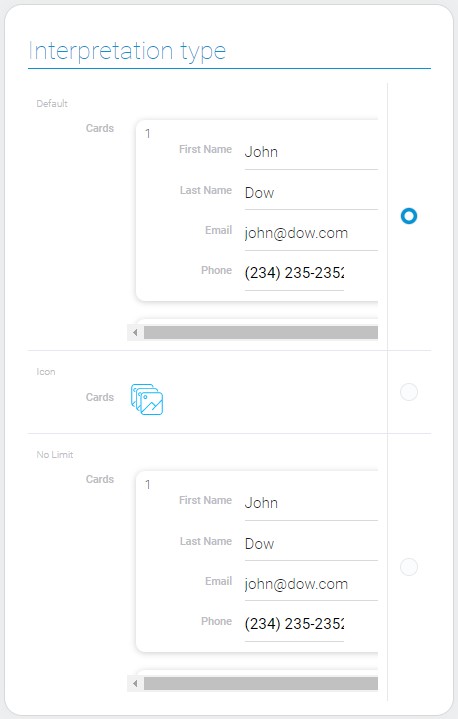
Default
The first type of interpretation displays items as cards. It uses virtual repeat. This type is mainly for HTML pages, so as not to overload them.
Icon
This type of interpretation displays an icon instead of usual element.
No Limit
This is the same type of interpretation as the first one but without virtual repeat. It is useful for document forming when you need to save a large number of elements in a document.
Value Format
This is one of that elements that does not have field value.
Data Model
Since the element has many settings, the data model has many properties.
{
    "data_model": {
        "app_id": "28752",
        "cards_settings": {
            "action": "send_message",
            "items_order": 1,
            "sort_cards_field": 0,
            "view_id": "1528082"
        },
        "field_groupe": "",
        "filters_list": [],
        "height_carts": "256px",
        "interpretation": [],
        "selected_item": 1,
        "send_message": {
            "app_id": "28752",
            "field_id": "678845"
        },
        "view_id": "1528082",
        "width_cart": "512px"
    }
}
| Name | Type | Description |
|---|---|---|
| app_id | string |
contains ID of the source application |
| cards_settings | object |
contains all properties of cards |
| action | string |
contains name of the selected card action |
| items_order | number |
contains ID of the order of cards |
| sort_cards_field | string |
contains ID of field by which cards will be sorted |
| view_id | string |
contains ID of the view that will be opened after card action |
| field_groupe | string |
contains IDs of fields by which items cards will be grouped |
| filters_list | array |
contains filters that configure which items will be displayed |
| height_carts | string |
contains value of the cards height |
| interpretation | array |
contains all element interpretation types |
| selected_item | boolean |
shows whether the cards selection is used or not |
| send_message | object |
contains data needed for field message |
| app_id | string |
contains ID of the destination application to which the message will be sent |
| field_id | string |
contains ID of the message destination field |
| view_id | string |
contains ID of view that is displayed in cards |
| width_cart | string |
contains value of the card width |

 Edit document