App Settings Element
App Settings is a gh-element that allows users to open settings of the current application. More precisely, it is a special button that opens a view with all the options of the application. There, the user can change any application settings and apply them.
Note that the application settings will be applied only if the user is the Admin or Owner of the current application.
The application settings are divided into four groups:
-
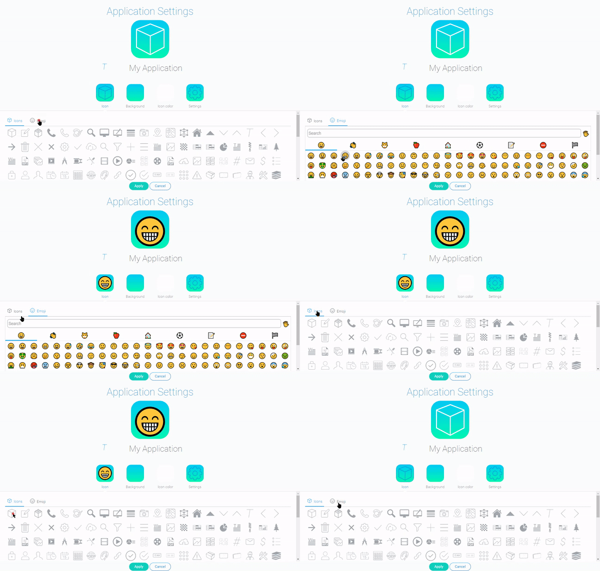
Icon - allows you to select an image on the application icon. It have two tabs where you can select a GudHub icons or an emoji.
-
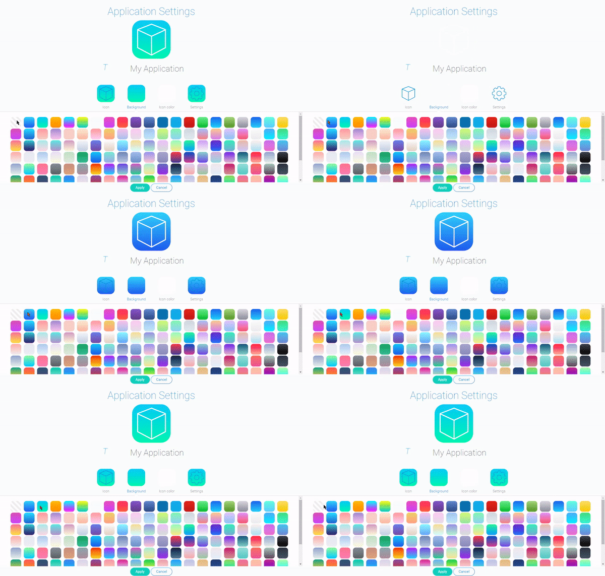
Background - here you can select the color of the icon background. It offers you to choose a background from ready-made styles or even remove the background.
-
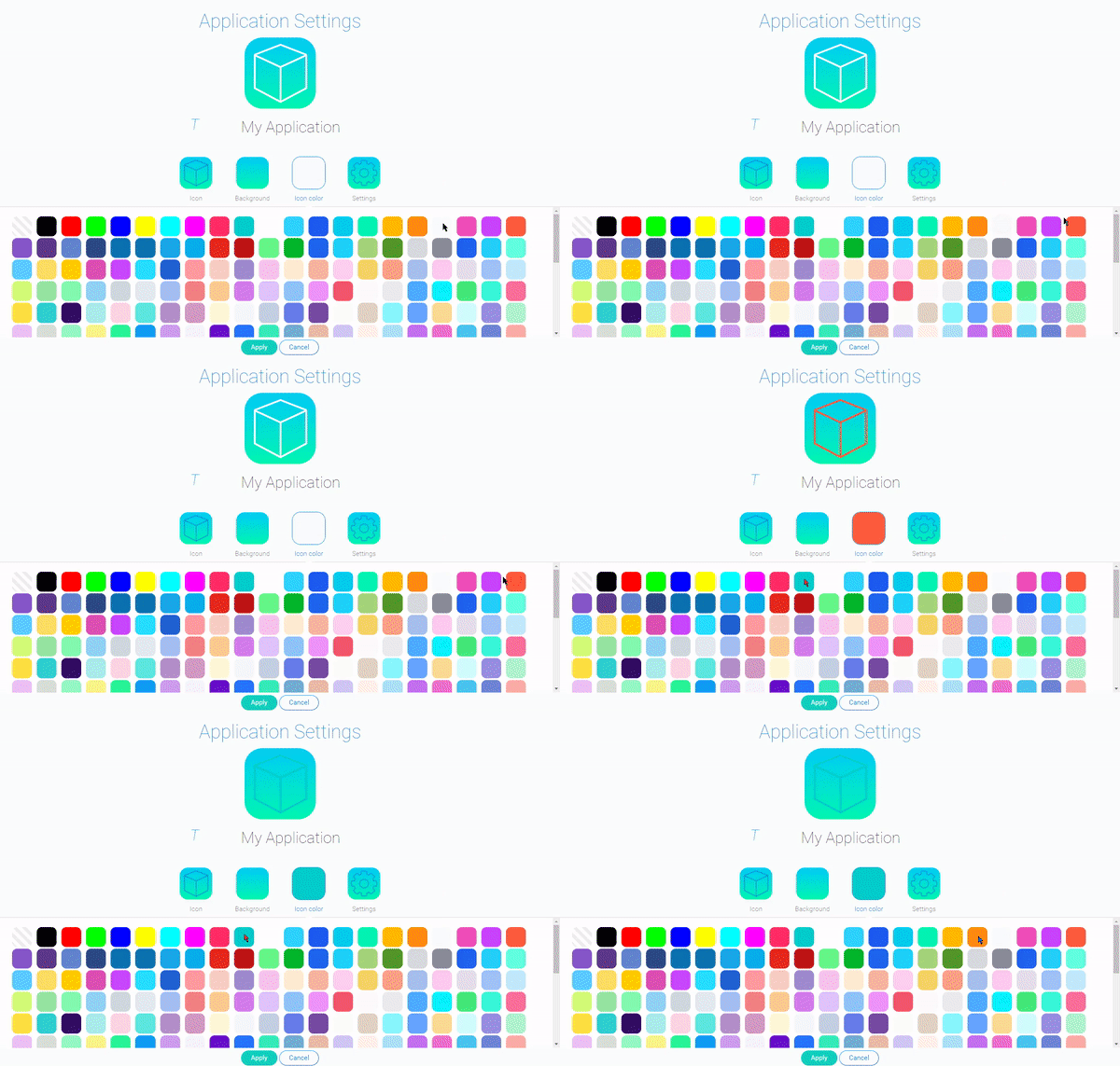
Icon Color allows you to choose the color of the previously selected icon from a set of ready-made colors.
-
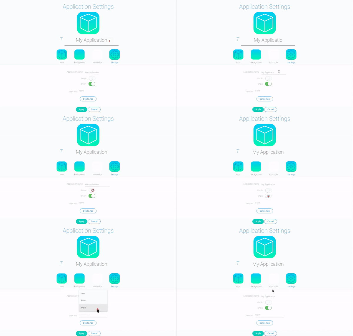
Main Settings are responsible for displaying, naming, deleting, and accessing the application.
| Name | Description |
|---|---|
| Application Name | allows you to enter the app name; the same field is located under the application icon, so it is available all the time, regardless of the active group |
| Public | allows you to make your app public; that is, your application will be available to all GudHub users regardless of their permission |
| Show | allows you to hide the app in the app list; if this function is disabled, the application will be available only after pressing the pencil button on the right above the list of applications |
| View Init | allows you to select the view that will be opened first after the application starts |
| Delete App | simply allows you to delete your application |
Functional Characteristics
The main purpose of this element is to update the settings of the current program from the inside. The same settings are available from the GudHub main menu. But this element eliminates the need to go to the main menu to change the application settings.
As a reminder, to apply the settings, you need to have Admin or Owner access rights to the application.
Element Options
Element settings consist only of standard field settings.
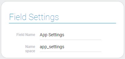
Element Style
The current gh-element has only standard style settings, except for one common additional setting. The types of its interpretation are described below.
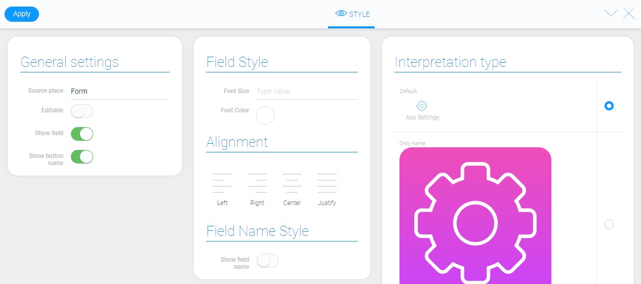
General Settings
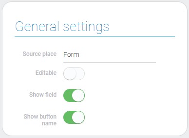
These settings configure the basic functions of the style. They are mostly standard functions, besides the last one.
| Name | Description |
|---|---|
| Show button name | allows to hide the button name |
Show Button Name
Depends of its value, this function allows to show or hide the button name. If this feature is disabled, element interpretations will look different.
Filtration
This element cannot be filtered.
Interpretation
The current element's appearance will depend on the chosen interpretation.
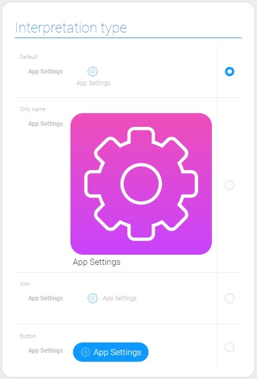
Default
This interpretation type allows the element to be displayed as an icon with the button name.
Only Name
This is the interpretation type that displays the element as a big button. It looks like an application icon.
Icon
This is an interpretation type that displays the icon and the name of the button next to it.
Button
The last interpretation is the blue button with an icon and button name on it.
Value Format
The current element does not store any value.
Data Model
Its data model have only one property.
{
    "data_model": {
        "interpretation": []
    }
}
| Name | Type | Description |
|---|---|---|
| interpretation | array |
contains all element interpretation types |

 Edit document