Configuring the Table Element #
GudHub CRM lets you display app records in a tabular format using the Table element. You can choose which field values appear in the columns and open a record for viewing or editing by clicking its row.
A table can display data from either the current app or another app you have access to. Its settings let you choose and reorder columns, sort records, and show only the information you need.
In this guide, we’ll walk through the main Table settings and show you how to use a table to view related records.
Step-by-Step Guide to Configuring a Table in GudHub CRM #
For this example, we’ll use an app with a table displaying customer data. The Table element is already included in the standard “Table” template, which you can select when creating an app.
Step 1. Open the Table Settings #
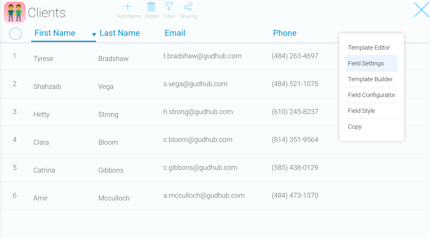
Right-click the table and select “Edit Field”.
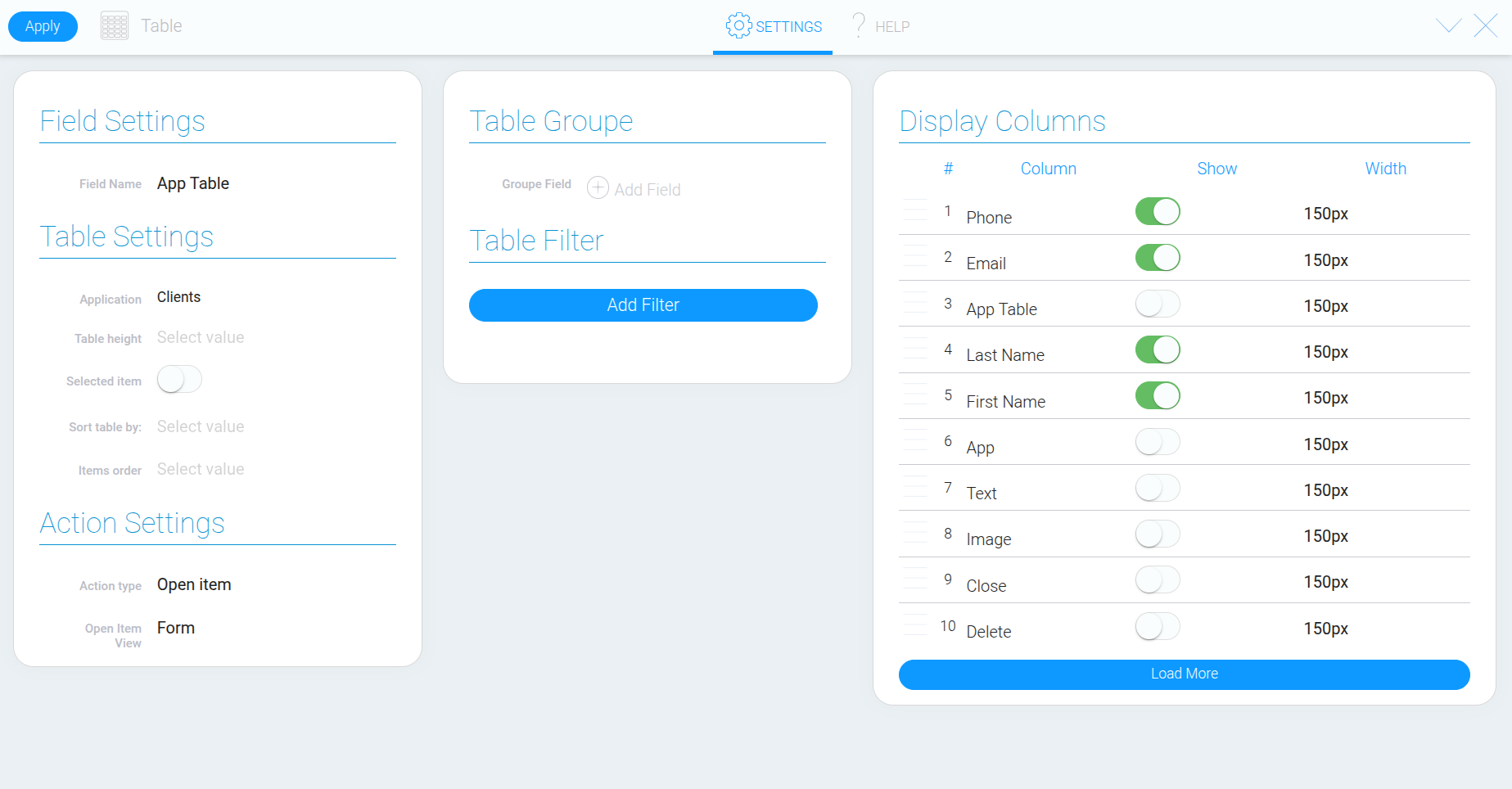
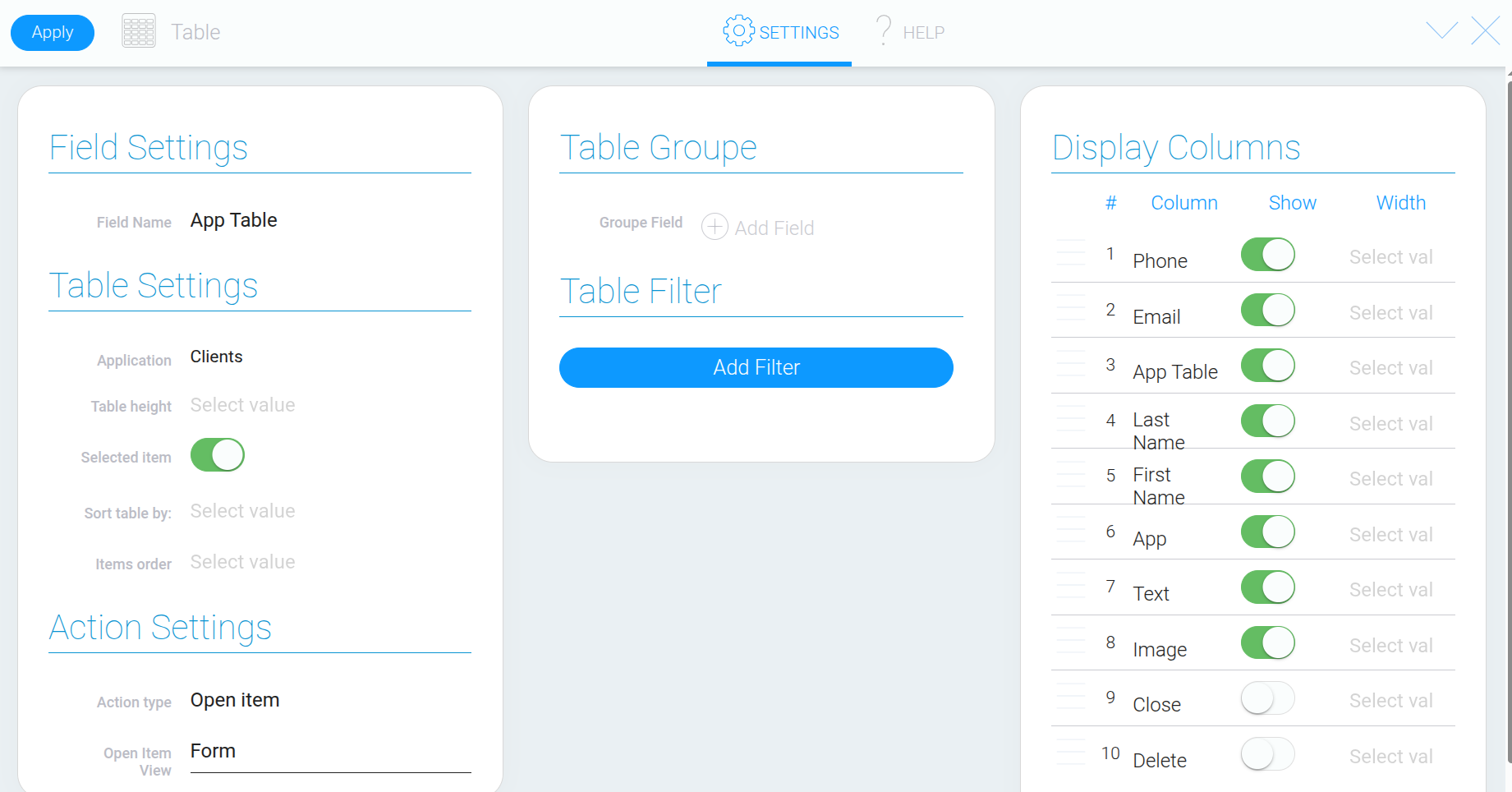
The window that opens contains settings for the data source, table behavior, sorting, filters, and columns. You can also change the element’s name at the top of the window.
Step 2. Select the App That Contains the Data #
In the app selection field, specify which app the table should retrieve records from. This can be the current app or another app you have access to.
For this example, we’ll keep the current app containing customer data. If you select a different app, the table will display its records, and the fields available for configuring columns will come from that app.
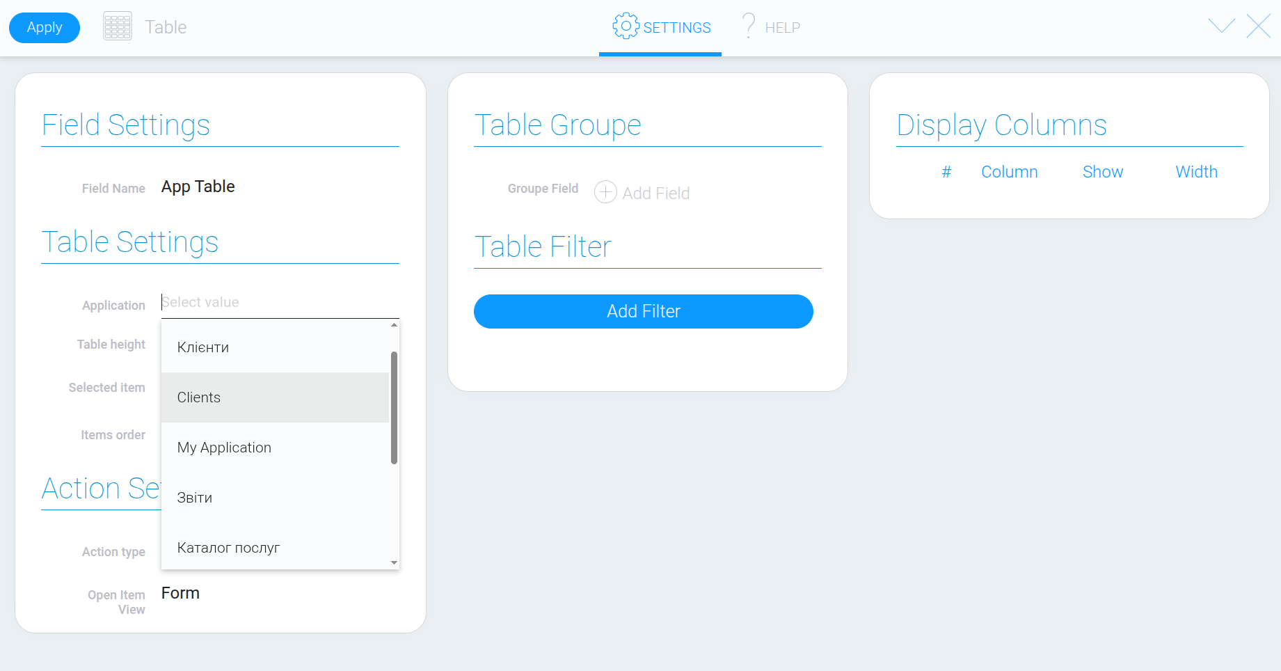
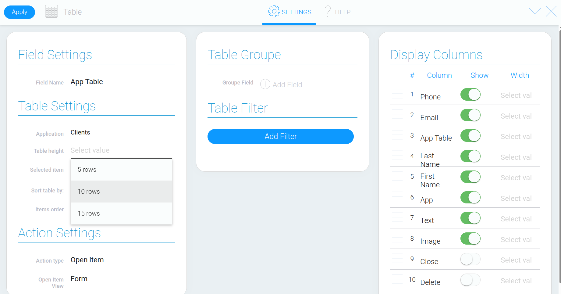
Step 3. Set the Table Height #
In the height settings, choose how many rows should be visible in the table.
This lets you fit the table into the desired area of the page while leaving room for other elements. If all records or columns do not fit, you can scroll to view the remaining content.
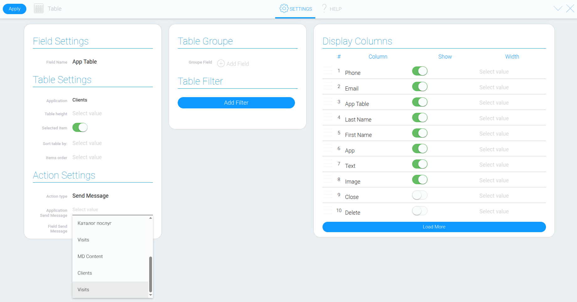
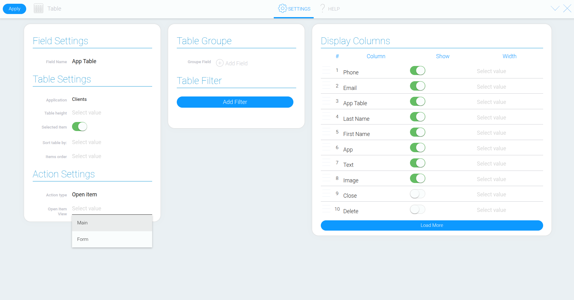
Step 4. Configure What Happens When a Record Is Clicked #
Choose what should happen when someone clicks a table row. There are three available options:
“Open Item” – opens the selected record.
“Send Message” – sends a message to another element.
“None” – displays the data without triggering any action when a row is clicked.
If you select “Send Message”, additional settings will appear. You’ll need to specify the app and field that should receive the message. For example, this option can be used to interact with a View Container and display the selected record inside that element.
Step 5. Enable or Disable Record Selection #
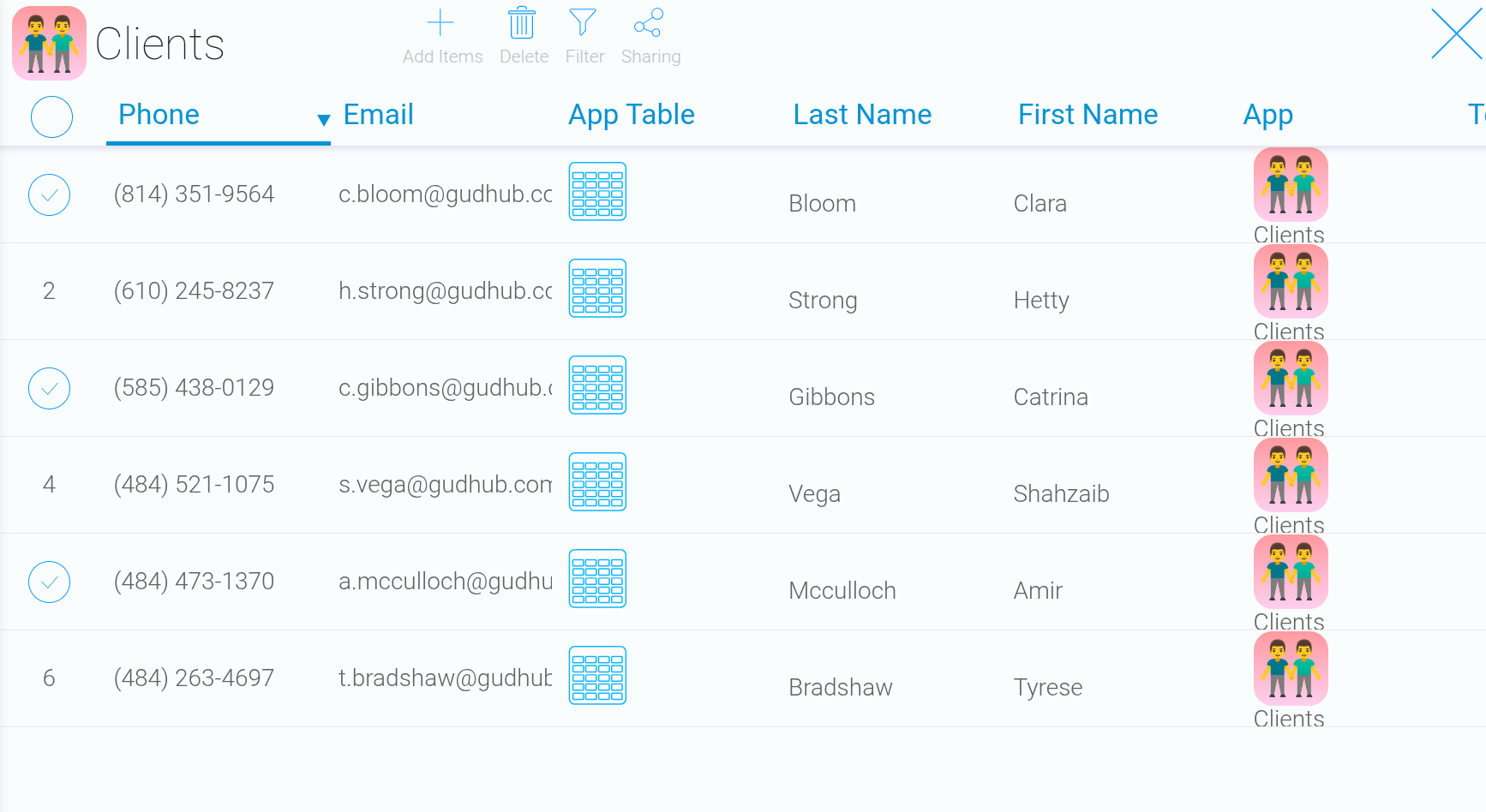
The “Selected Items” setting determines whether users can select table rows. This can be useful when selecting records for further actions, such as deletion.
Step 6. Set the Sorting Order #
Under “Sorted By”, select the field you want to use to sort the records. For this example, we’ll choose “First Name” to arrange customers by their first names.
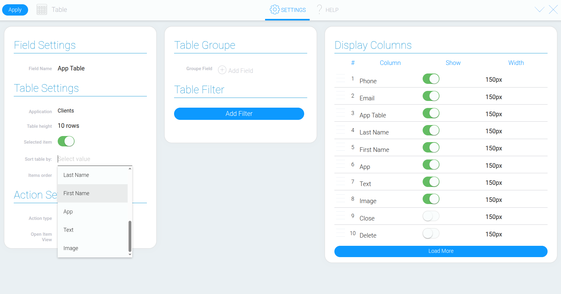
For text values, this means alphabetical or reverse-alphabetical order. For numbers, it means sorting from the smallest to the largest value, or vice versa.
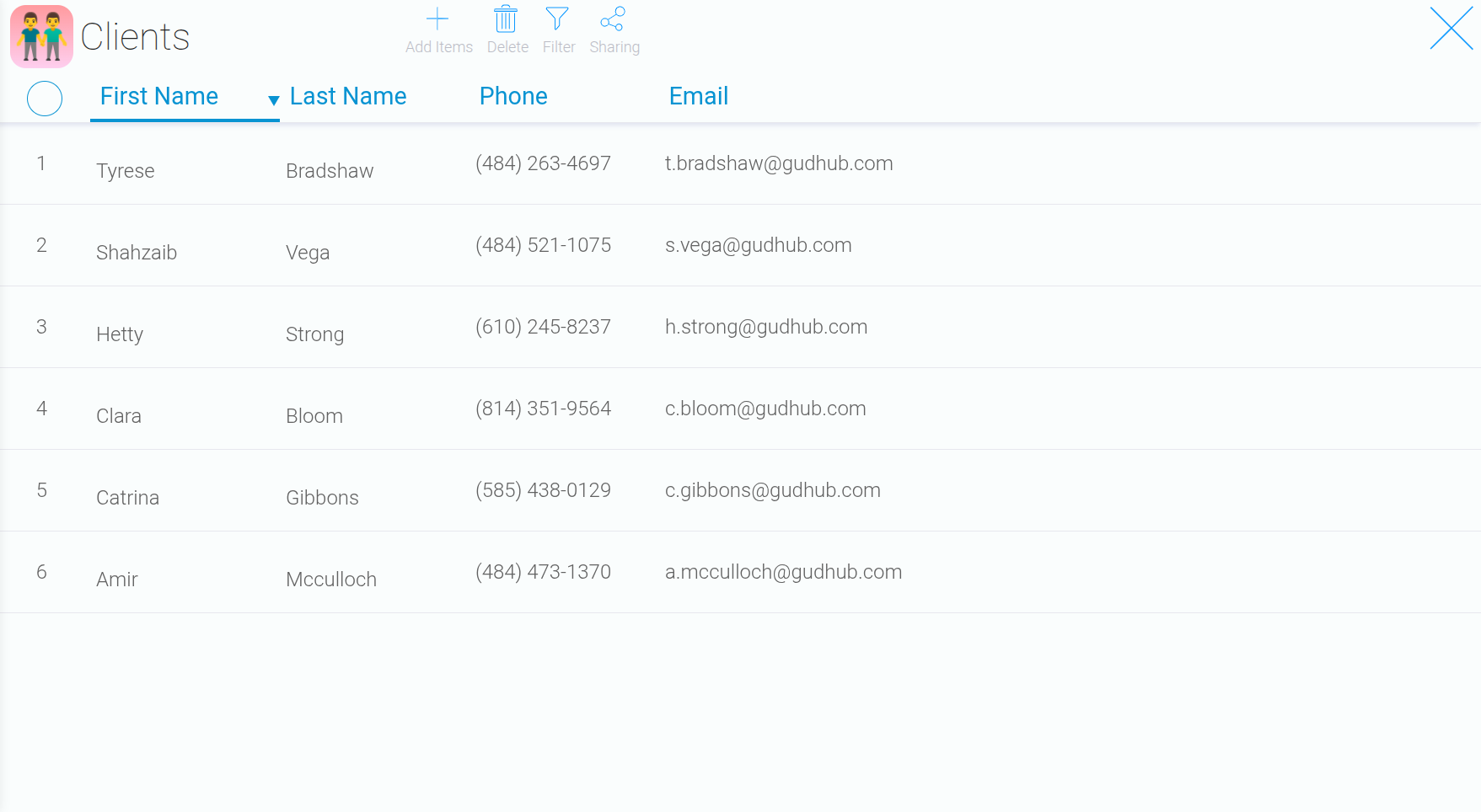
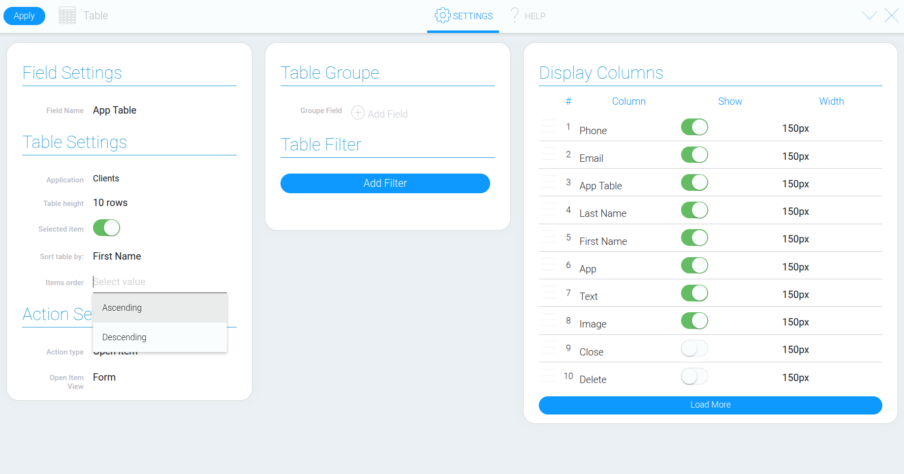
We’ll select “Ascending”. The table will now display customer records in alphabetical order by first name.
Grouping Records #
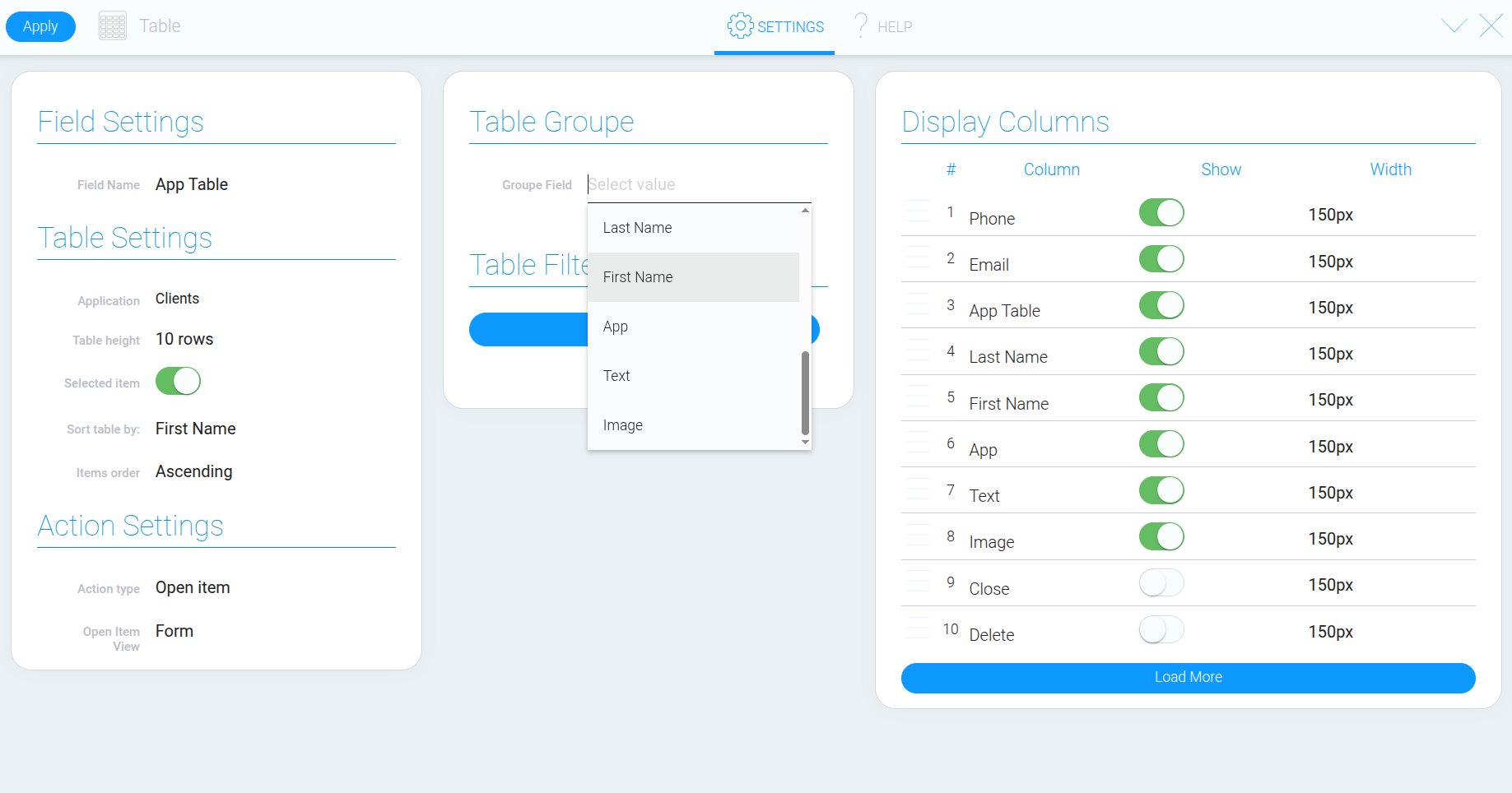
The table settings also let you select a field to group records by. Records with the same value in that field will appear together in a single group.
For this example, we’ll select “First Name”. If two records have the same first name, they will appear together in one row in the grouped table.
Filtering Table Data #
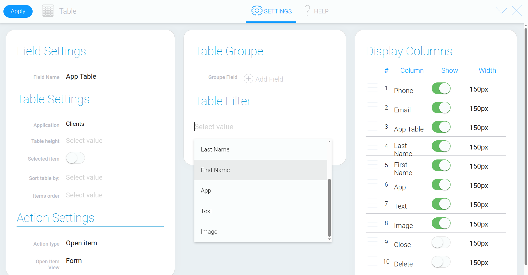
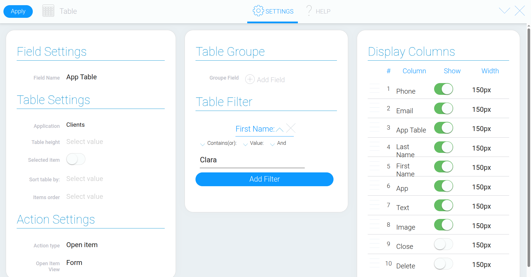
Filters let you display only the records that meet specific conditions. For example, you can select a field containing a name and enter the desired value to show only matching customers in the table.
Configuring Columns #
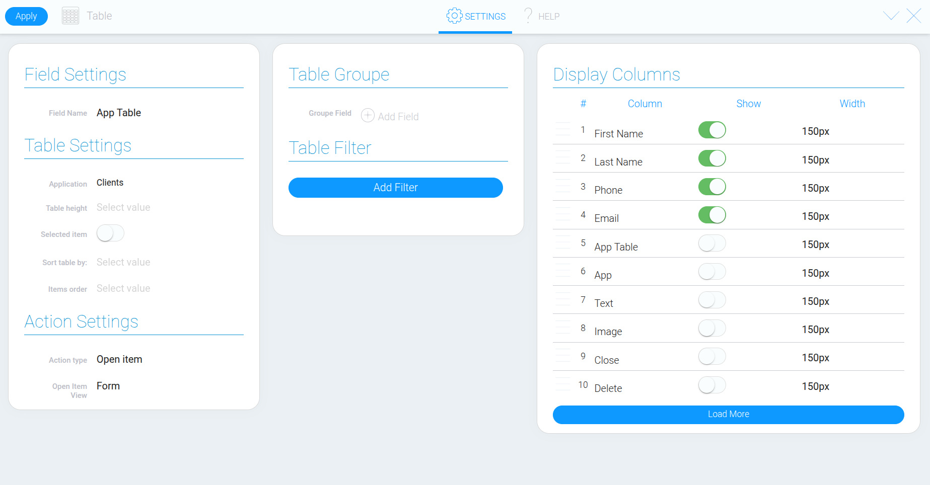
The Table settings also include a list of fields that can be displayed as columns. For each field, you can configure its visibility, position, and column width.
Start by enabling only the fields you need. For example, a customer list might include first name, last name, and contact details, while unnecessary fields can be hidden.