Setting Overview
GH-elements are the elements that the GudHub consists of. They perform a wide variety of functions. Each can be configured with the help of its own sets of options.
Note, settings of each element are consist of other gh-structure.
Element Options
Every gh-element has its own unique set of options. They allows to configure elements and their individual functions. These options are divided into several groups.
Field Settings
Every gh-element has at least one group with at least two options. They are standard for all fields. As you have already guessed, Field Settings is just such a group.
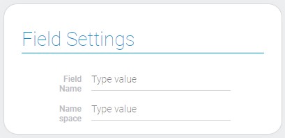
| Name | Description |
|---|---|
| Field Name | name of the element |
| Name Space | unique element ID in the application |
Field Name
Field Name is a name that will be displayed in the application. You also can hide it in selected field.
Name Space
Name Space is an element that is unique within one application. That helps to give the element your own ID and change it while field ID remains the same.
Others
In addition to the field settings, the item can have other groups. For example:
- Default value settings
- Type
- Options settings
- Filter list
- Others
Element Style
All gh-structure have options that allows to customize their style of displaying in different parts of applications.
Style Place
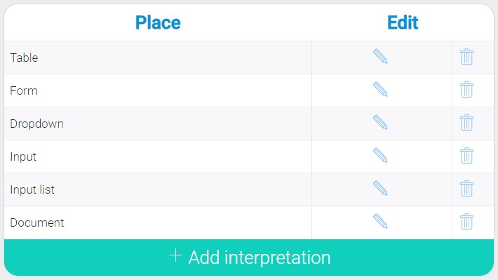
This group of settings allows to configure the element style for individually for each of possible places. Also, user can add its own style for any place and delete or update the previous one.
General Settings
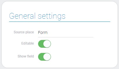
The main style settings are responsible for the way of displaying the element, rather than for its style.
| Name | Description |
|---|---|
| Source place | place there the style settings are used; details... |
| Editable | allows to make element uneditable; details... |
| Show field | allows to hide the field; details... |
Source Place
This is the view of the current application where the style is used. This means that the current style settings will apply to the element only if it is located in the source view.
Editable
This is the setting that allows to configure whether the element value could be edited. Also, here we can make the field uneditable regardless of its type of interpretation.
Show Field
This option allows to hide the field in the current place.
Field Style, Alignment and Field Name Style
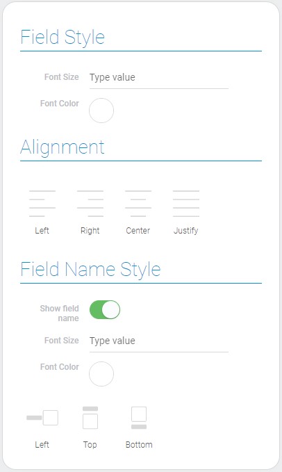
There are three groups of style settings in this block.
| Name | Description |
|---|---|
| Font size | to change the font size of the element text; details... |
| Font color | allows to change the font color; details... |
| Alignment | allows to align element in container; details... |
| Show field name | allows to hide the name of the field; details... |
| Font Size | allows to set the font size of the field name; details... |
| Font Color | allows to select the color of the field name font; details... |
| Position | allows to configure the field name position; details... |
Font Size
This option allows to set the size of the element text. There are two such settings:
- For value text
- For field name
Font Color
These options allows to select the font color. You can configure the color of:
- Value text
- Field name
Alignment
This option allows to configure the element alignment in the container.
Show Field Name
This setting allows to display the field name or hide it at all.
Position
With this option you can set where the field name will be displayed in relation to the element itself.
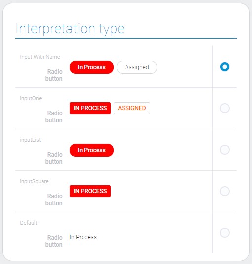
Interpretation Types
Among the style settings you can find all interpretation types of current element. Every element have at least one interpretation that is default.
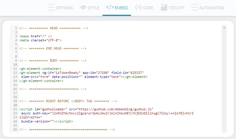
Embed
This tab contains the HTML code of the selected element. This code can be used in other platforms.
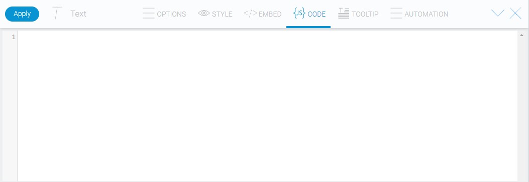
Code
Code is an option that allows you to add additional scripts to an element. When you start the client, the additional script will also be activated.
Tooltip
Tooltip is an interesting tool which allows to create special tooltip for element. You print any text in options.

And it will be displayed in the tooltip.

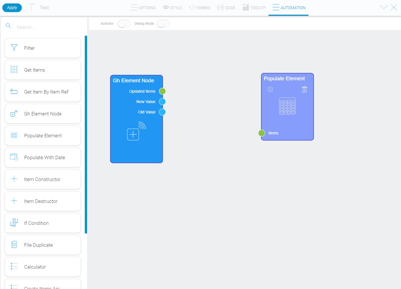
Automation
This is the only tab of element options that is not used in every gh-element. It contains set of different methods and allows to automate almost all processes in application.

 Edit document